


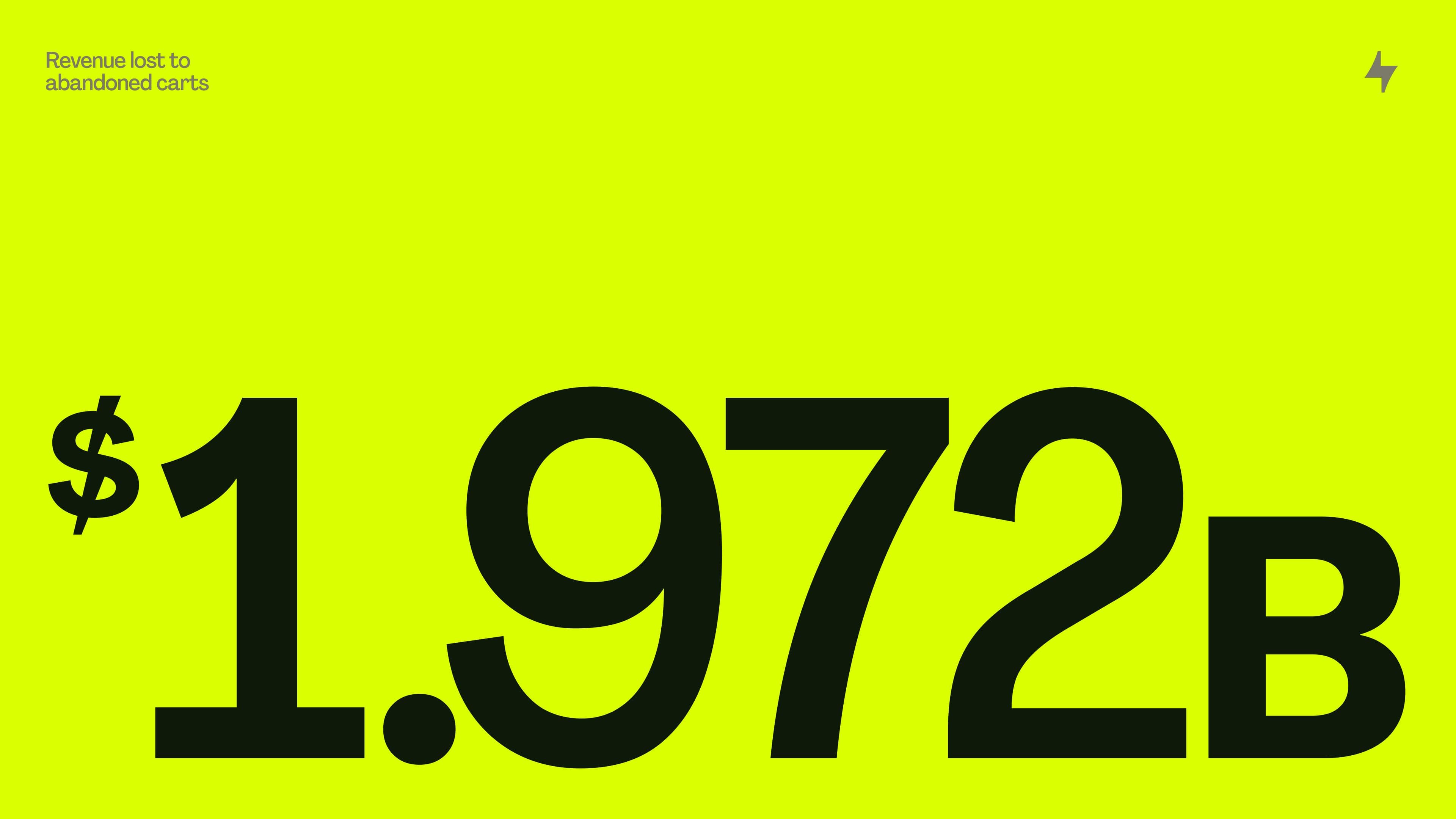
Checkout should be instant and invisible, but instead, it drags. Steps pile up, carts get abandoned, patience runs out. Bolt’s answer is a checkout that moves at the speed of a click: 50 milliseconds.
The challenge was to make the brand feel just as instant, just as electric.
Strategy
The strategy centered around one idea: Shockingly Simple. Not faster-for-the-sake-of-it, but freedom. For shoppers, it means less friction, faster speed, more ease. For merchants, it means more loyalty. One click that proves checkout doesn’t have to be a barrier, it can be the easiest part of buying.
Identity
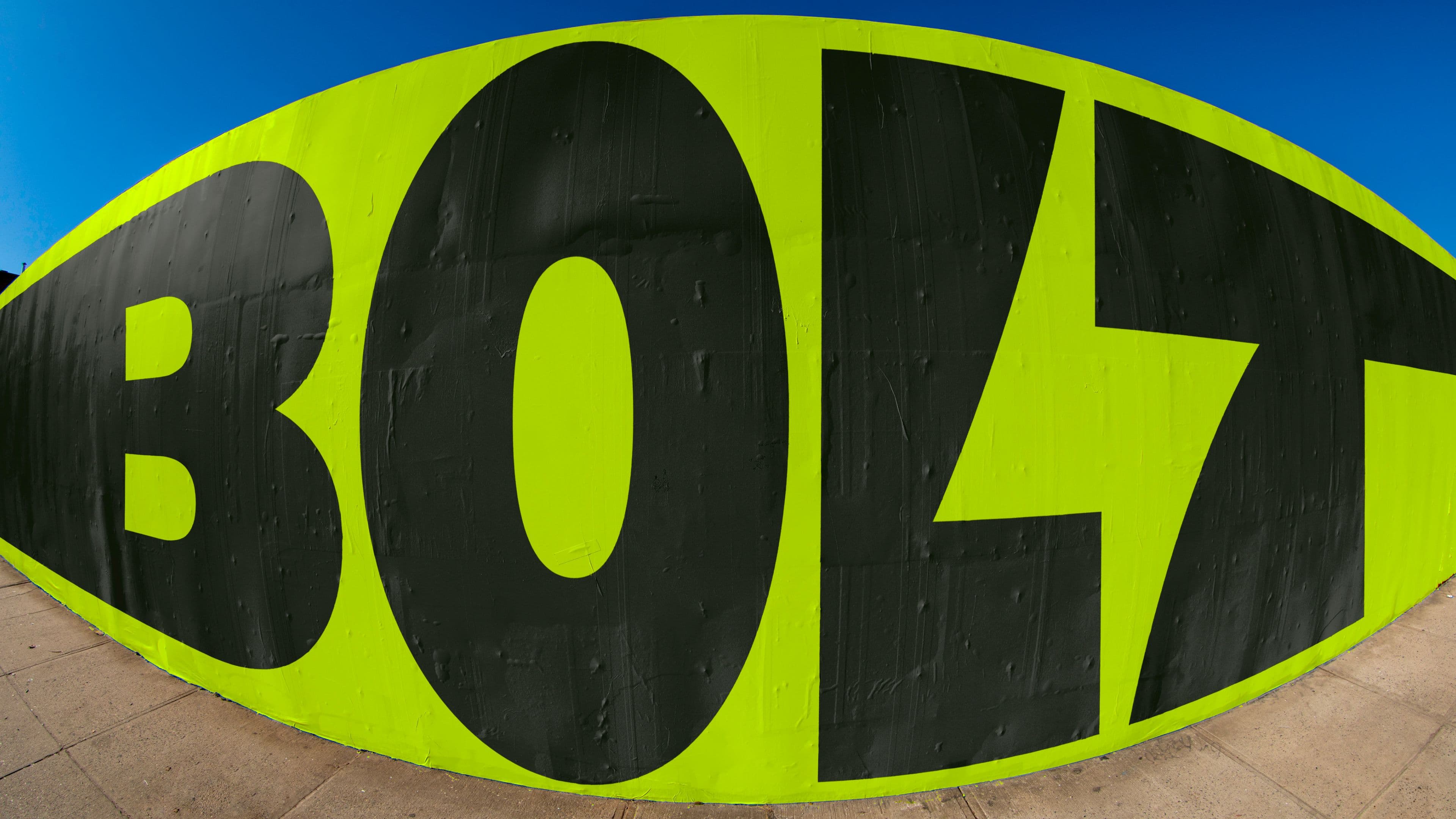
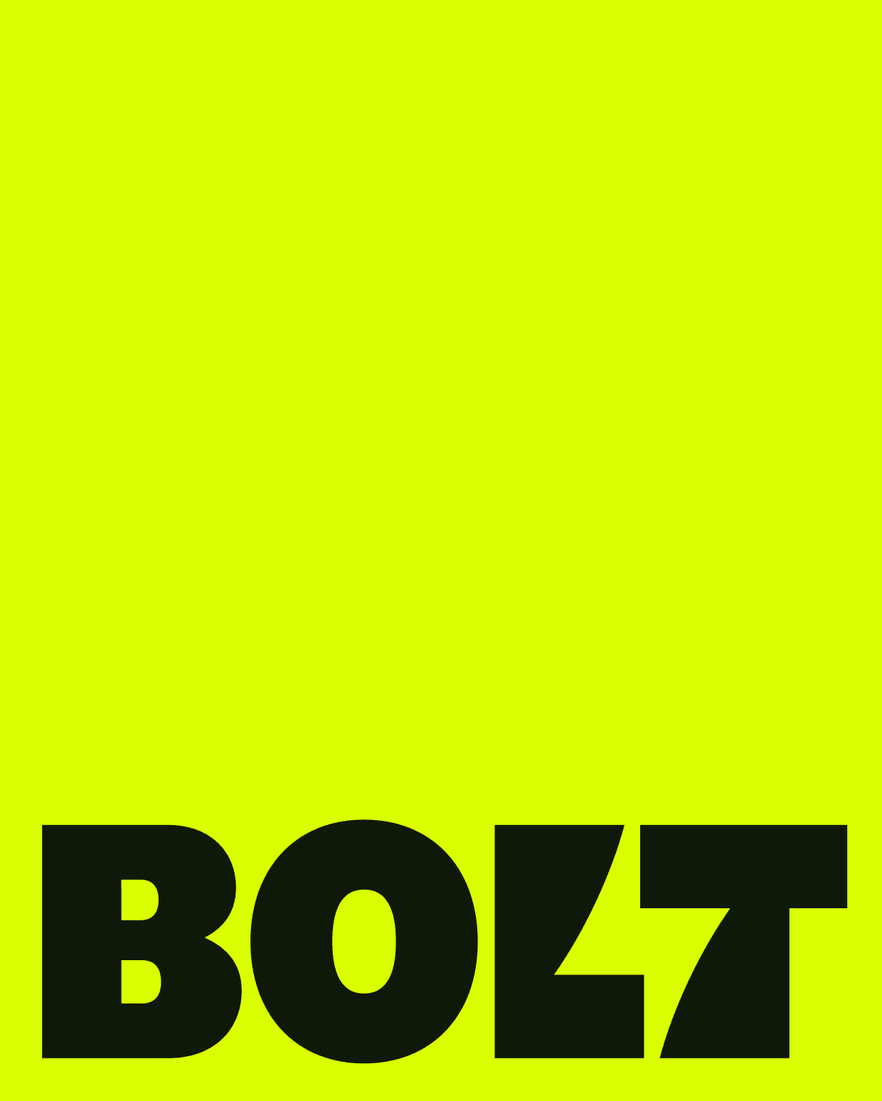
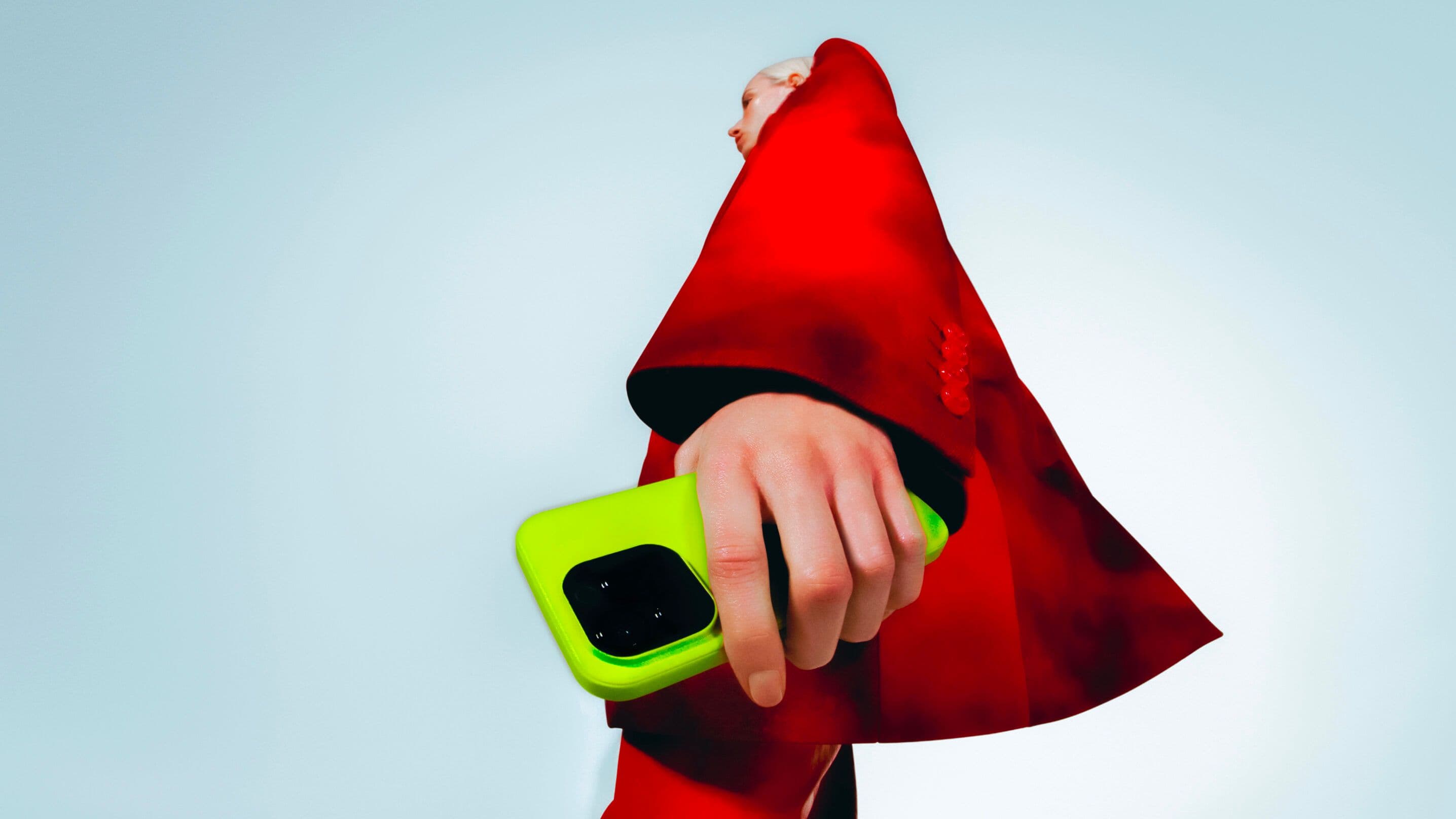
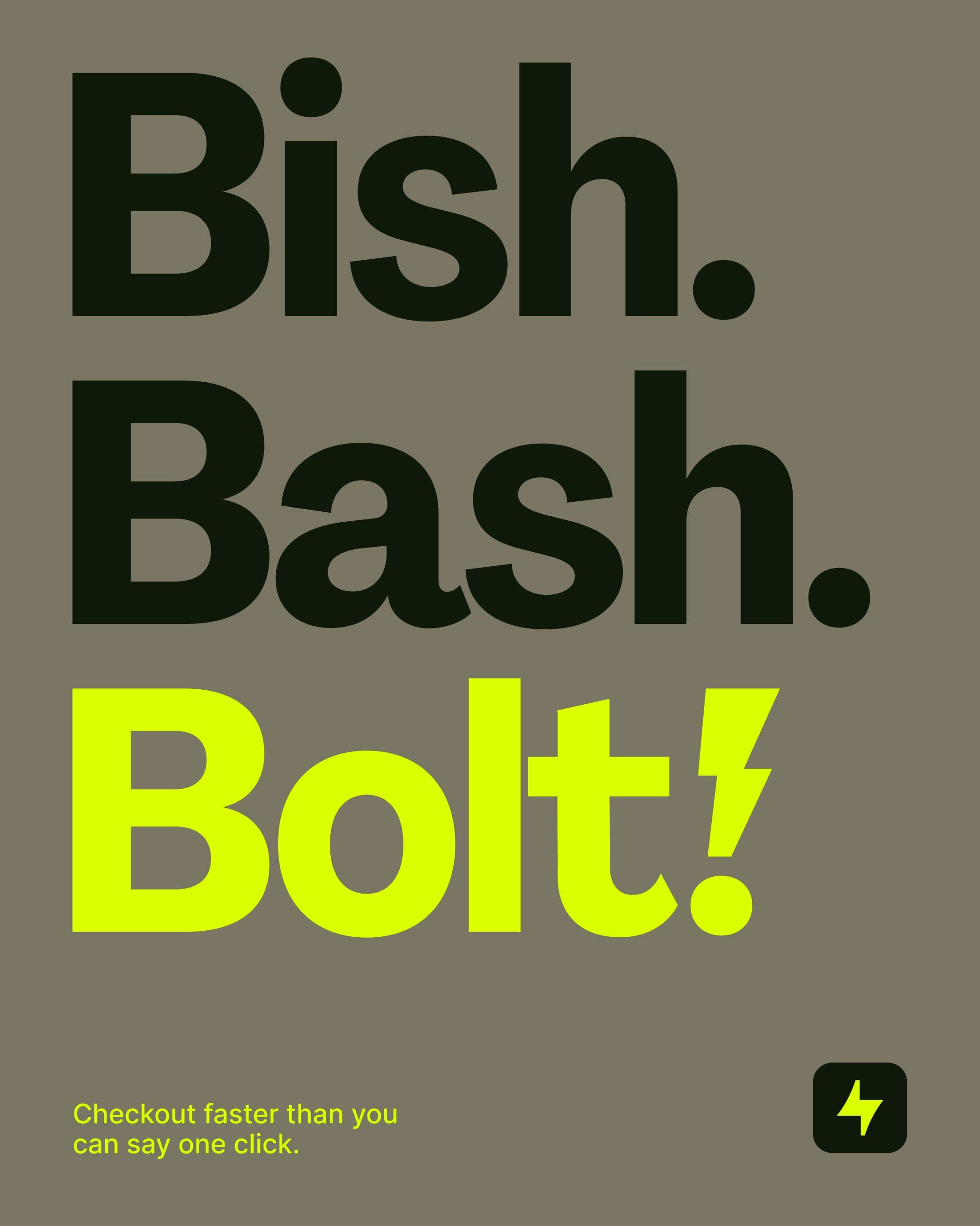
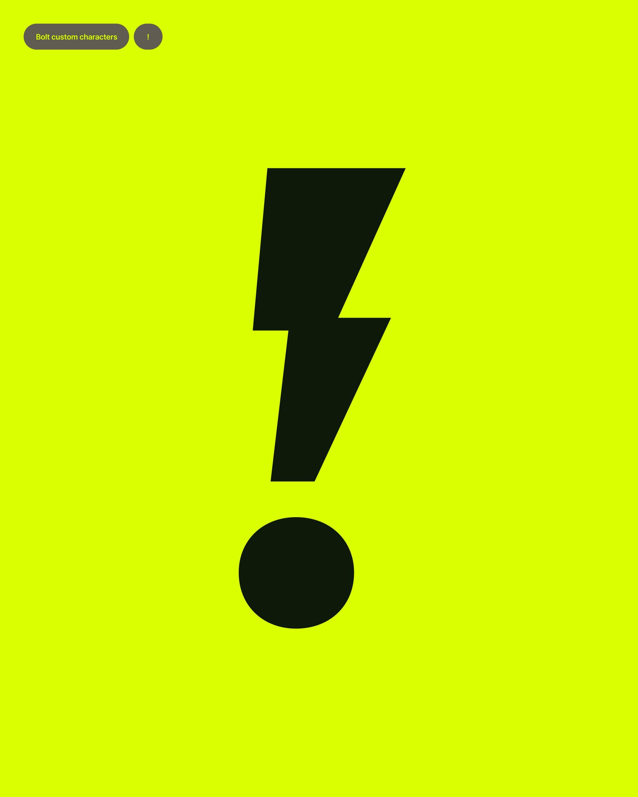
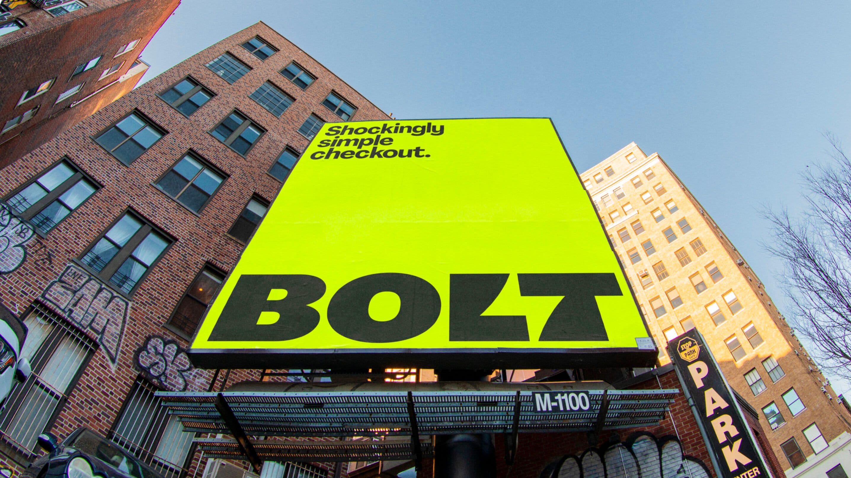
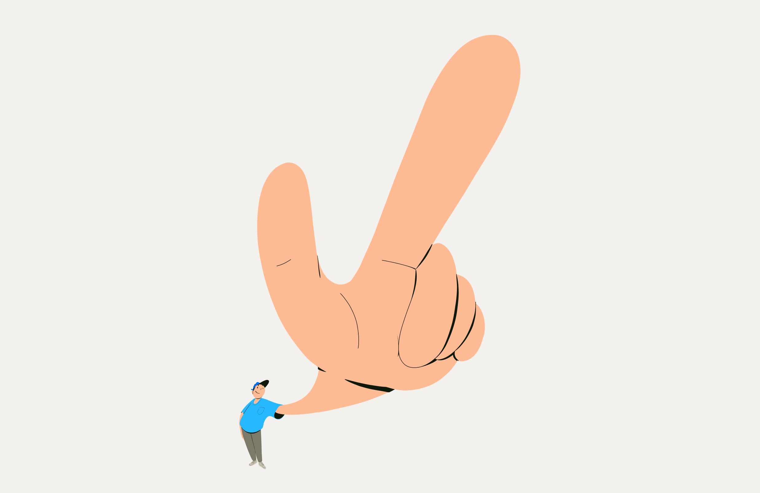
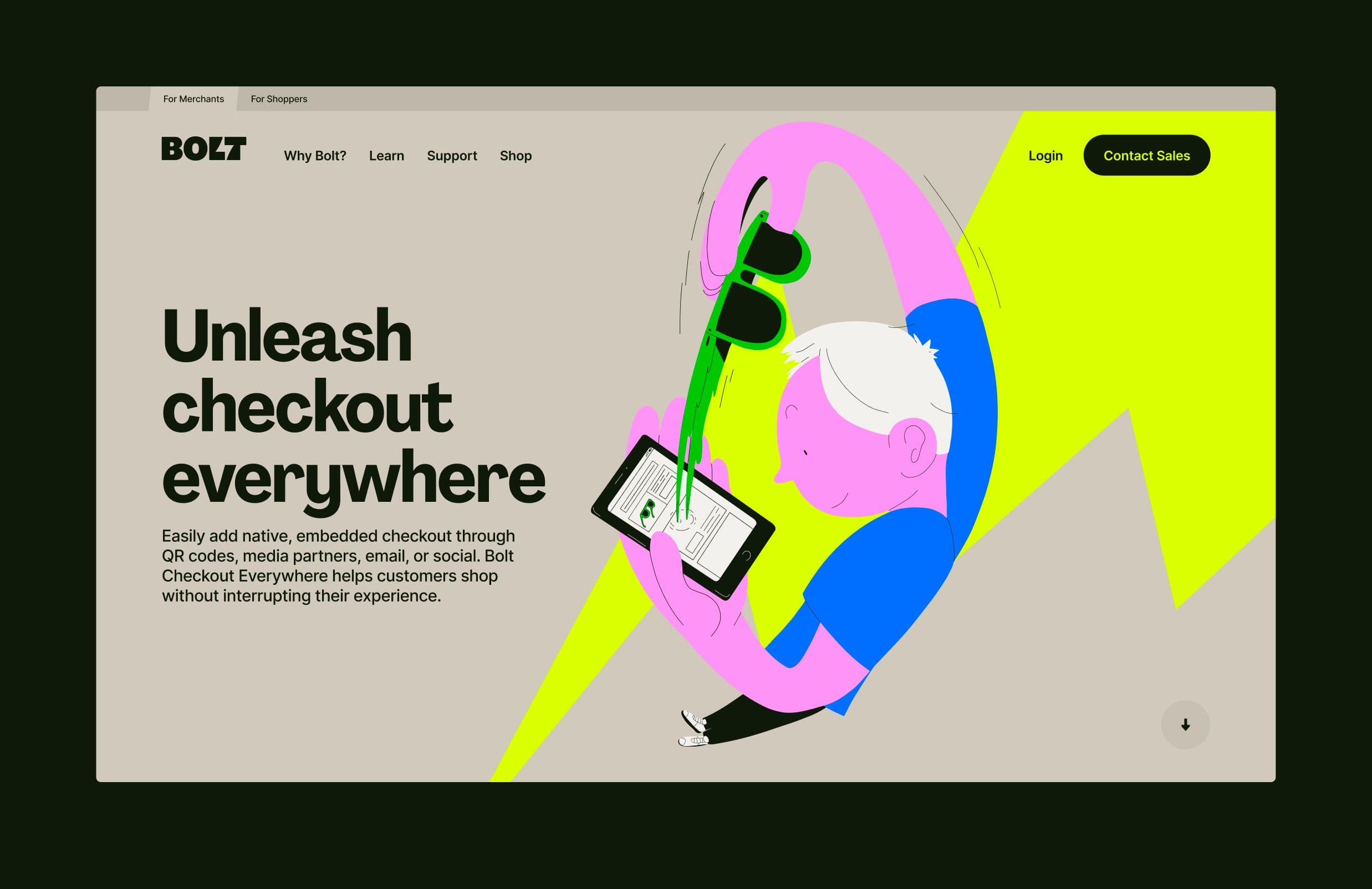
The identity is Bolt by name, bolt by nature. A sharp new logo, custom type and a high-voltage palette create instant impact. Motion and sonic branding echo the speed of a click. Photography and illustration that make simplicity feel human and alive, and every element charged with the same energy as the product itself.
Application
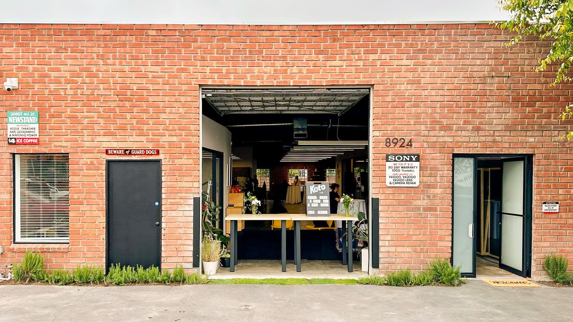
The brand lives everywhere the product does: in the UI, campaigns, in motion, in sound and in code. Each touchpoint is designed to feel immediate, so no drag, no clutter, no static. Just Bolt: fast, clear and unmistakable.


Outcome
The new identity helped Bolt step out of the utility box and show up as the leader in lightning-fast checkout. With Shockingly Simple, Bolt proved that one click is enough to change everything.