

Walkie Talkie is the voice-based social app where people tune in to hang out. After quick growth, their team wanted more: More investor attention, more user loyalty, more meaningful connections, and more stand-out from the competition.
Strategy
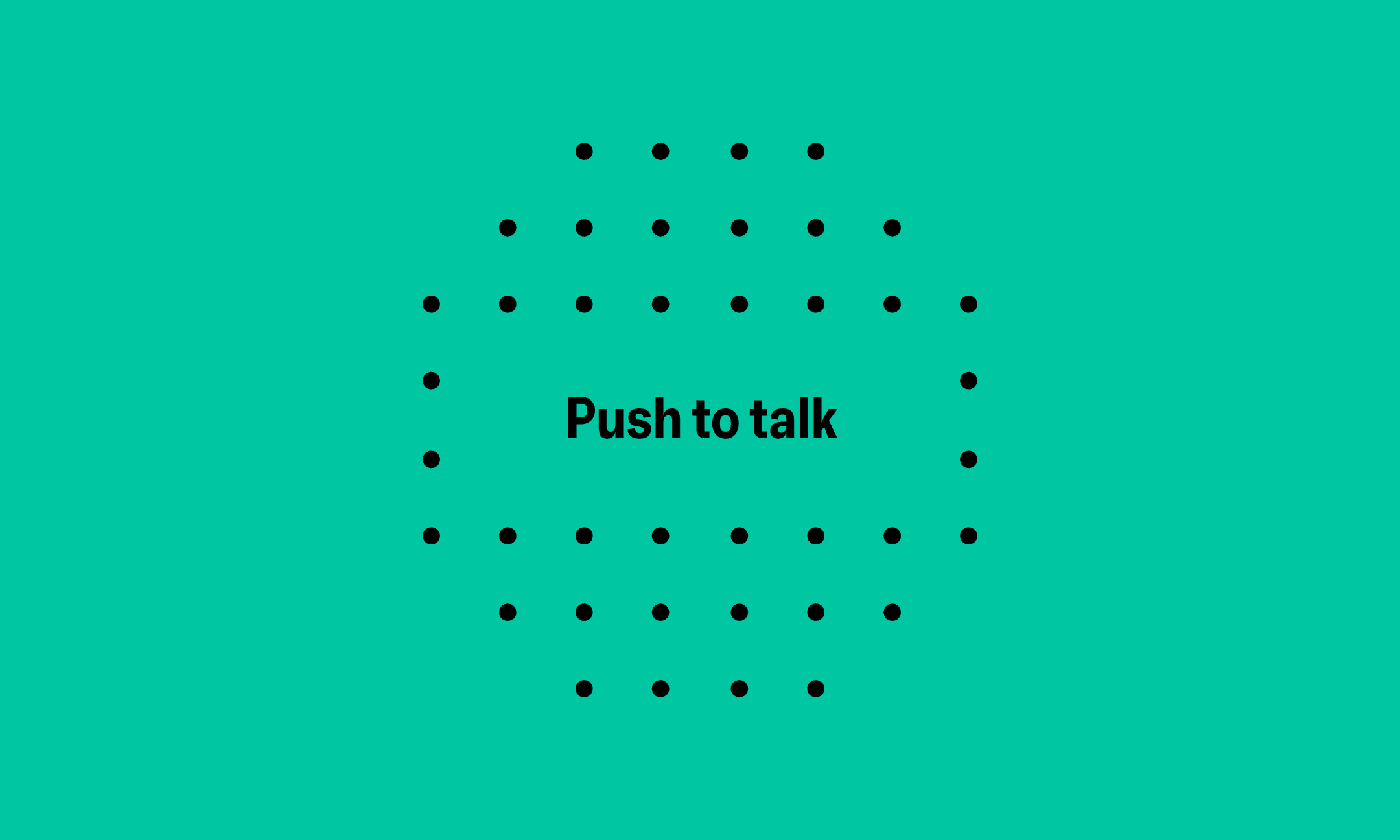
Our strategy focuses on the in-app experience, captured by our brand idea, ‘Third Place’. This positions Walkie Talkie as a place beyond home or work, where people feel free to embrace imperfection and enjoy authentic, spontaneous connections.
![Black text on a white background reads: Find [purple ghost] your favorite frequencies and [blue rocket] chat about all [yellow dog] things fun, fascinating and refreshingly weird [green mic] with people across the [red burger] globe.](/_next/image?url=https%3A%2F%2Fcdn.sanity.io%2Fimages%2Fsbsn7wuy%2Fproduction%2F5350696f71f6a38c357ad9873af6f064918c779f-2160x1296.png&w=3840&q=75)
Identity
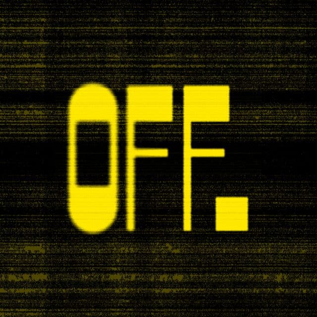
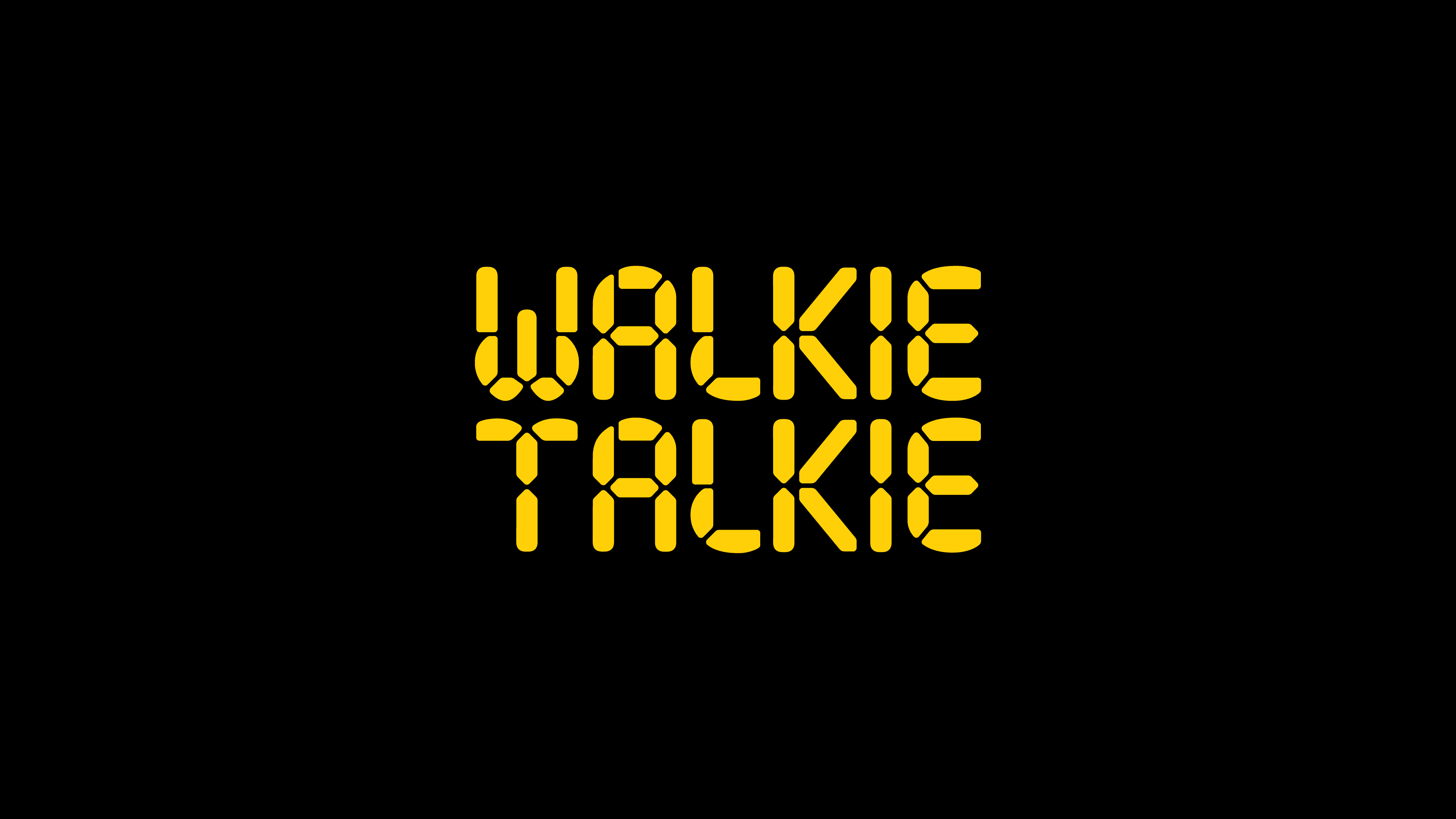
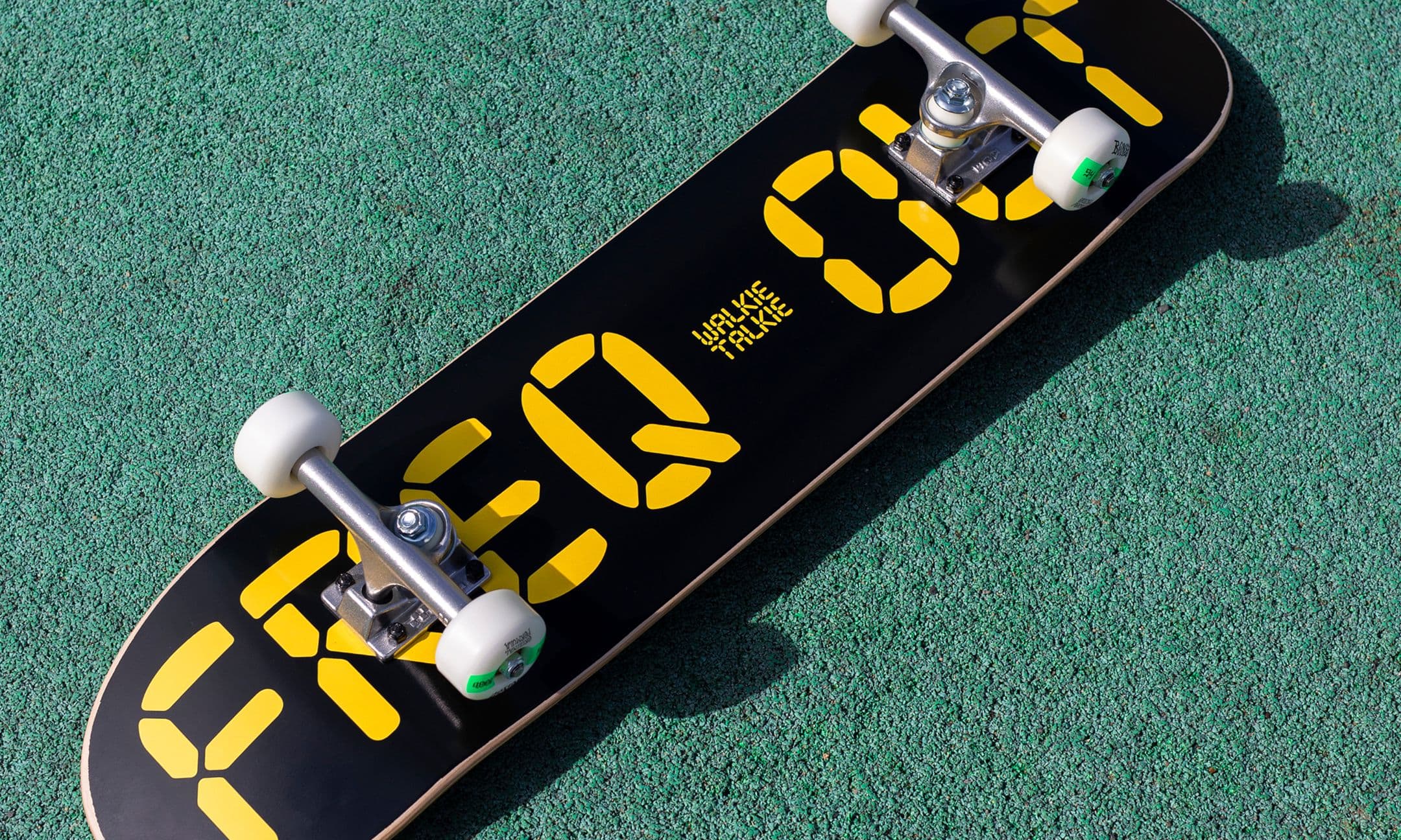
Inspired by Walkie Talkies, our visual identity pairs retro aesthetics with a bold system update, fit for Gen Z. We created a LCD-inspired typeface, refreshed the brand mascot, and built a verbal identity that sets the tone for all types of conversation, from real talk to deep dives.
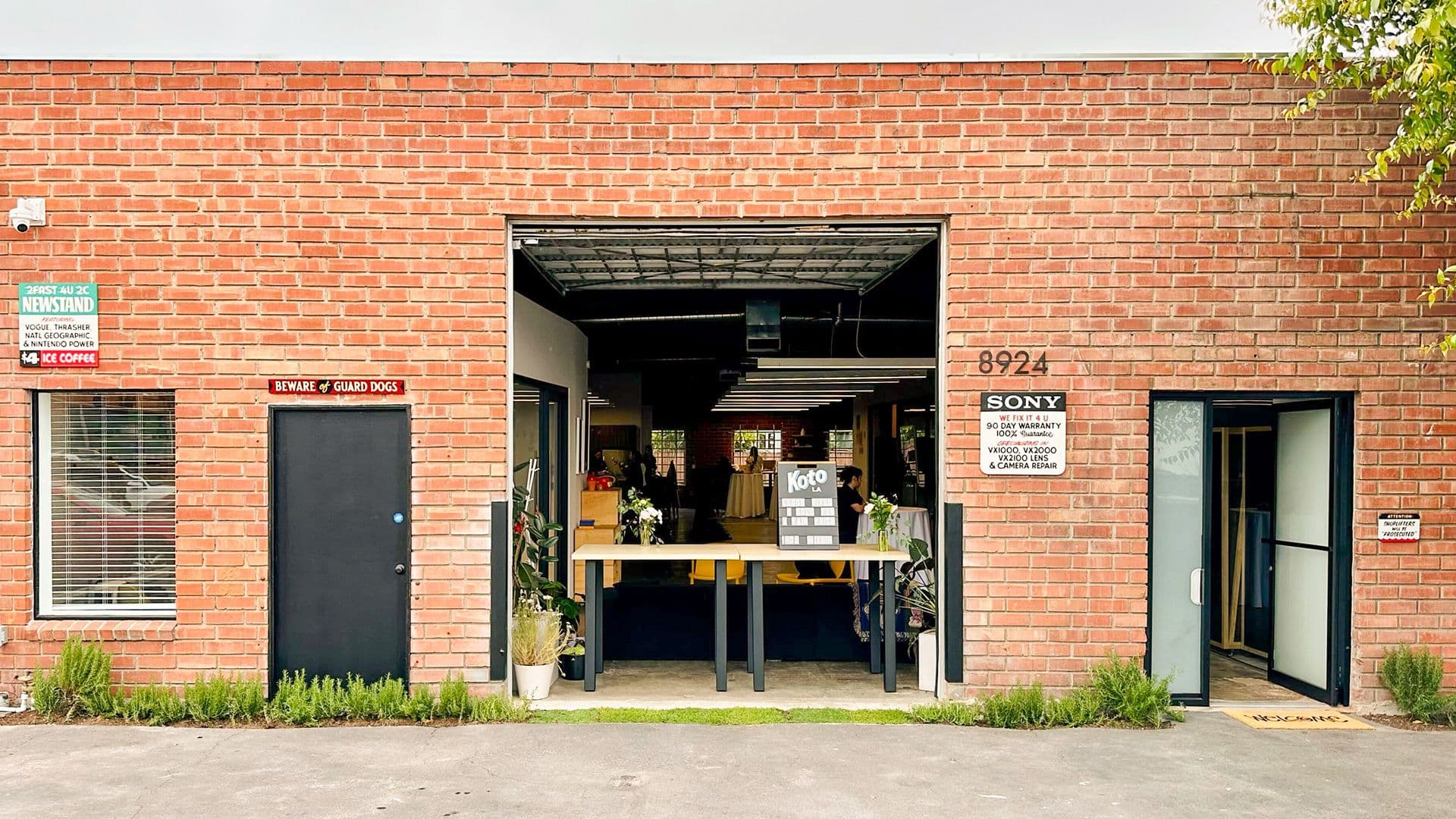
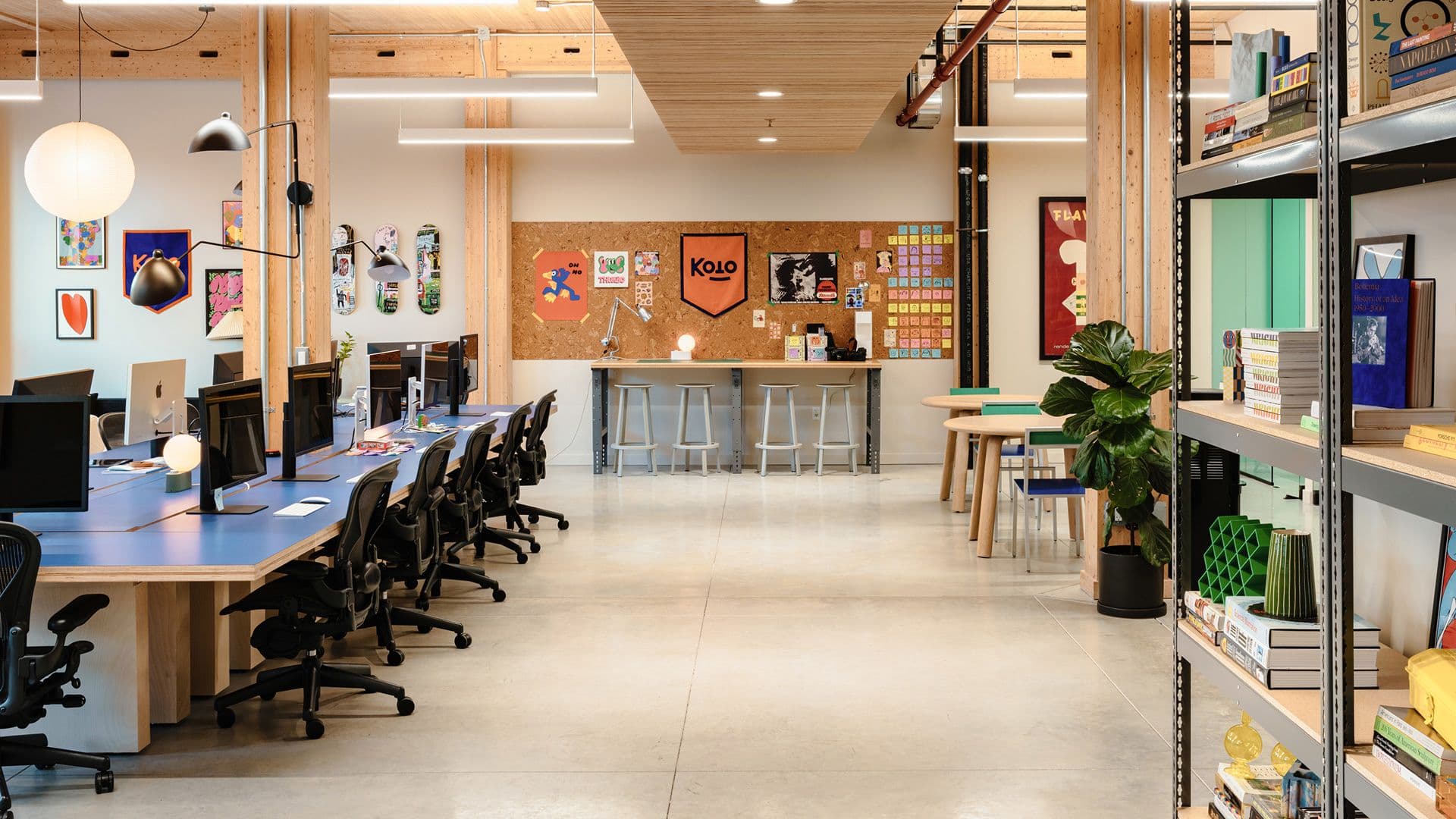
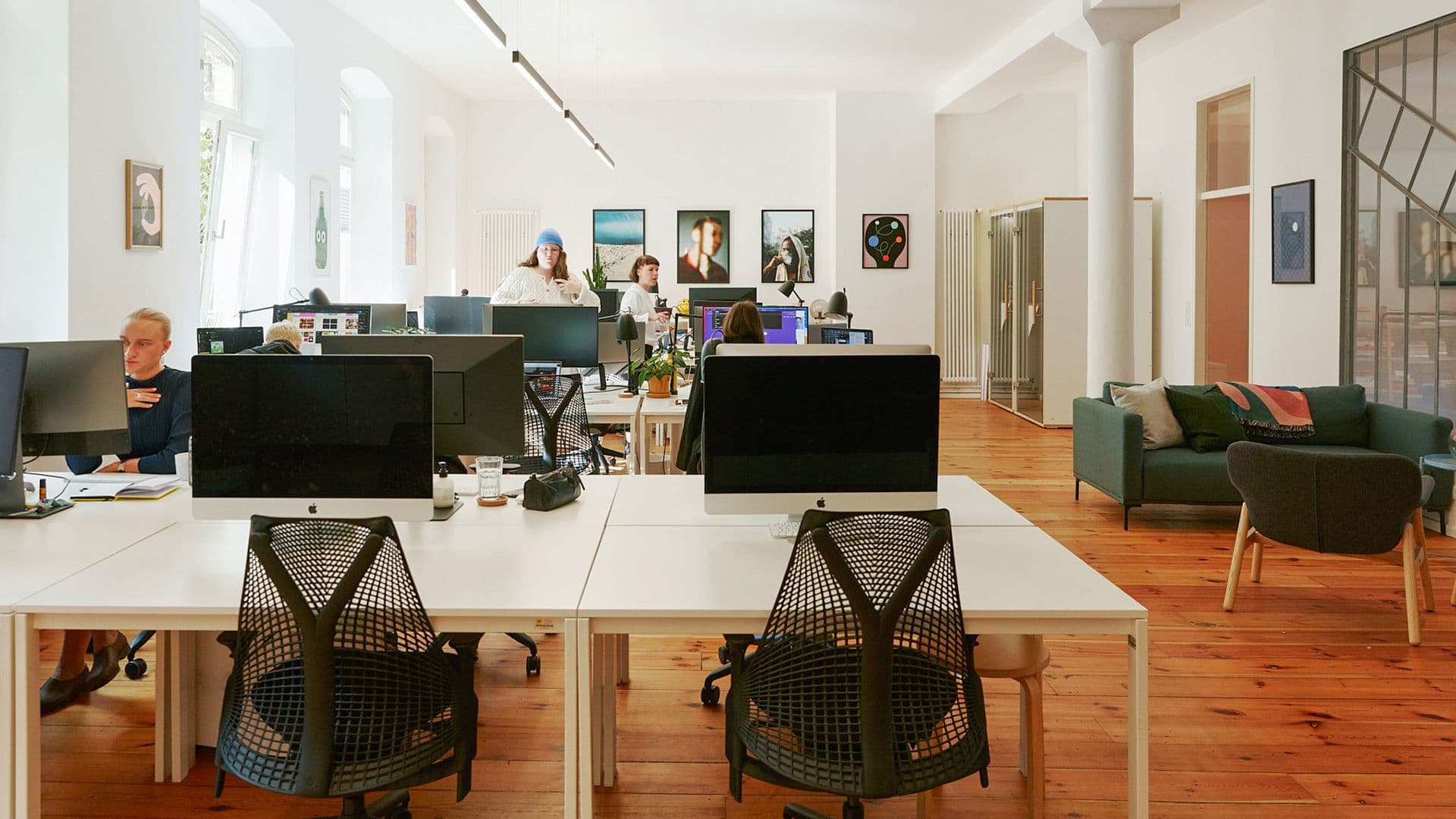
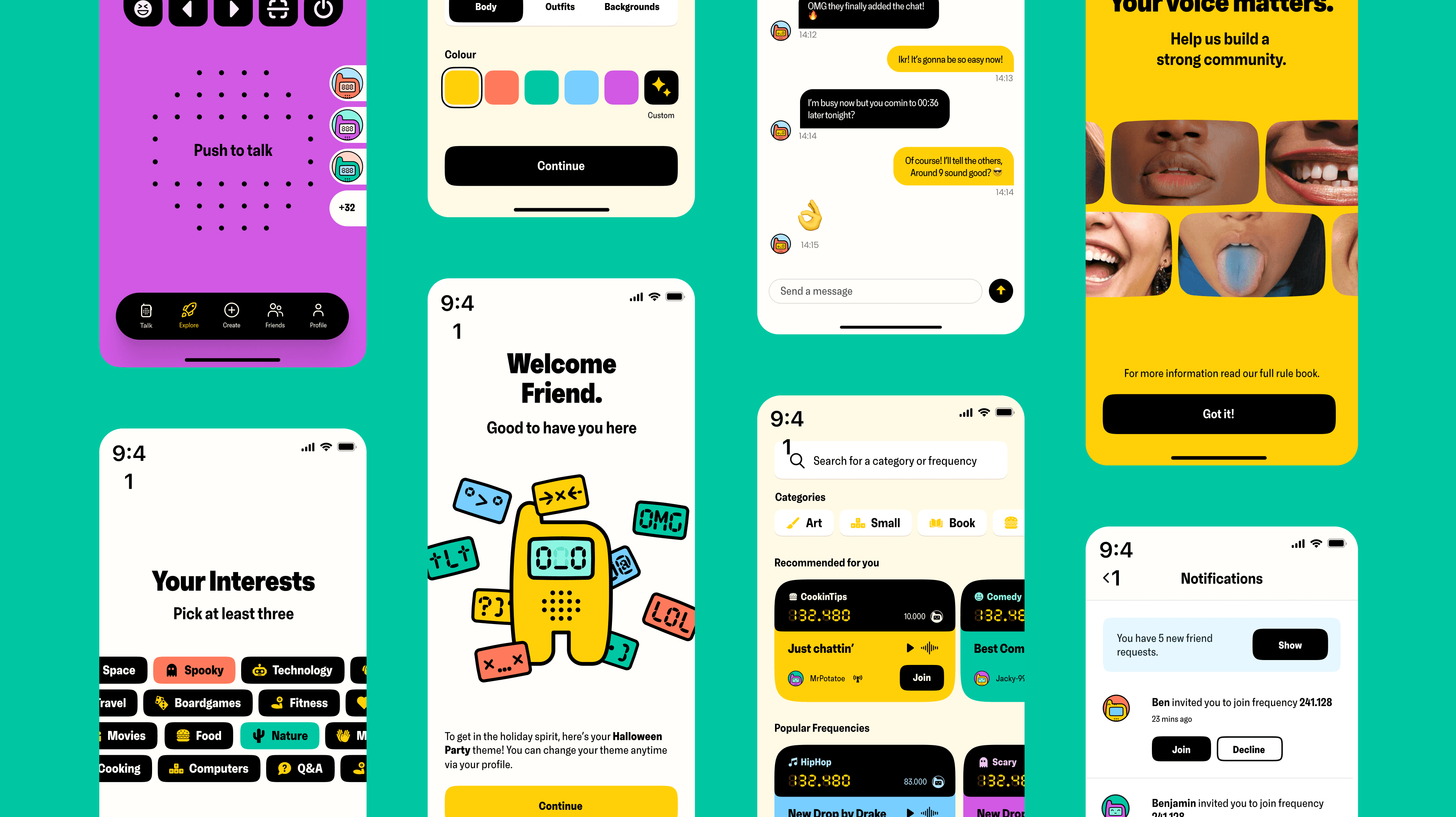
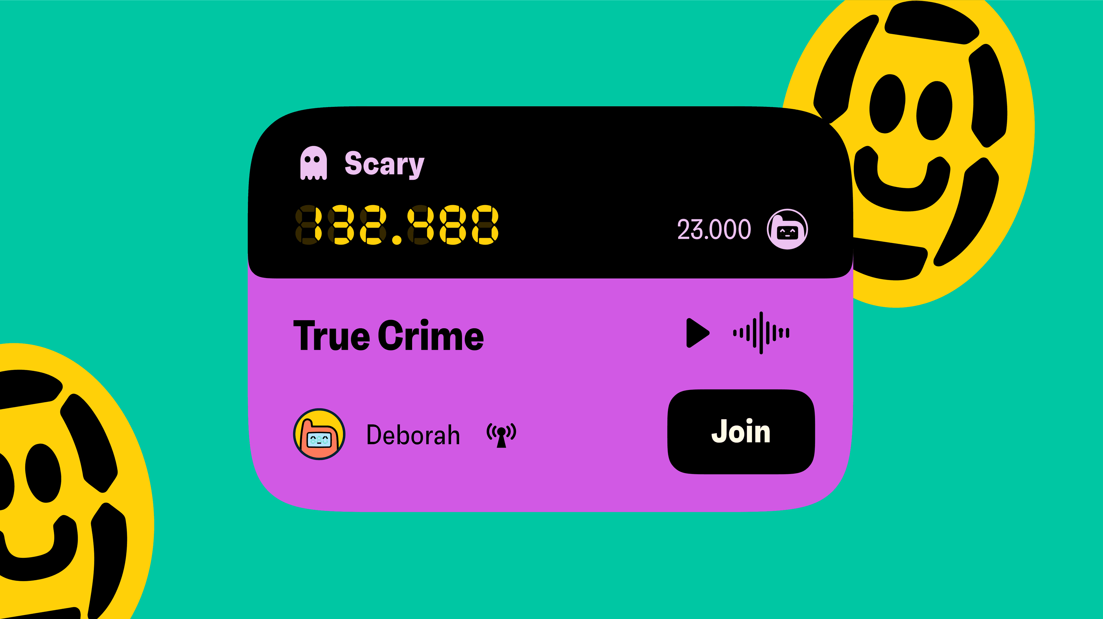
Application
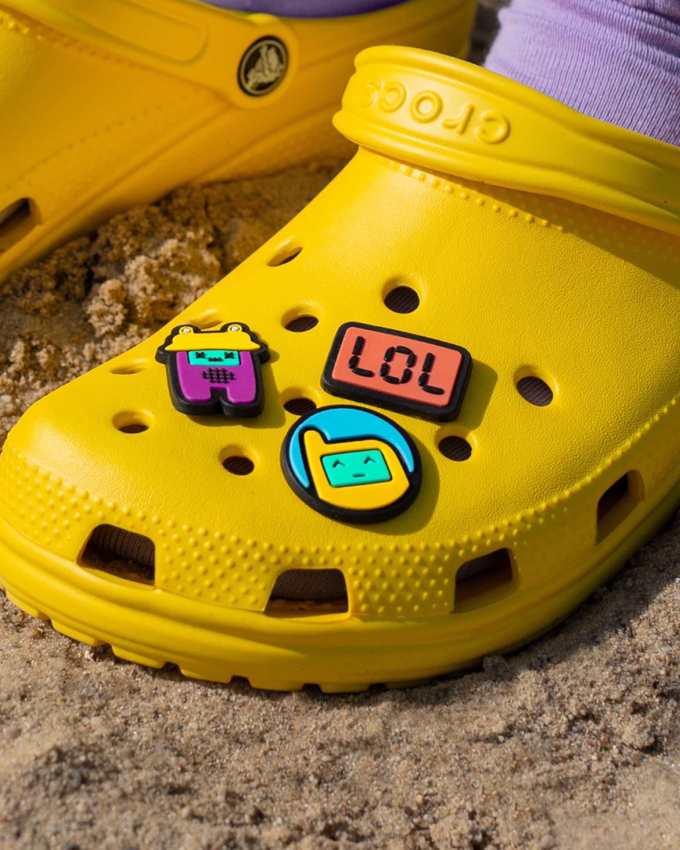
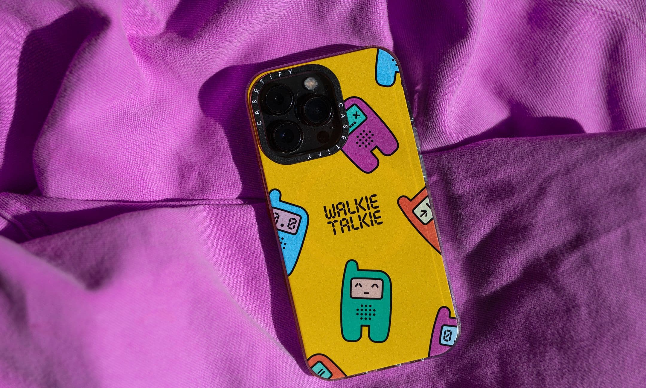
Our digital team brought the brand to life by redesigning the app, making the experience more enjoyable and helping users explore every frequency. We also created a VR version of Talkie the mascot, and developed merch for the whole team to celebrate the new brand.
Outcome
The new brand helped Walkie Talkie stand out, making their differentiation clear to both users and investors. It sparked connection and turned the app into the go-to hang-out, keeping users coming back.