

A legacy recoded
For over a decade, Stack Overflow was a tab pinned to every developer’s browser. A place to question, troubleshoot and solve coding conundrums. By 2019 it was a tech institution with a growing suite of business products.
Then came 2022 and the boom of mainstream AI. LLMs scraped data from the platform, and AI search changed user behavior overnight. By inadvertently powering the very models eating into its own traffic, Stack found its utility and cultural relevance at a critical crossroads.
Strategy
Is there a place for Stack Overflow in an AI-first world? This wasn’t just a brand strategy task; it was an existential reckoning. Our response? Change the narrative. Because AI models are only as good as the data they consume, Stack’s archive of expert discussion, problem-solving and human-validated knowledge became a goldmine. We repositioned the platform as the ultimate arbiter and hub of truth for the entire industry.
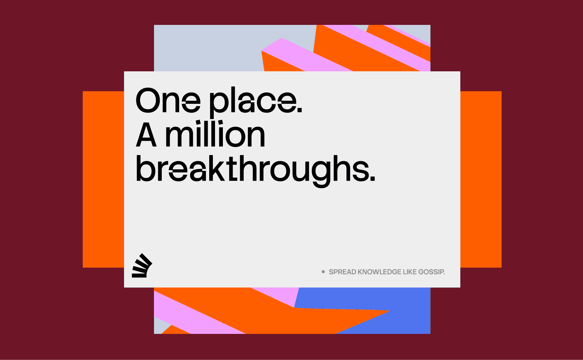
We anchored this reframing in an ambitious new vision: to be the world’s most vital source for technologists. We brought a radical simplicity to a vast portfolio, consolidating the public platforms under ‘Stack Overflow’, and products and services under ‘Stack Overflow Business’. And we tied everything together with a new brand idea, Always in Build: a commitment to curiosity, growth and continuous evolution.
Logo
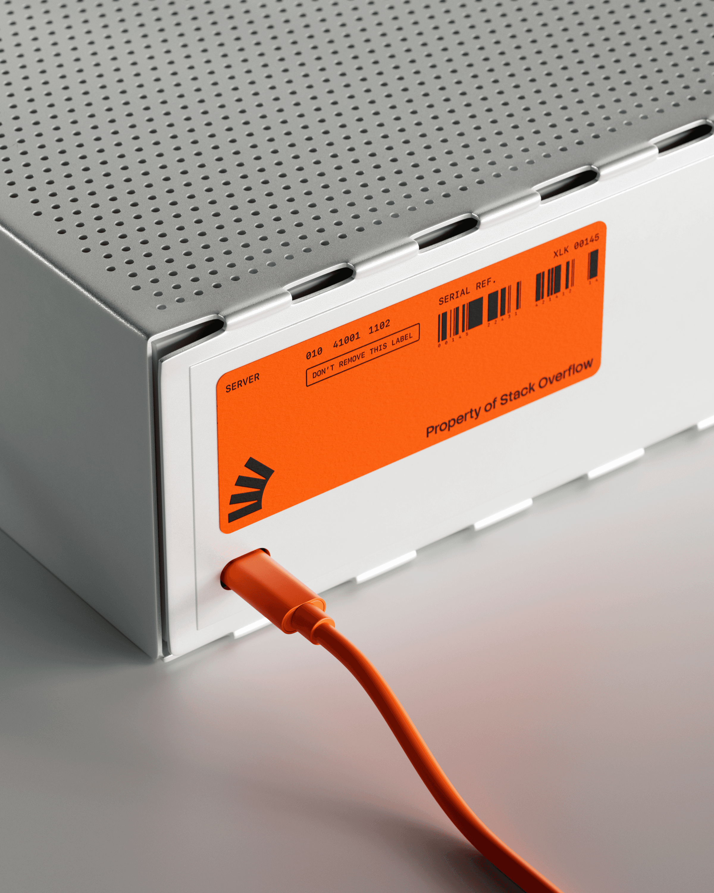
The logo evolution was a delicate balancing act between visual optimization and retaining brand equity. We simplified the symbol into a clean, single-color execution designed to look like building blocks in motion, in keeping with the new brand idea. But refinement didn’t mean erasing history. The toppling tower remains perfectly intact, serving as a classic insider joke about the literal engineering error behind the brand name.
System
The logo’s geometry unfolds into a fluid visual language: Always in Build set in motion. By reformatting, reorganizing and rebuilding in real time, the shapes mirror the iterative rhythm of a developer’s workflow. To scale this system, we built a custom generative tool that gave team Stack exactly what they needed to deploy a massive universe of assets (without any of the headaches).
Interactive
Typography
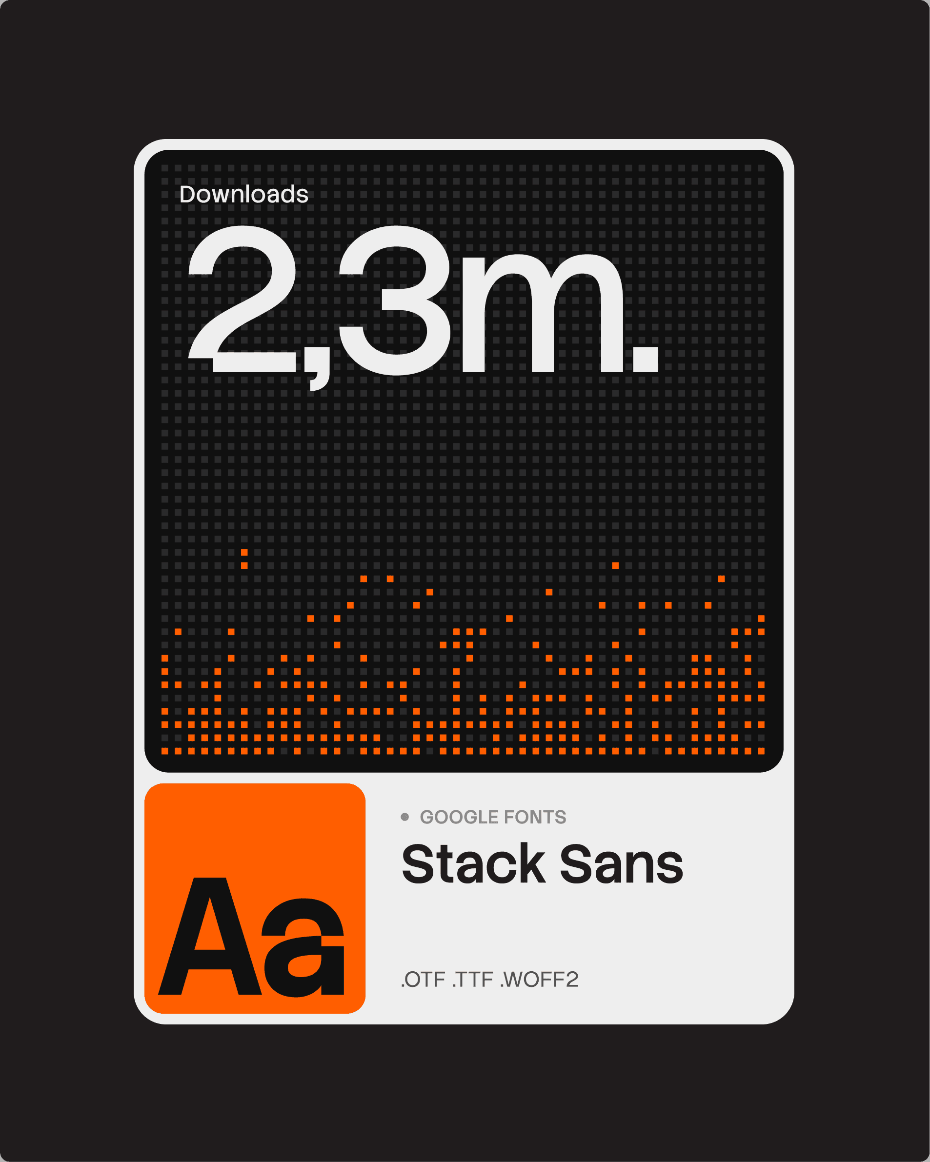
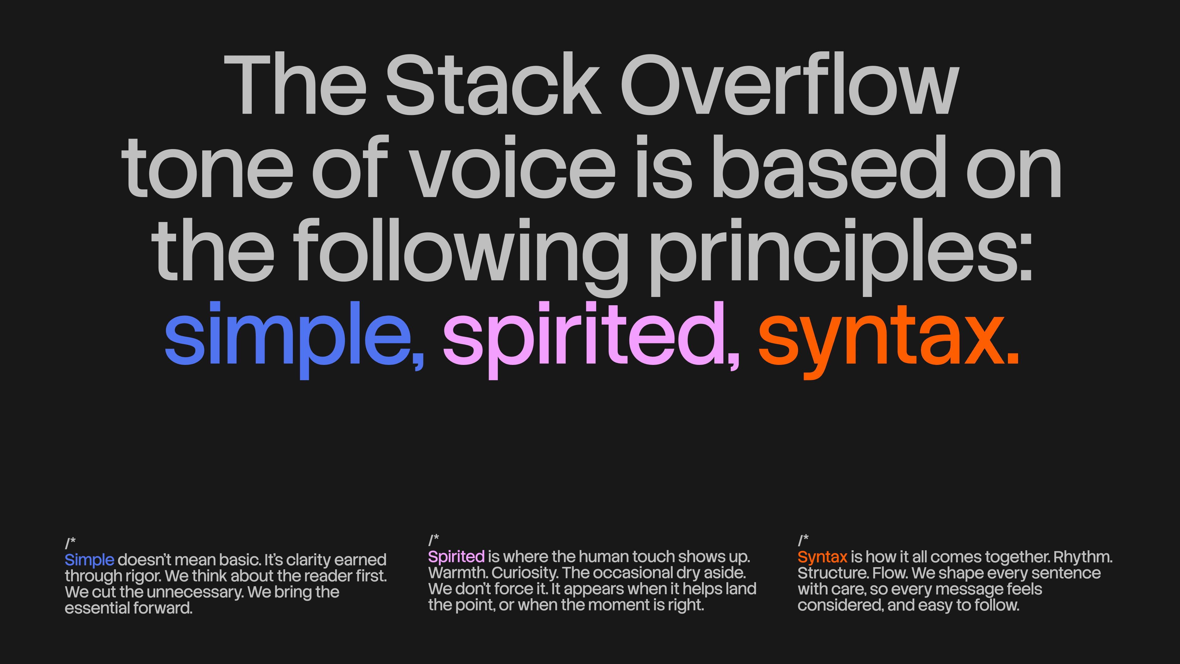
We developed a custom typeface, Stack Sans, to give the brand complete ownership of its written execution. A distinctive ‘notch’ detailing, inspired by the building process, creates a sharp, recognizable signature unique to the family. Crafted specifically for Stack Overflow, and available on Google Fonts, the typeface includes headline and text styles that allow for typographic expression at every scale.
Interactive
Digital
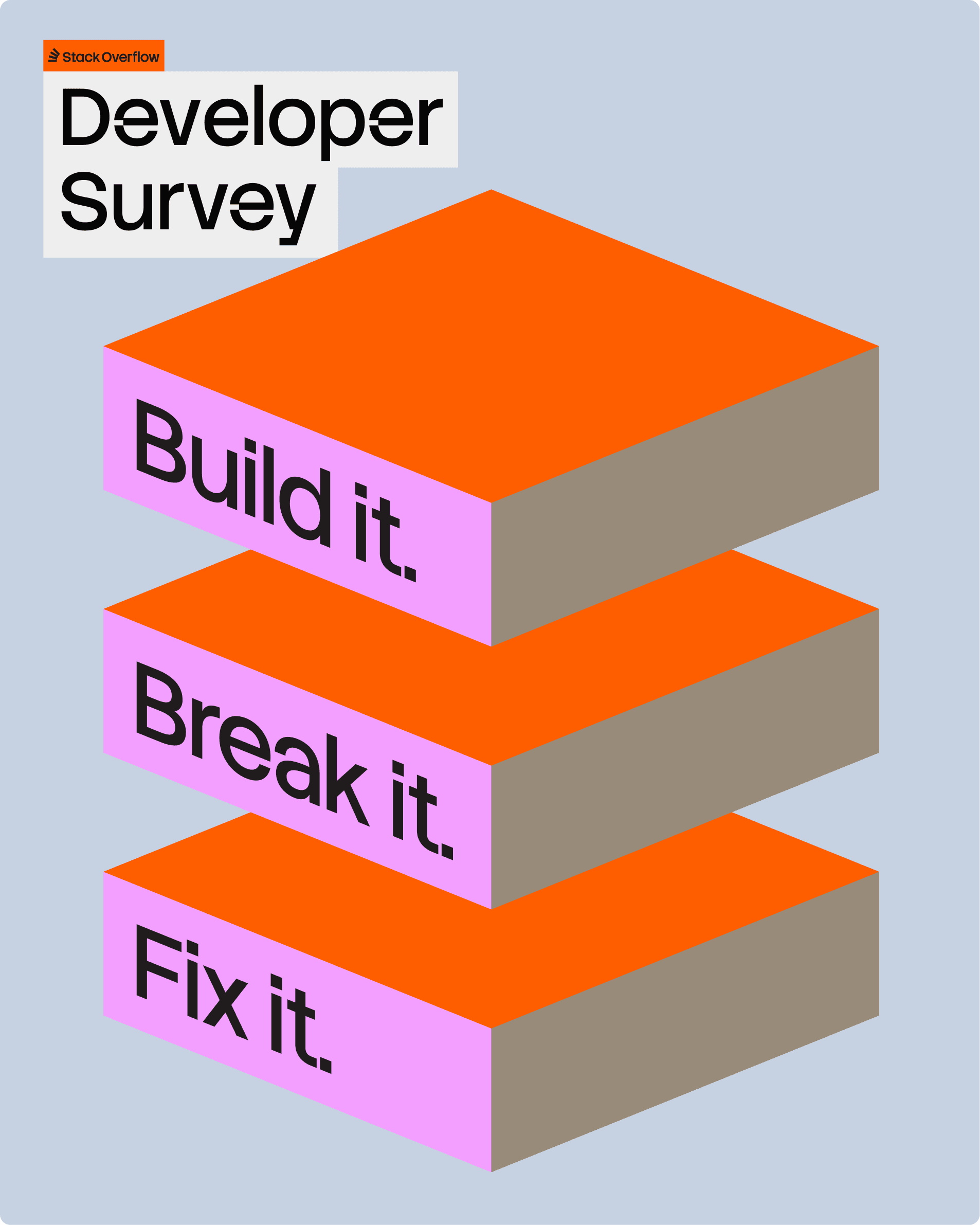
We built the digital system to flex its volume based on context. In product, it stays quiet and unobtrusive to protect the developer’s flow state. But across campaigns and the annual Developer Survey, it’s dialed up with more expressive flourishes, adapting seamlessly from raw technical data to rich brand storytelling.
Tone of Voice
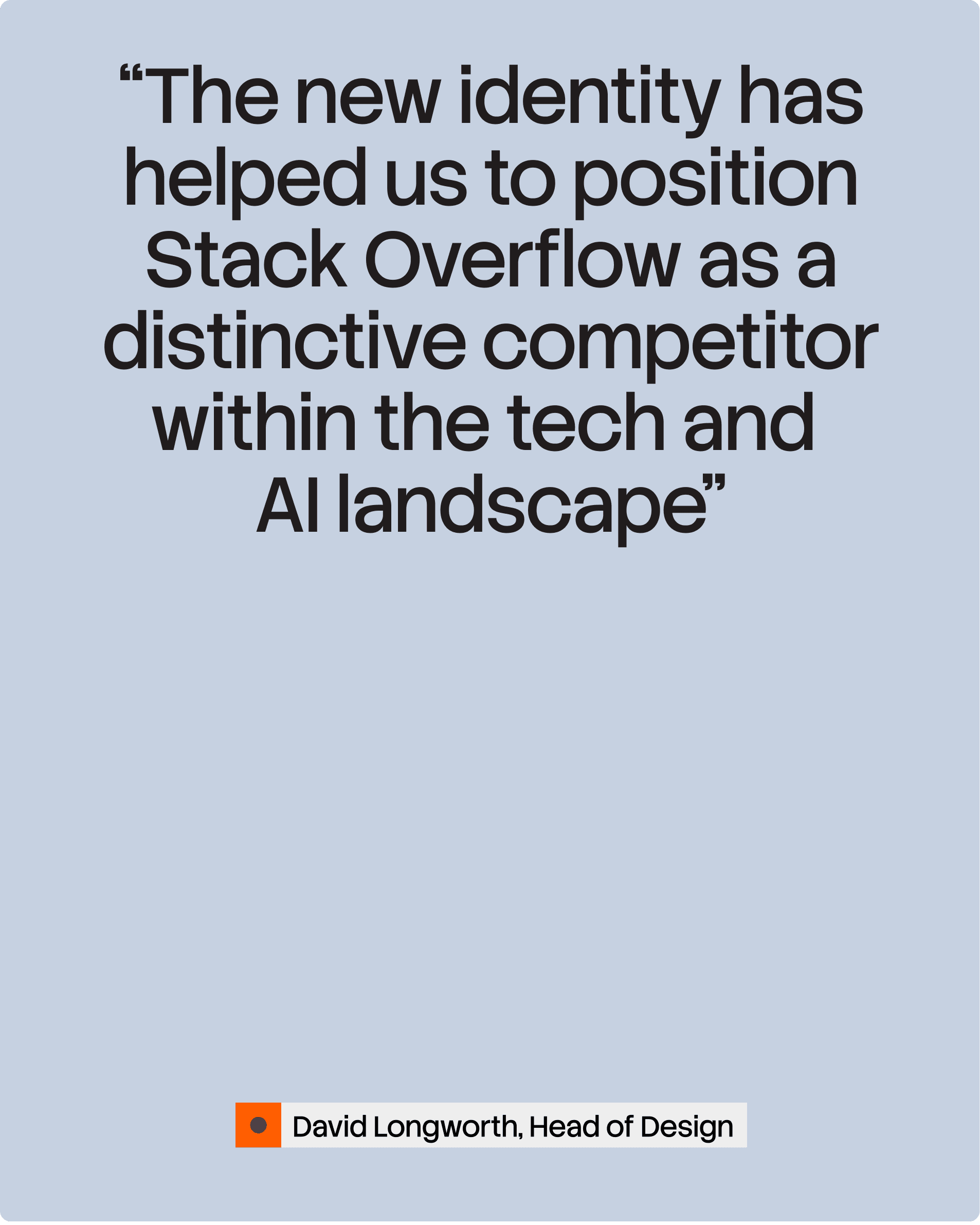
We overhauled Stack’s voice to push back against a tech sector that mistakes density for depth. Stripping away the smoke, mirrors and excessively supercharged jargon, we introduced a ‘simple, spirited, syntax.’ The new tone pairs a studious clarity with a dry, human wit, mirroring the clean logic of good code and the sharp humor of the people who write it.
Outcome
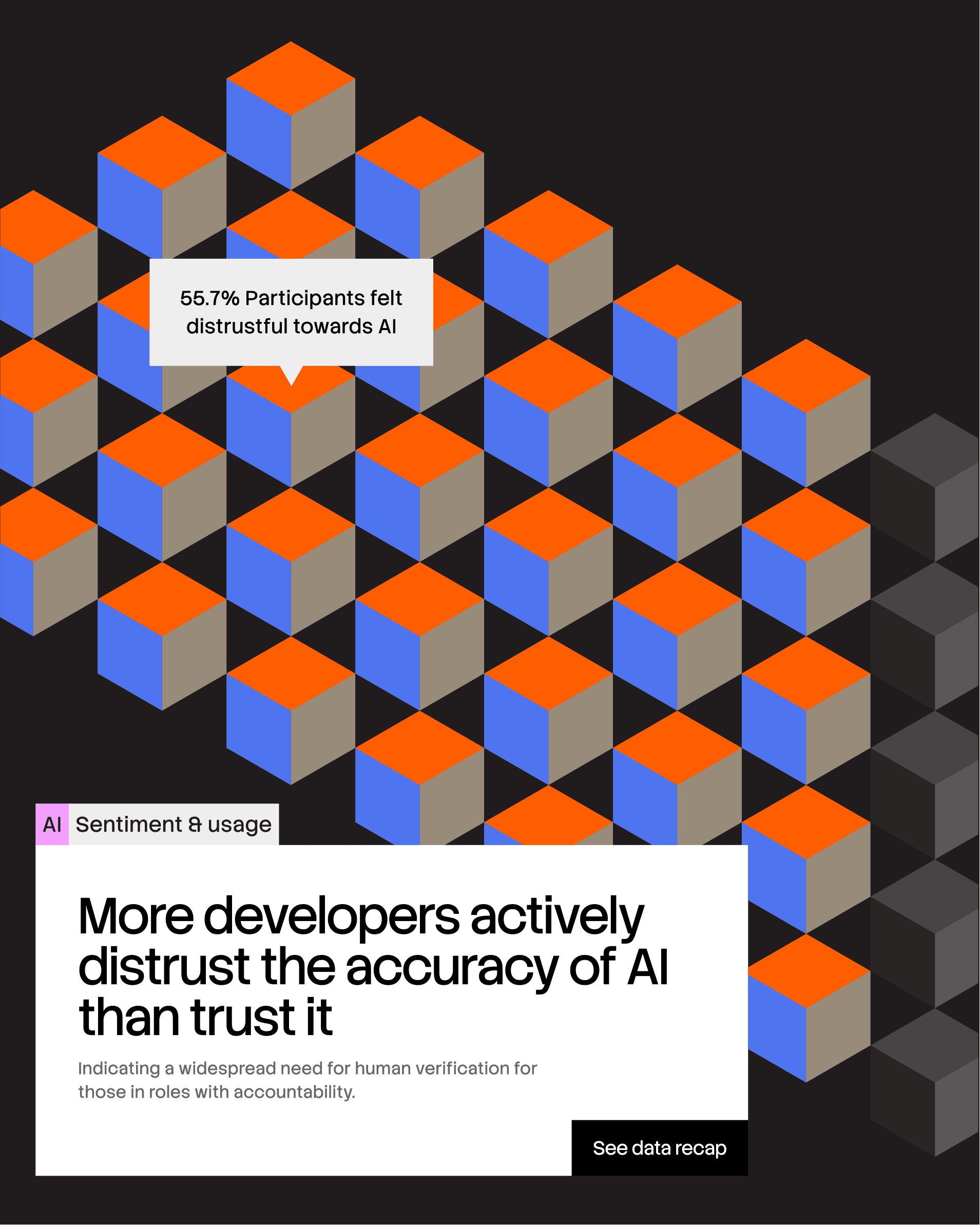
Far from becoming a relic, Stack and its community are an anchor of the AI era.
We reframed the brand from a static repository of knowledge, to a living truth engine. And we helped Stack prove that in an increasingly automated world, verified knowledge (from actual human brains) is still king.