


Where it all began
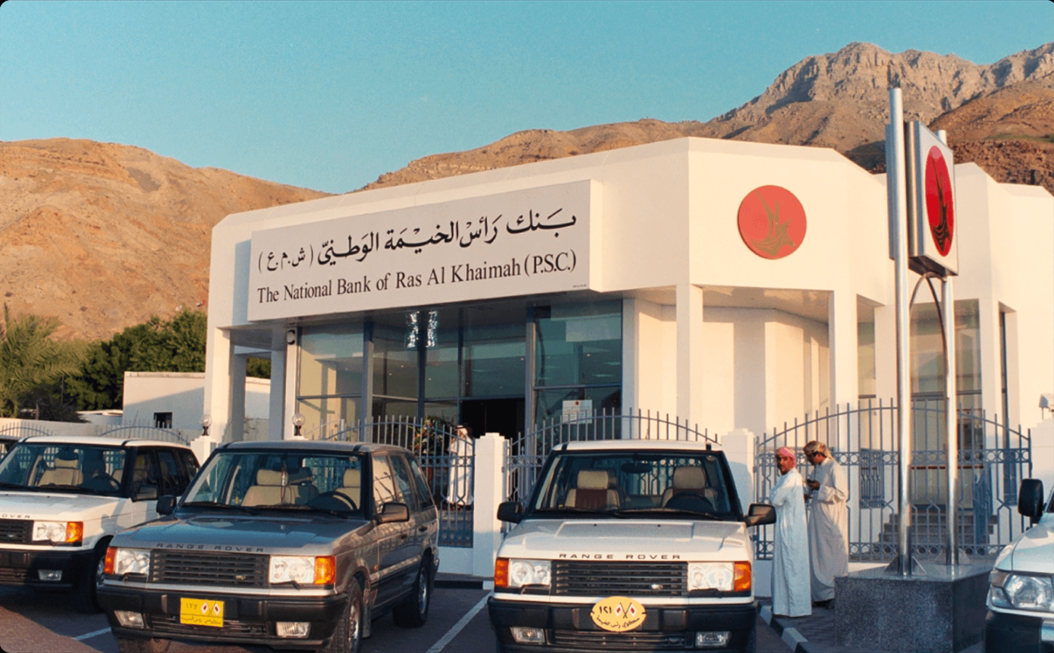
Does banking have to be faceless to be fast? Rakbank has been serving customers in the UAE for 50 years. Even as they’ve kept up with the demands of digital, their commitment to friendly faces in branch and real voices on the phone has never wavered.
As their 50th anniversary approached, they wanted to cement their commitment to real service, and prove that you don’t have to choose between human and digital in banking. You can have both.
The partnership
We were asked to create a brand, bring it to life, and take it to the world. We partnered with Rakbank on strategy and brand architecture, and created a new visual and verbal identity, as well as a TVC and launch campaign.
Rebranding one of the UAE’s oldest banks takes time, so through the process we also supported as a strategic and creative partner across the Personal, Business, and Elite banking business, creating work that was true to who they were and who they were about to be.
The Rakbank promise
Banking customers in the UAE often face a choice: a digital-first bank that lacks experience, or a people-first bank that lacks agility. This insight informed the existing Rakbank promise, ‘Digital with a human touch, with you in key moments of truth’. This promise isn’t just about having an app and a phone line. It’s lived throughout the organization. Rakbank was proudly the first bank in the UAE to launch a crypto brokerage service, and they support more female entrepreneurs than any other bank in the region.
From this foundation we developed the brand idea ‘Best of both’, encapsulating the benefit of being digital and human – big enough to deliver, but small enough to care.
The logo
‘Best of both’ was our guiding idea for the new identity. We simplified and refined the existing logo, taking inspiration from the shape and movement of the iconic Dhow sails. We then honed the details of the symbol and wordmark so they feel like part of the same family, along with the Arabic version and the logo for the National Bank of Ras Al Khaimah.
The visual system
For the visual system, we started with the color palette. We stayed close to Rakbank’s iconic red but updated it to a more vibrant tone that speaks to their digital edge. In typography, we married human and digital with a handwritten script typeface and a digital version, coded to change glyphs when two characters are typed in the same word. The handwritten font is the first ever to have a full ligature suite in both Latin and Arabic in the same type styling.
With the system in place, we worked on the brand architecture. Rakbank’s Personal, Business, Wholesale, and Islamic businesses had different identities that conflicted with the streamlined experience customers expect from a modern bank. To solve this, we built a masterbrand-led approach, with clear structural categories and specific visual and verbal guidance. Now every business area delivers a tailored but consistent experience.
The physical card portfolio became a key expression of the new system. We designed a cohesive suite of 11 different cards, using the brand architecture work to create a unified look for Personal, Elite, Islamic, Business, and Corporate banking.
Interactive
Interactive
Launch campaign
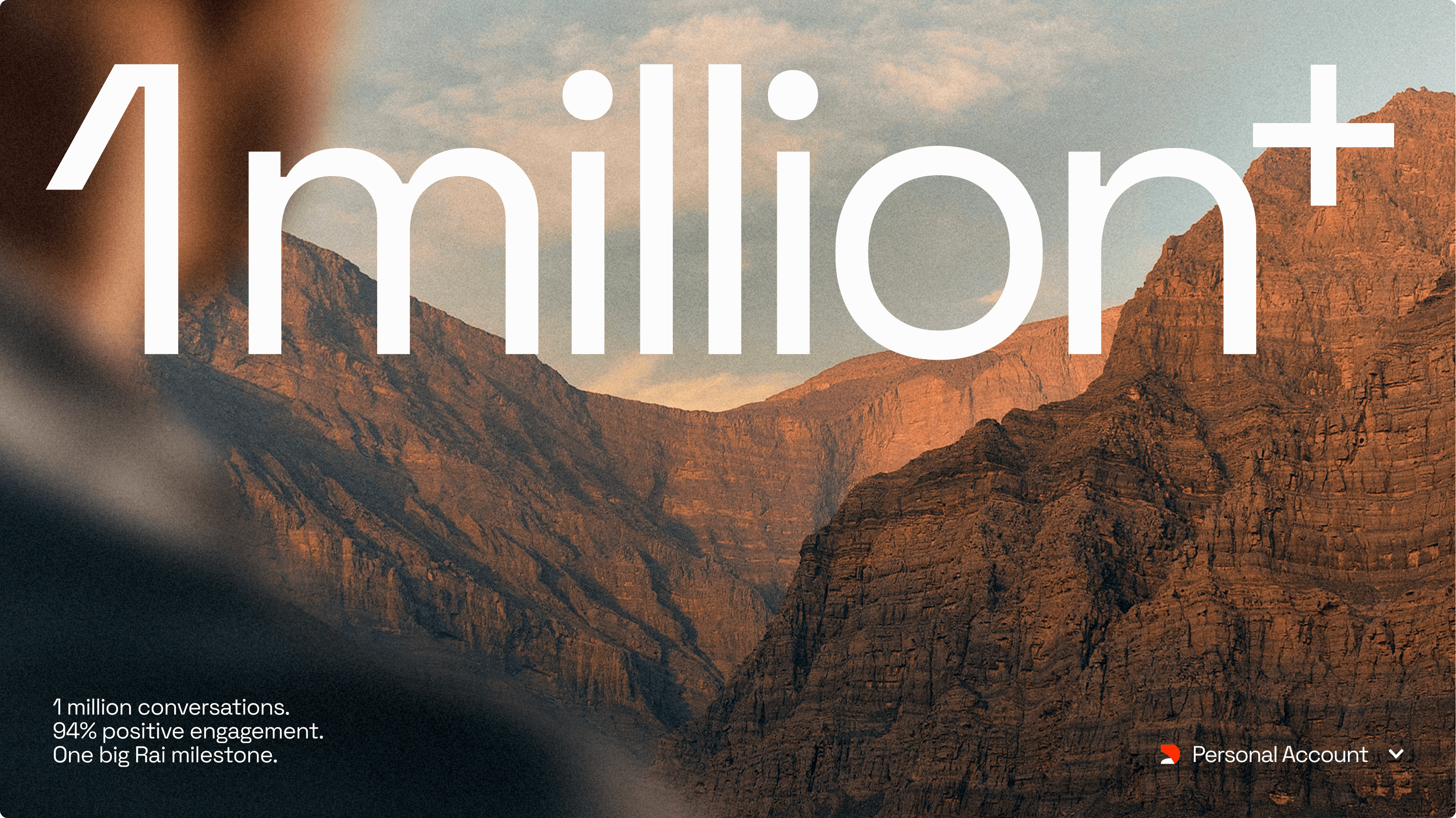
To introduce the evolved Rakbank brand, we developed a multi-channel launch campaign. We shot a TVC in the UAE and wrote radio spots, sourcing the right voice-over artist to embody the ‘human touch’ at the heart of the brand. We also created social content and a nationwide OOH presence–all supported with strategic messaging and a comprehensive campaign plan to ensure the ‘Digital with a human touch’ promise resonated at every level.
Physical roll out
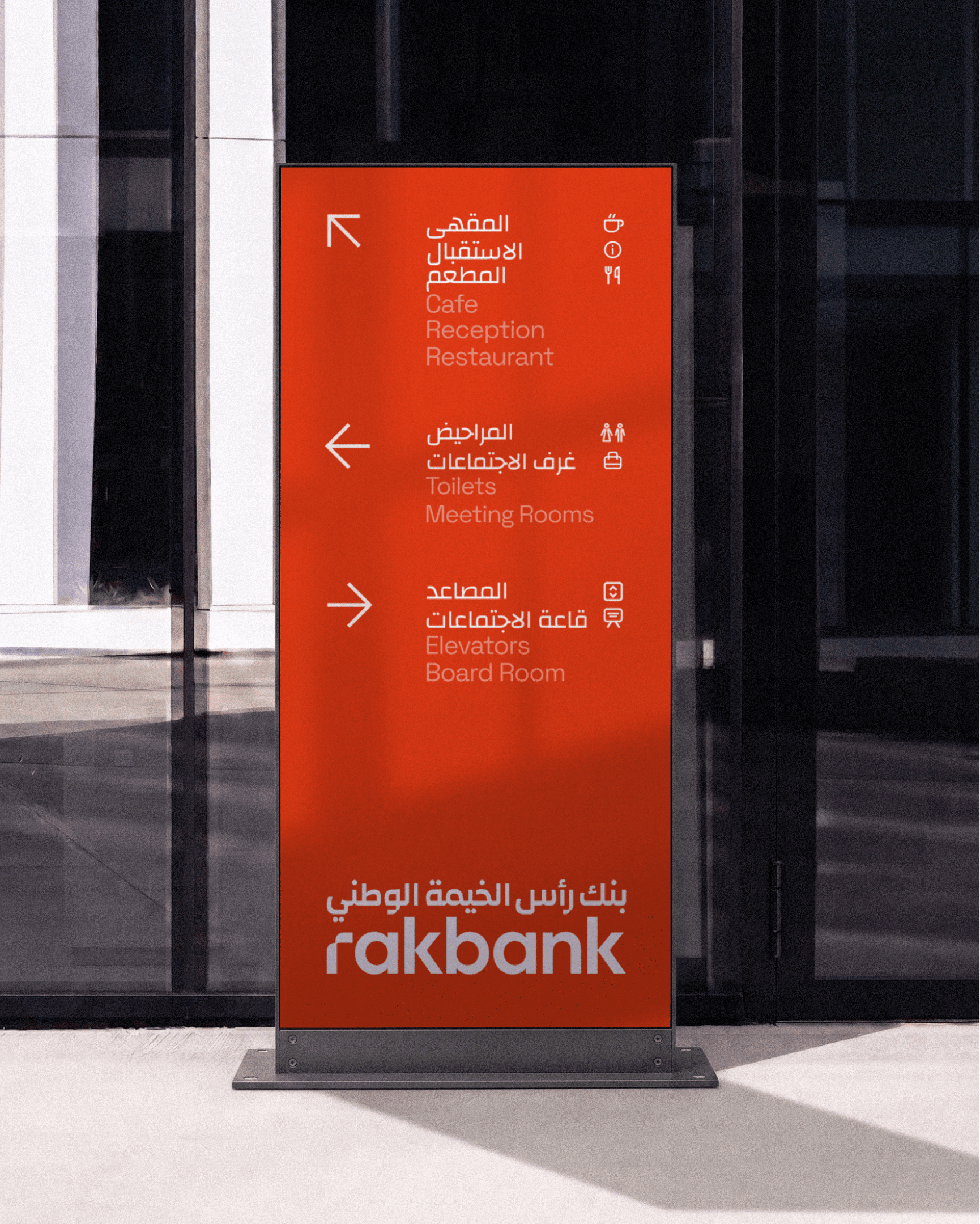
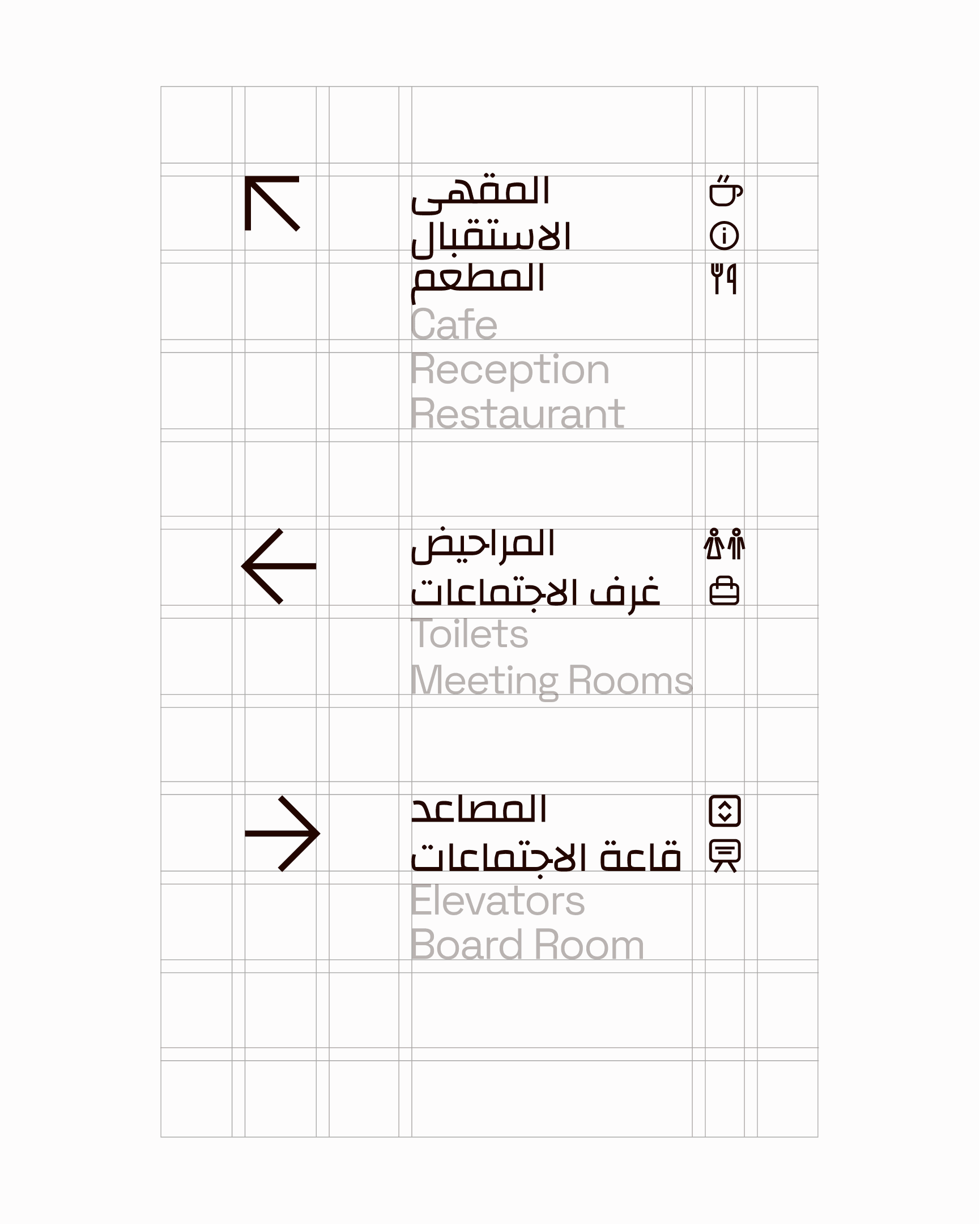
As well as the campaign, we rolled the brand out across the touchpoints people encounter every day. We applied the new identity to signage, wayfinding and livery, ready to appear in branches, at cashpoints, and in offices across Dubai, Ras Al-Khaimah and beyond.
In digital
To deliver on the promise of ‘Digital with a human touch’, the digital experience had to feel completely intuitive, whether customers are checking their balance or exploring crypto. We built a system and component library to inform the app build, partnering closely with developers to bring the visual identity to life within the digital experience.
Koto helped us go beyond a new visual identity to define more clearly who Rakbank is and how we show up for our customers. Their strategic and creative thinking has shaped a distinctive brand platform that can support the bank’s ambitions for years to come. They brought expertise, openness and a genuinely collaborative approach throughout the partnership, and we are super proud of what we have created together.
Carmen DeRosas
Chief Marketing Officer, Rakbank