
Vodafone and Sumitomo joined forces to launch a new ‘Digital Asset Broker’ technology, creating a platform where trusted devices can transact, collaborate, and generate revenue. With over 30 billion devices expected online by 2030, true connectivity remains fragmented. Enter Pairpoint – a breakthrough blend of SIM and blockchain. We named, positioned, and branded the business to unlock its vast potential.
Strategy
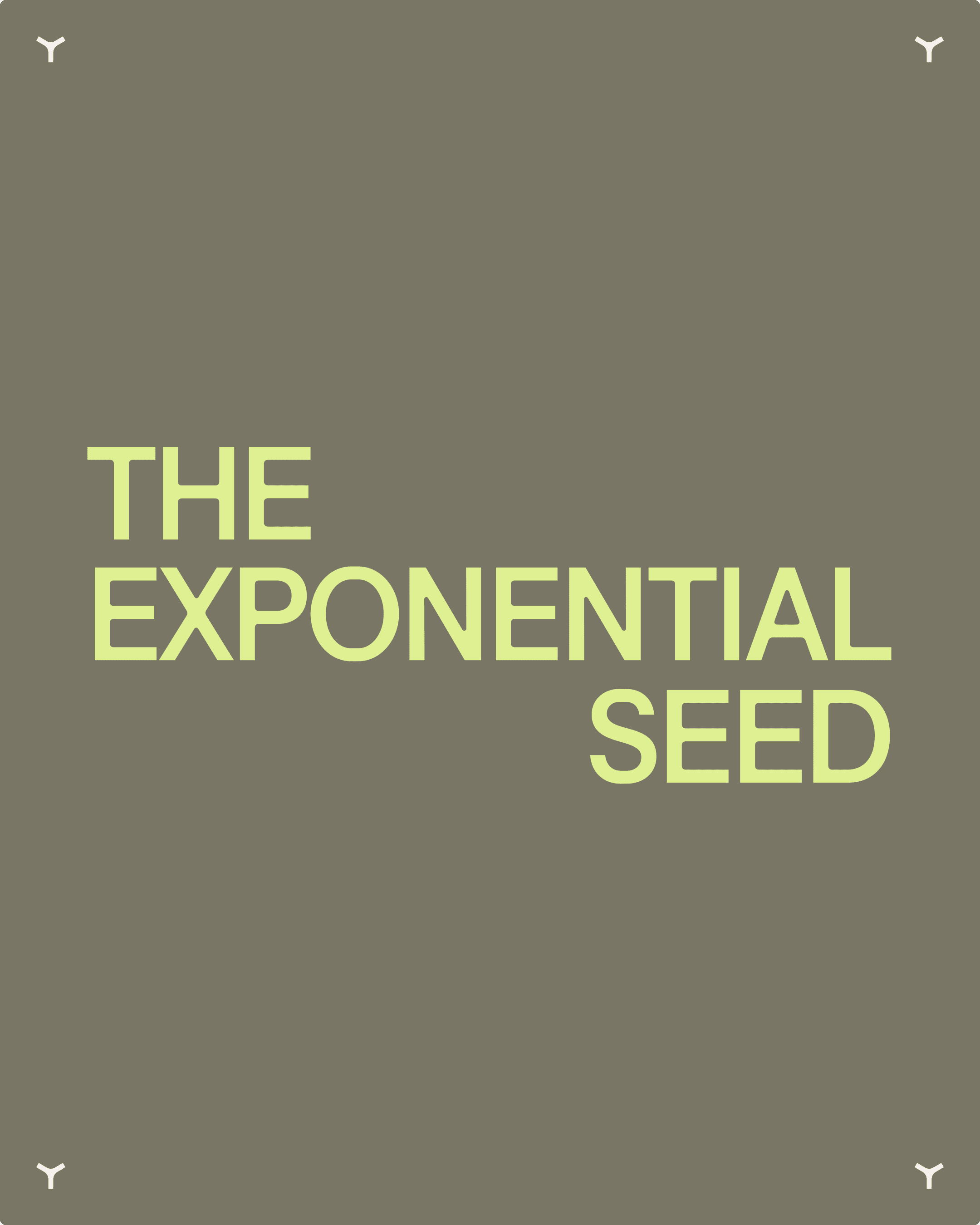
We named the business Pairpoint – a deliberately descriptive name for a technology that’s both nascent and complex, making it easier to understand and adopt. The brand strategy draws inspiration from the dandelion, symbolising effortless connectivity and exponential growth – seeds carried anywhere, creating infinite new possibilities across networks and ecosystems.
Identity
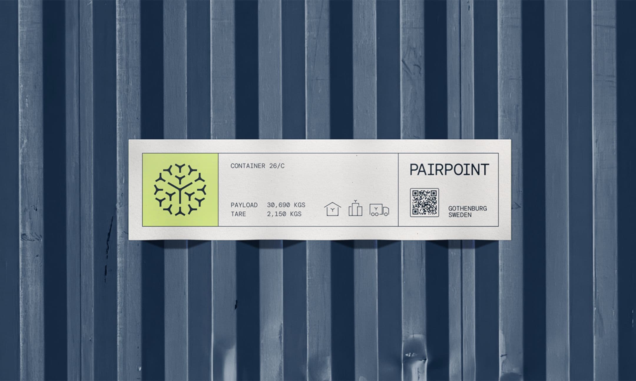
Inspired by the dandelion’s ability to disperse and take root anywhere, we designed a flexible visual system that brings Pairpoint’s promise of limitless connectivity to life. At its core is a dynamic symbol reflecting the technology’s behaviour – spreading, linking, and creating new possibilities. Radiating patterns, fluid forms, and bold colour transitions express the idea of constant motion, growth, and connection, giving the identity both energy and adaptability across every touchpoint.


Application
Pairpoint’s identity was designed with the future in mind, built to flex across everything from digital platforms and data visualisation to out-of-home environments and beyond. It has the power to make a bold statement when visibility matters, while remaining understated and functional when clarity comes first. A system built to grow as Pairpoint does.

Outcome
The new brand gave Pairpoint a clearer voice and a more credible presence in the market. It strengthened their ability to explain a complex technology, secured key partnerships with brands like MasterCard, IoT Squared, Ryd, and Senos, attracted top executive talent, and created new efficiencies across sales and marketing.