


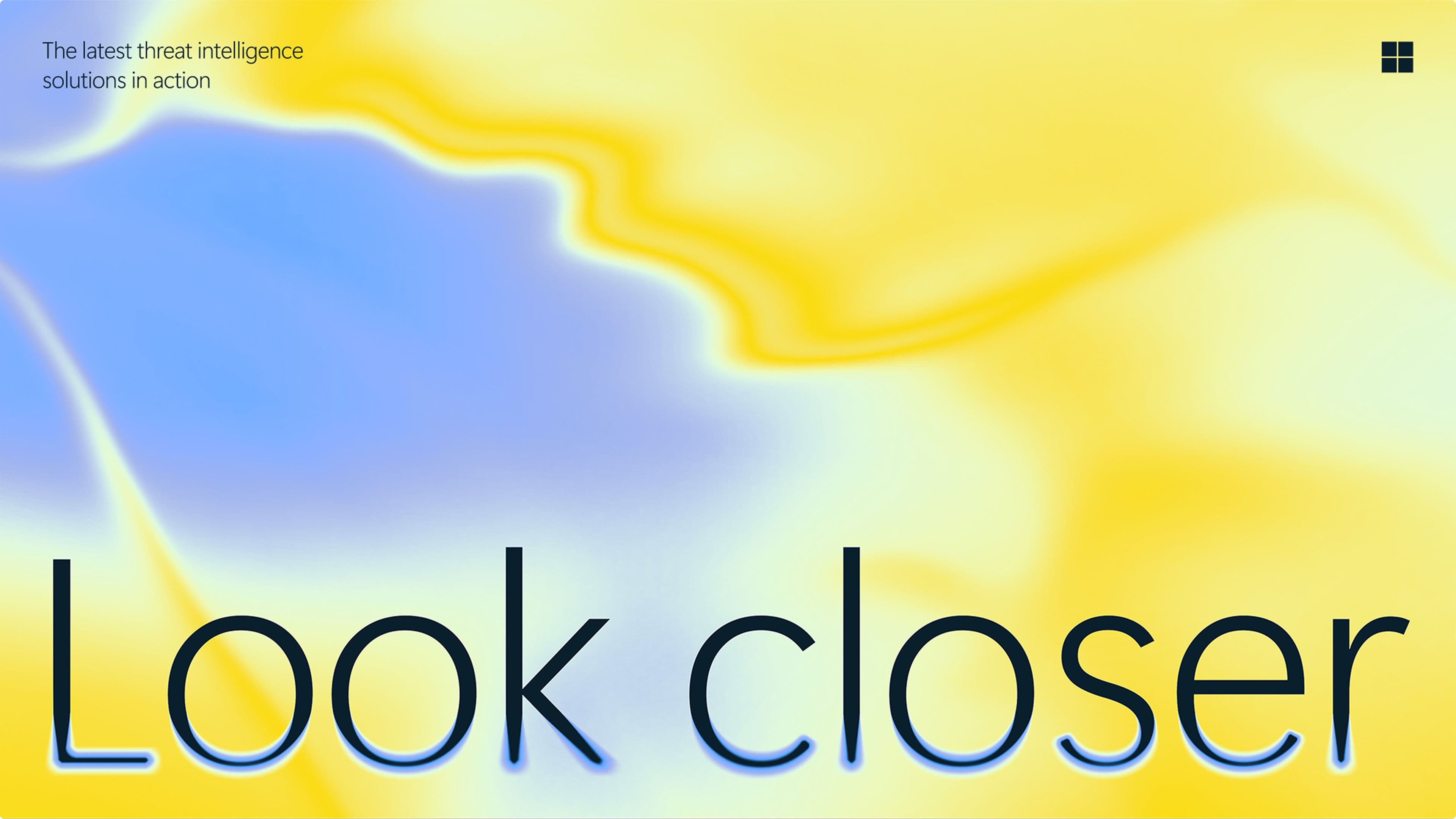
Cybersecurity isn’t just about reacting to threats – it’s about staying ahead of them. Microsoft Security needed a brand identity that reflects this proactive approach to protection. We moved away from tired tropes like padlocks and shadows, creating a vibrant, human, and reassuring system – one that makes security feel clear, confident, and always one step ahead.
Strategy
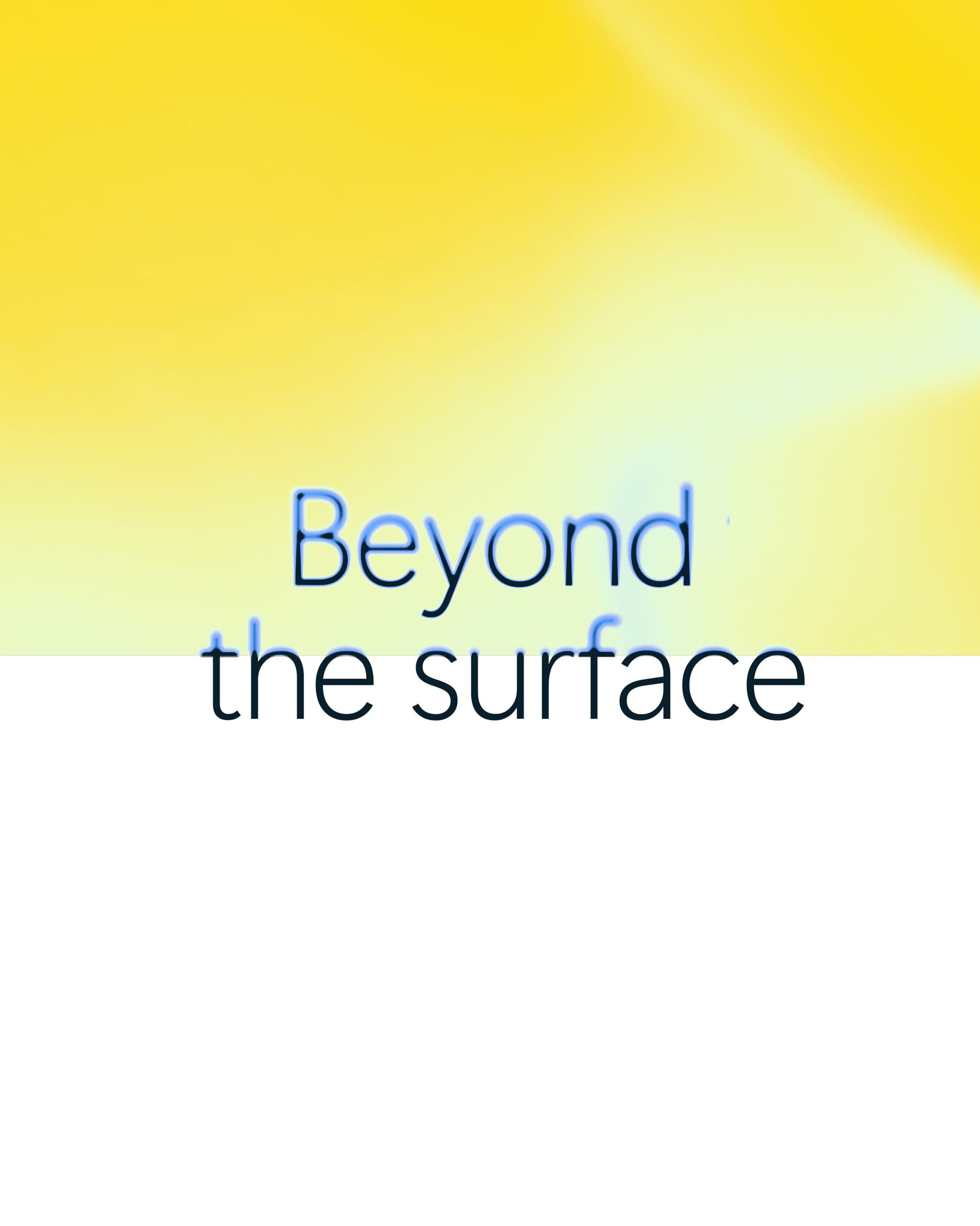
We developed the core strategic idea of “Beyond the Surface” to guide the brand’s evolution. It captures Microsoft Security’s ambition to move past reactive defence and instead anticipate, understand, and neutralise threats before they emerge. This thinking shaped a design system that cuts through complexity, using precision, clarity, and focus to express a smarter, more proactive approach to security.
Identity
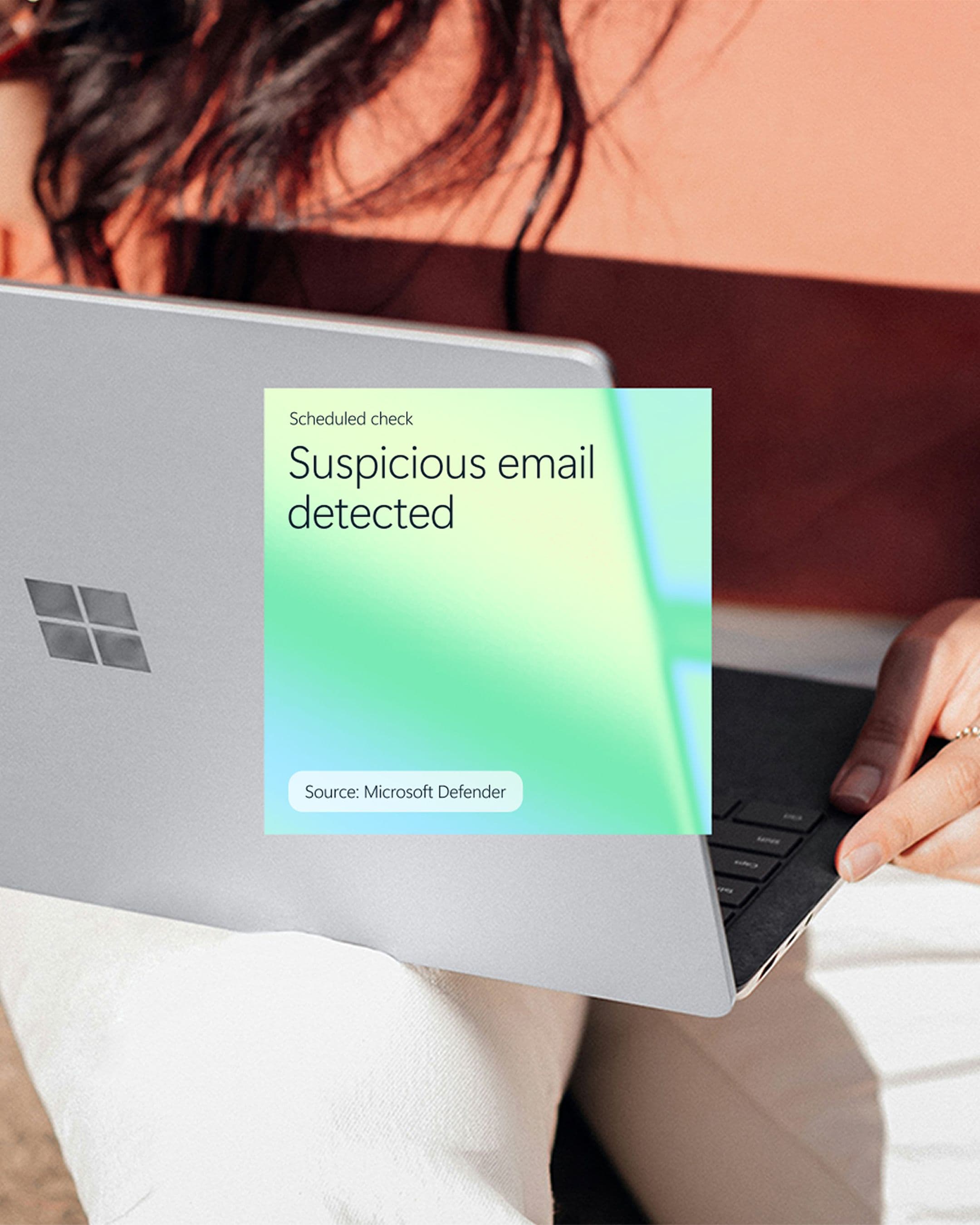
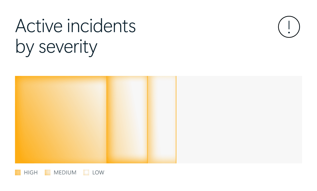
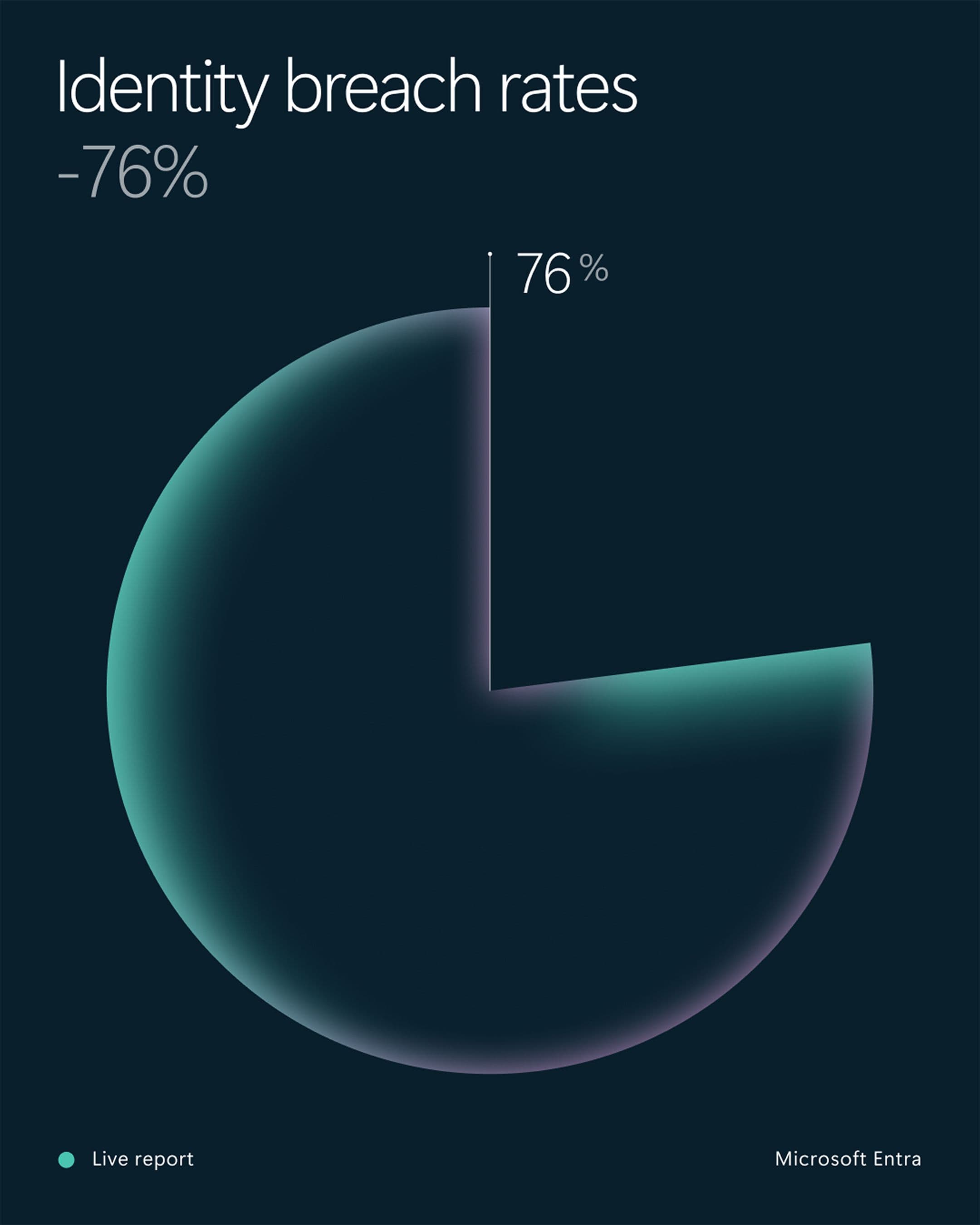
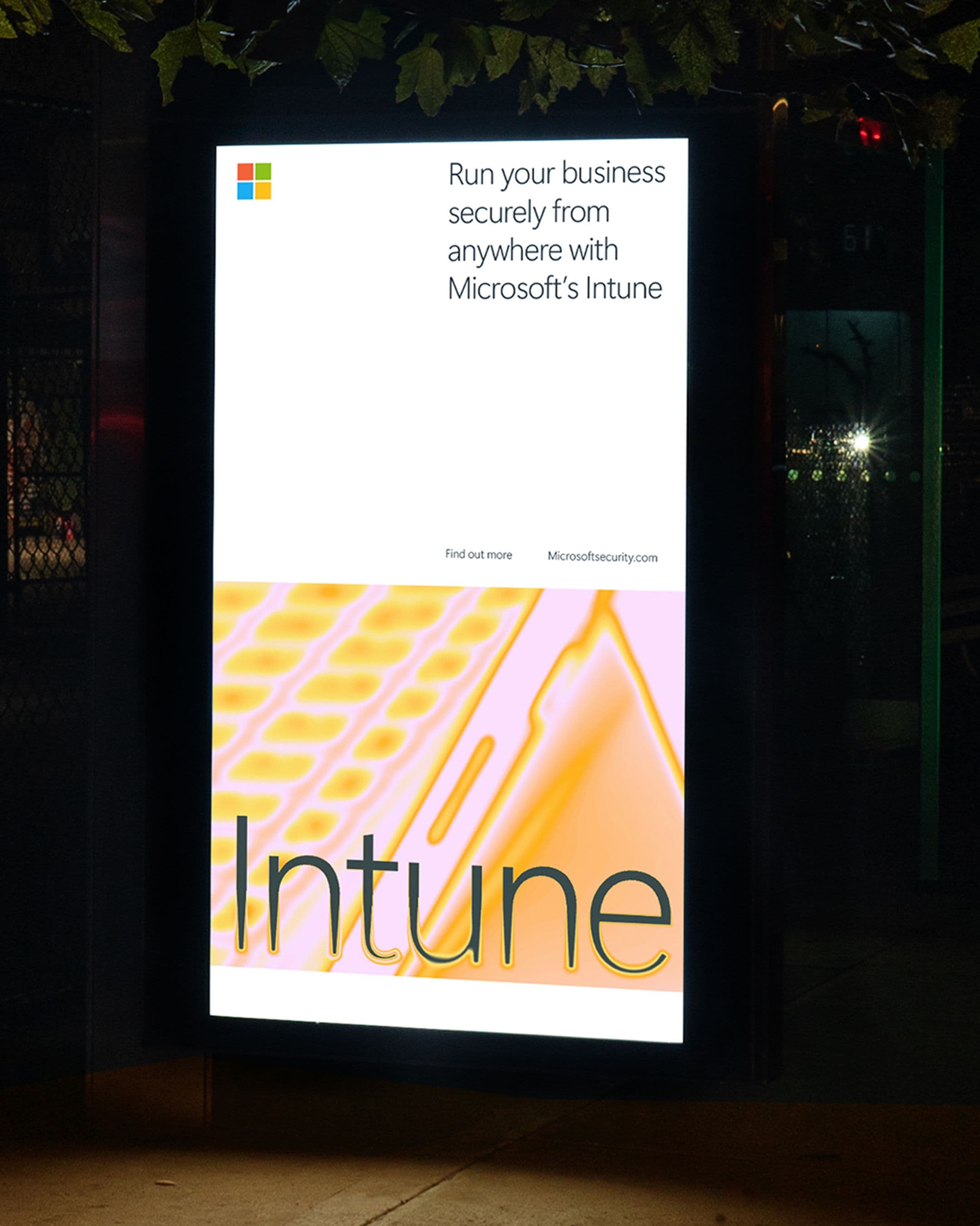
At the heart of the system is a scanning effect inspired by imaging technology, symbolising Microsoft Security’s ability to reveal hidden threats and provide clarity. Paired with a dynamic palette drawn from Microsoft’s core colours, it highlights key insights while creating an adaptable, engaging, and visually impactful experience.
Application
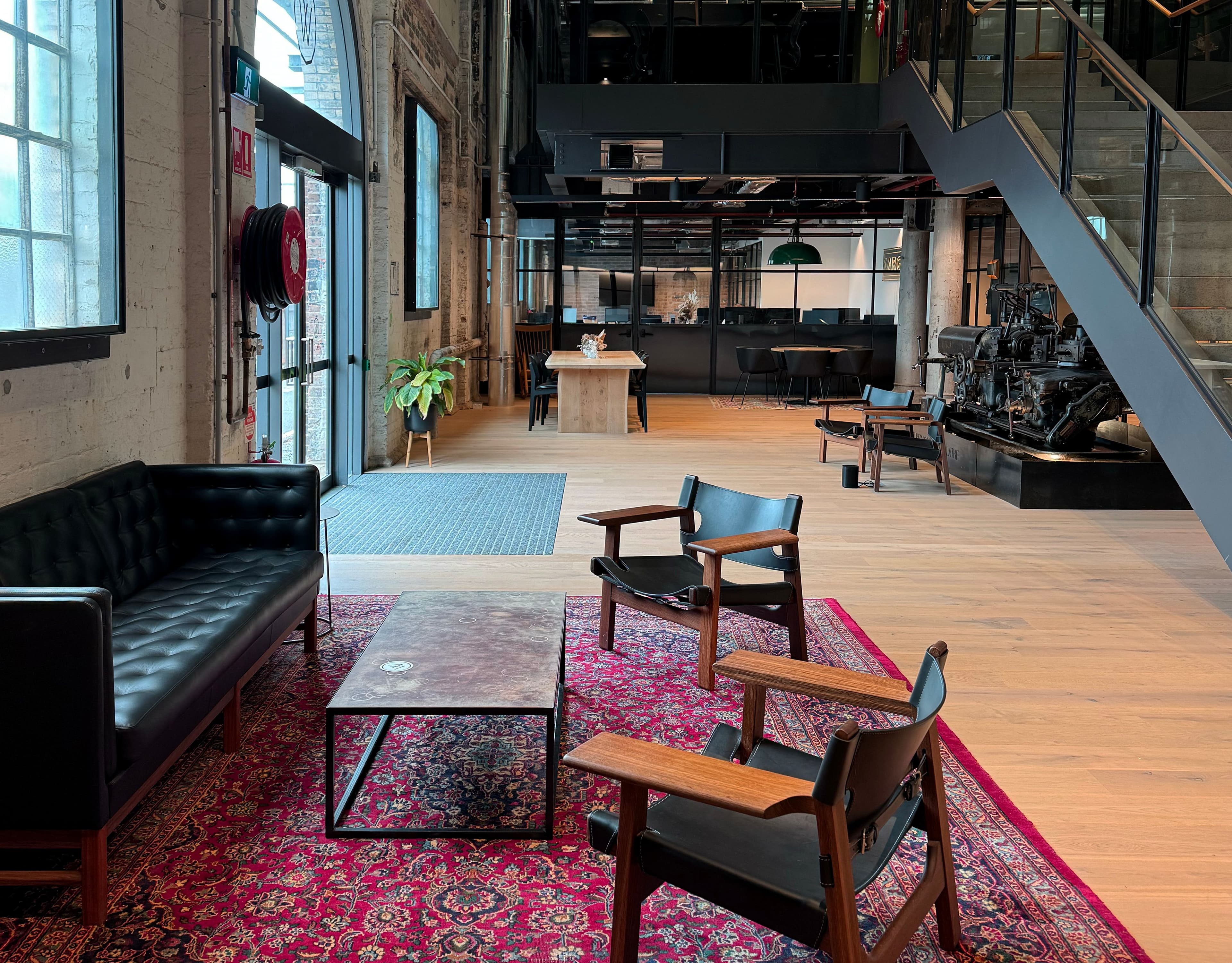
Our comprehensive identity system flexes from the digital to the physical and back again. UI and infographics are enriched with a touch of technical sophistication whilst physical environments and messaging benefit from a new layer of interactivity.
Outcome
The identity elevates the Security sub-brand, shifting focus from individual solutions to a stronger, unified presence. Still unmistakably Microsoft, the refreshed system adds clarity and distinction, making even the smallest interactions feel purposeful and considered.