

Your Lyft is Arriving
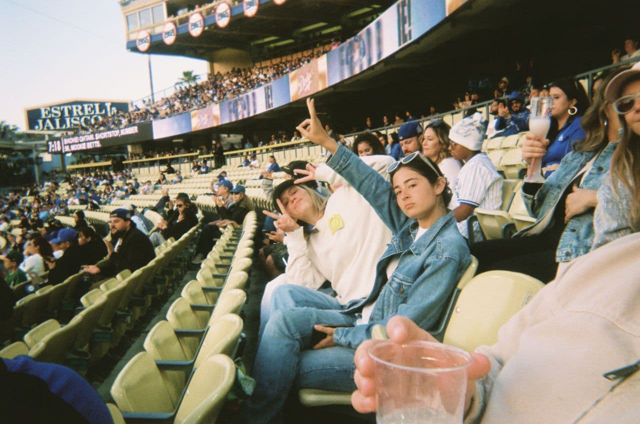
Since launch, Lyft has been the playful, rebellious force in rideshare: bright, human, and full of energy. But a decade on, the category had become crowded and commoditized. Lyft needed to evolve, to become more focused and mature, but still unmistakably people-first, with its spirit of connection intact.
Strategy
Lyft’s approach was to grow up without blending in. It doubled down on what set it apart from the start, a rebellious, human spirit, while evolving to feel more focused and mature. By framing rides as moments of connection rather than transactions, Lyft carved out a people-first position in rideshare that only it can own.
Identity
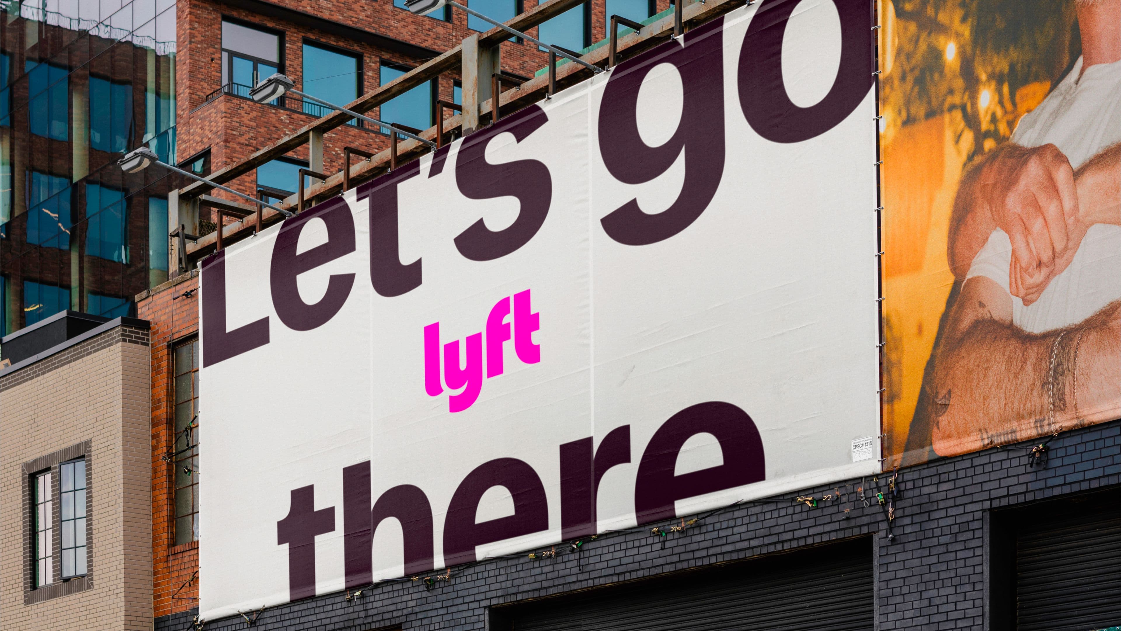
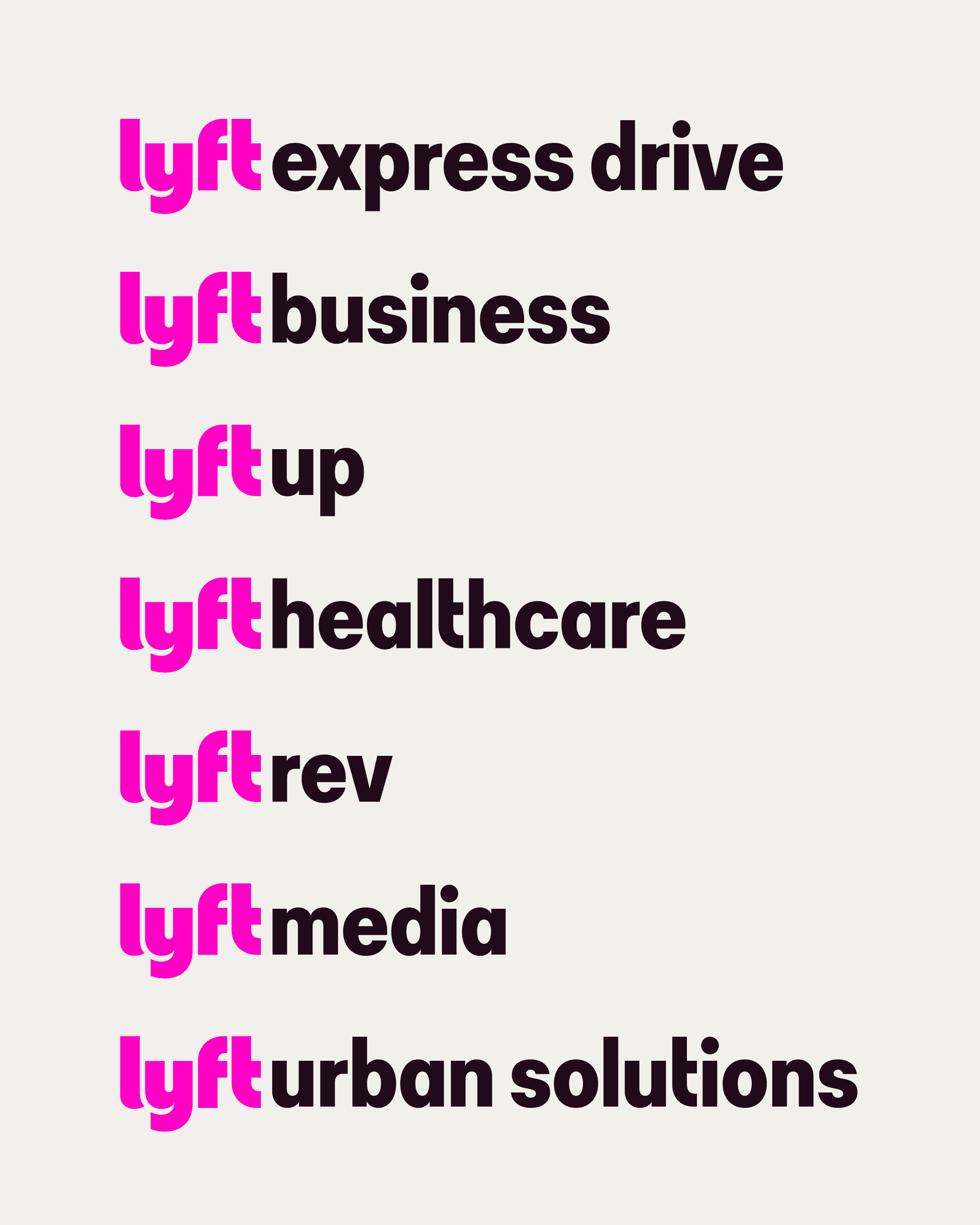
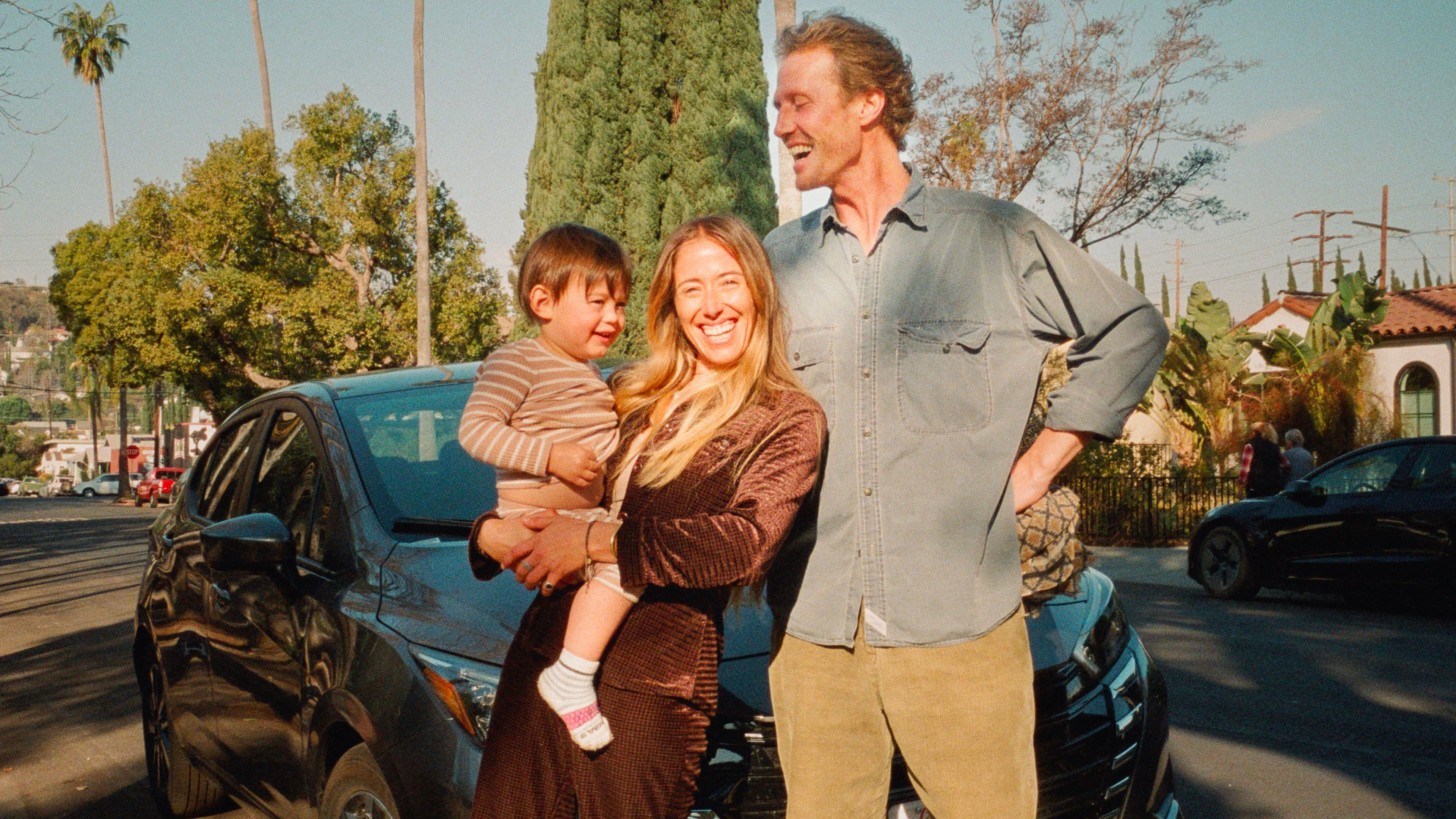
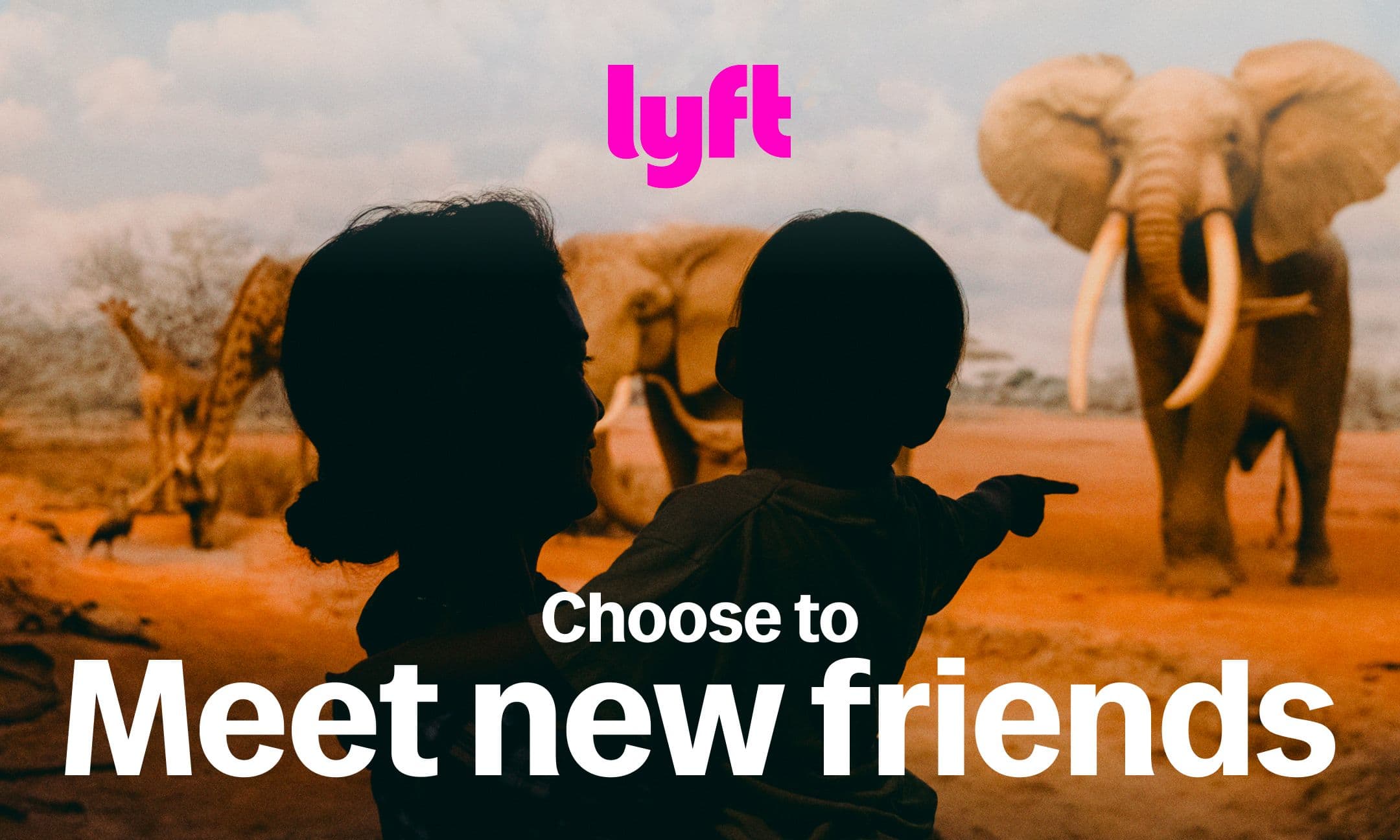
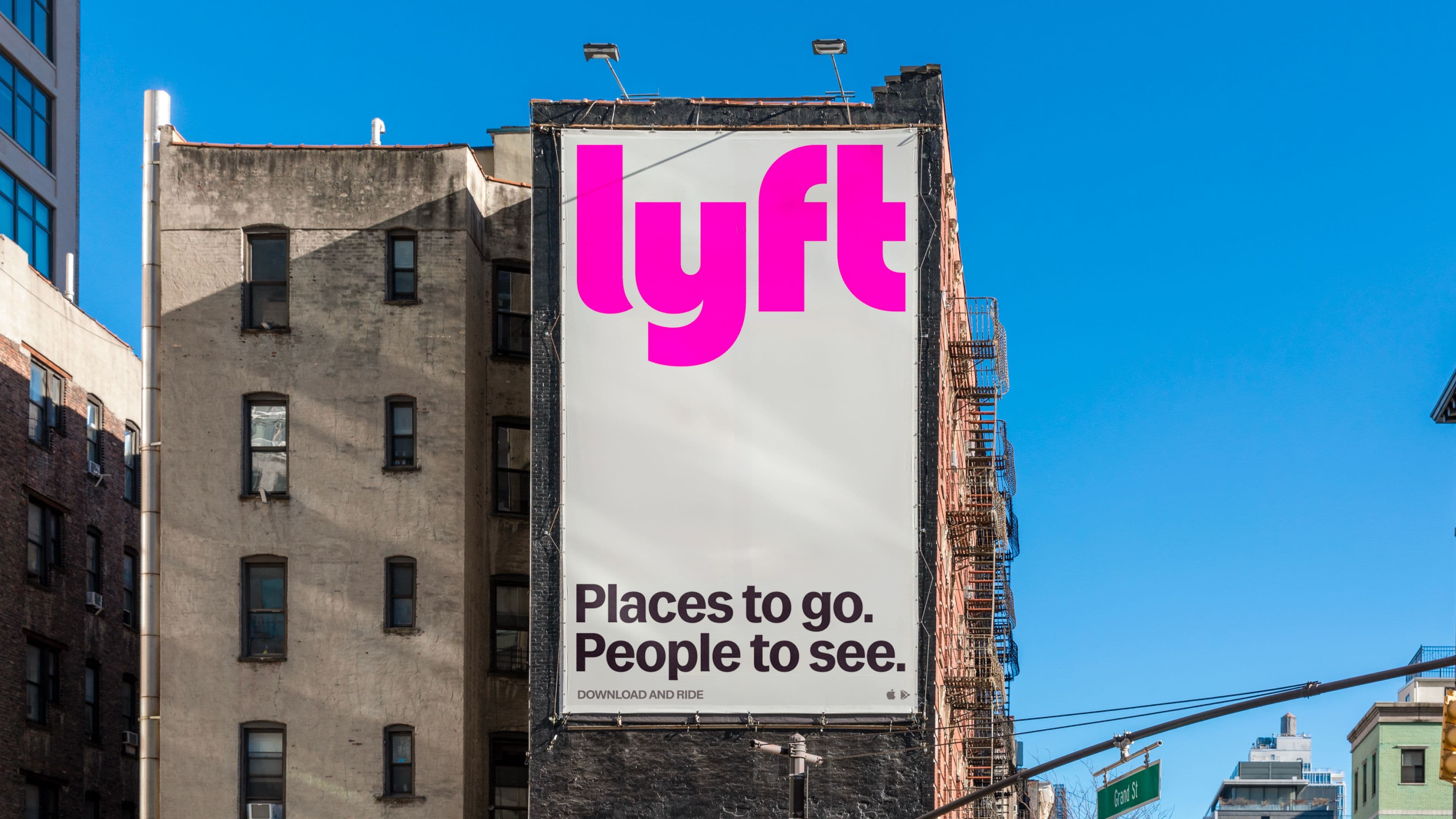
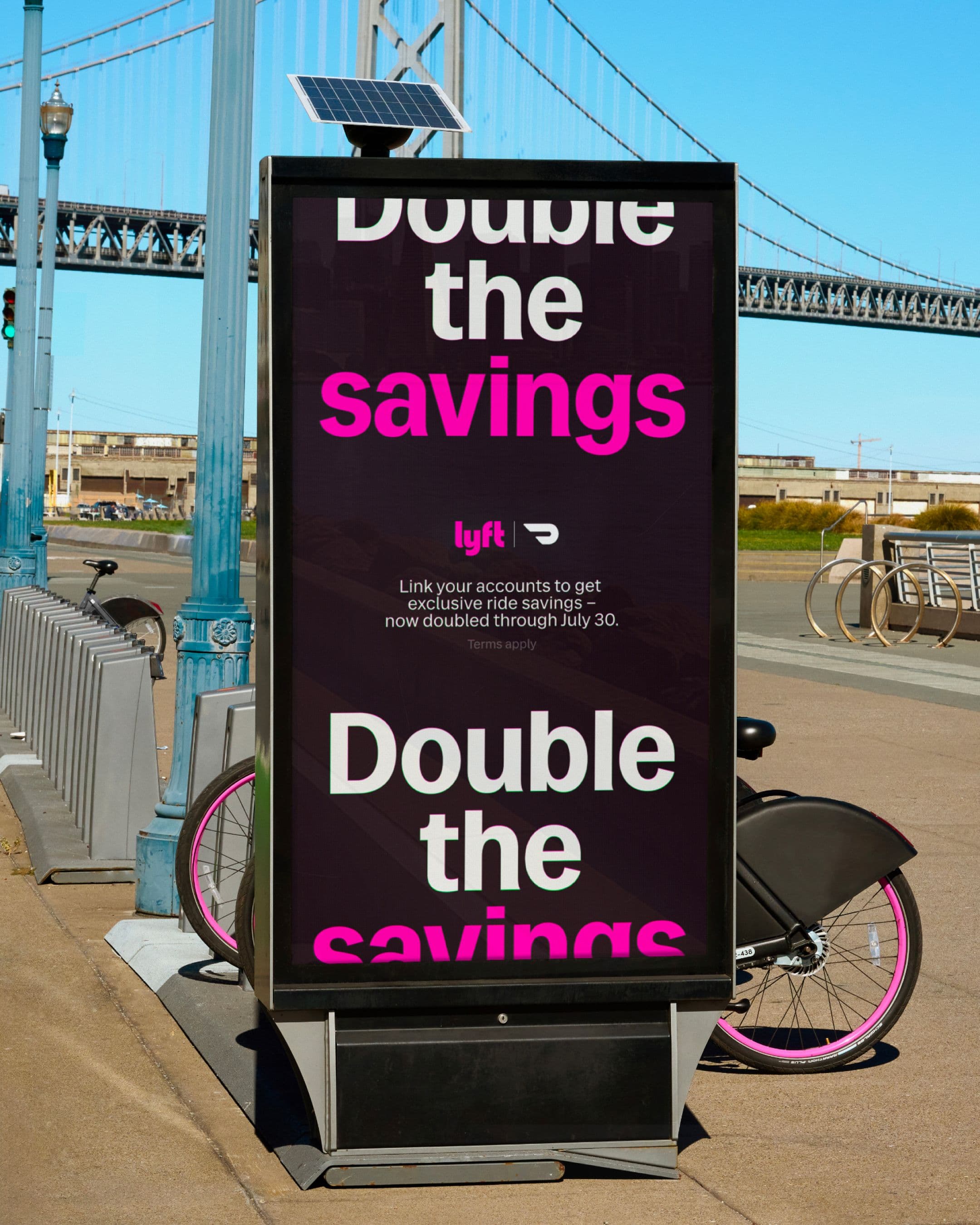
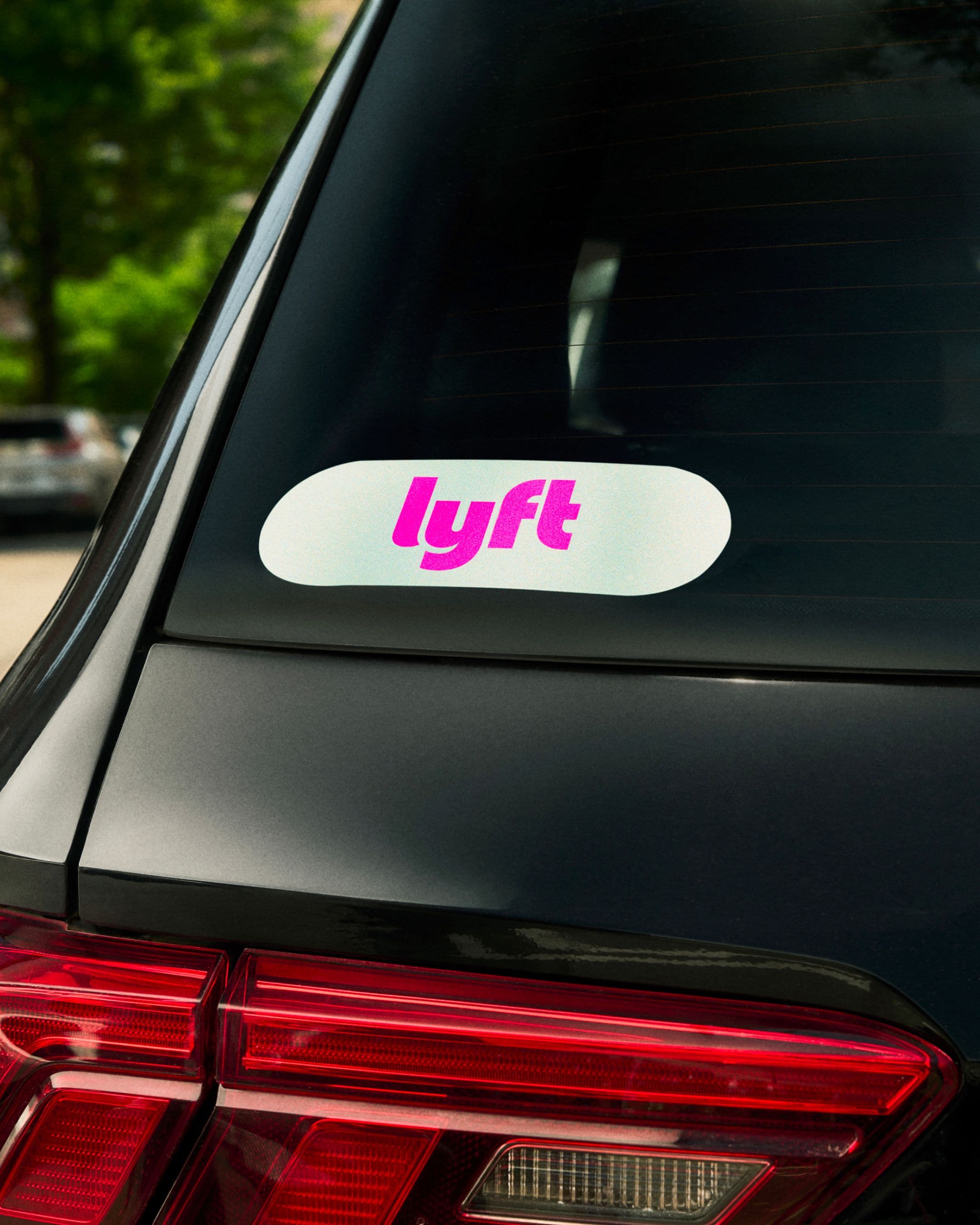
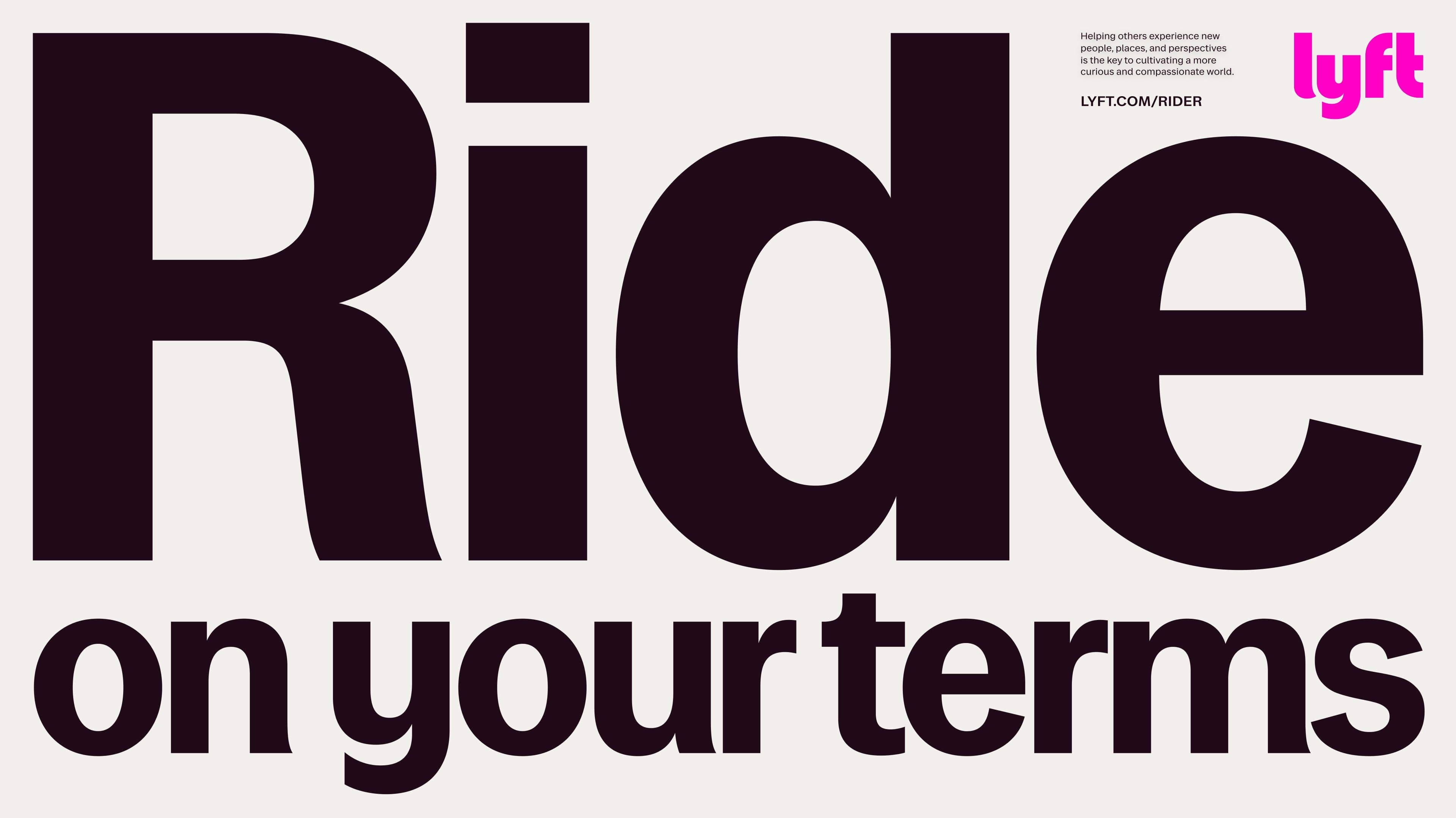
The refreshed identity balances confidence with humanity. A refined logo, bold typography, and an energized palette give the brand clarity and impact. Photography and design focus on people and the shared moments between them, carrying forward the joy and humanity that set Lyft apart.
Application
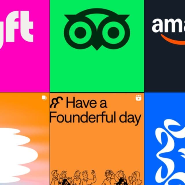
From app screens to driver comms to out-of-home campaigns, the system flexes across every touchpoint. It ensures Lyft shows up with consistency and distinction, whether in product, marketing, or the ride itself. A brand built to scale with the business while staying unmistakably Lyft.


Outcome
The rebrand gave Lyft a clear, confident identity for its next chapter. Still joyful and human, but now sharper, more cohesive and ready to grow. Lyft continues to stand out in rideshare as the brand built on meaningful connection.