
A new job for an iconic wordmark
Over fifteen years, Instagram evolved from a place to share photos into one of the world’s most influential cultural platforms—a home for creators, communities, businesses, and everyday interactions. During that time, the way people create changed. The way people communicate changed. And Instagram changed to meet the expanding needs of its growing community.
Yet one thing remained largely untouched: the wordmark.
As Instagram’s broader brand ecosystem evolved, a new tension emerged. The Instagram glyph became ubiquitous. While the wordmark, despite its immense equity, remained constrained.
The original wordmark had served the brand well. But it was now expected to function as a marquee global brand asset, working in concert with the wider brand system across marketing campaigns, product experiences, creator ecosystems, and cultural moments. All while scaling into new apps like Instants and Edits.
The challenge was complex, but clear: create a wordmark capable of expressing what Instagram is today and will be in the future, while preserving the familiarity and equity built over more than a decade of global recognition.
The Impossible Brief
Unraveling a unique paradox
Instagram’s wordmark is encountered billions of times each day. It carries enormous cultural and emotional importance. It also needs to perform across an increasingly complex ecosystem of products, platforms, and experiences.
Redesigning one of the world’s most recognizable wordmarks presents a unique contradiction: every change matters, yet too much change risks losing everything that made it renowned in the first place. At the same time, the new wordmark needed to establish a closer relationship with Instagram’s iconic glyph and wider brand identity—creating a visual system that felt unified without sacrificing the distinct character of either asset.
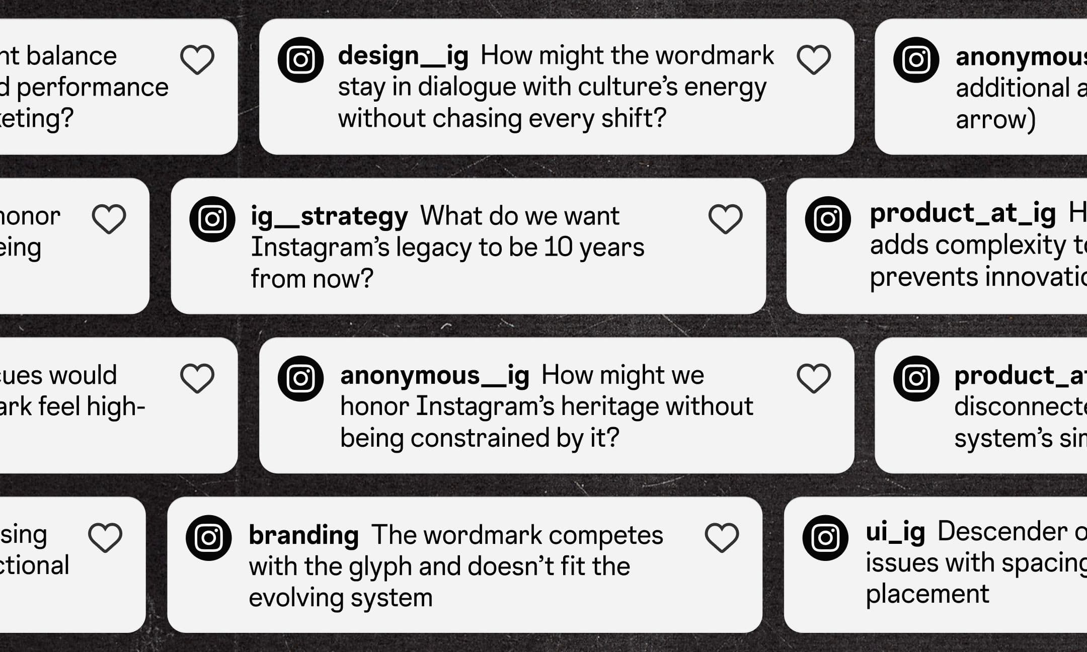
To create something new, we first had to understand what people already loved.
The Process
Finding a personal touch
The original Instagram wordmark spoke to the era of early mobile apps—designed to convey personality and nostalgia. Its quirky flourishes and bespoke handcrafted characteristics made it unique and memorable. Despite countless shifts in technology, culture, and visual trends, it had outlived most identities designed in the same era. That longevity felt significant.
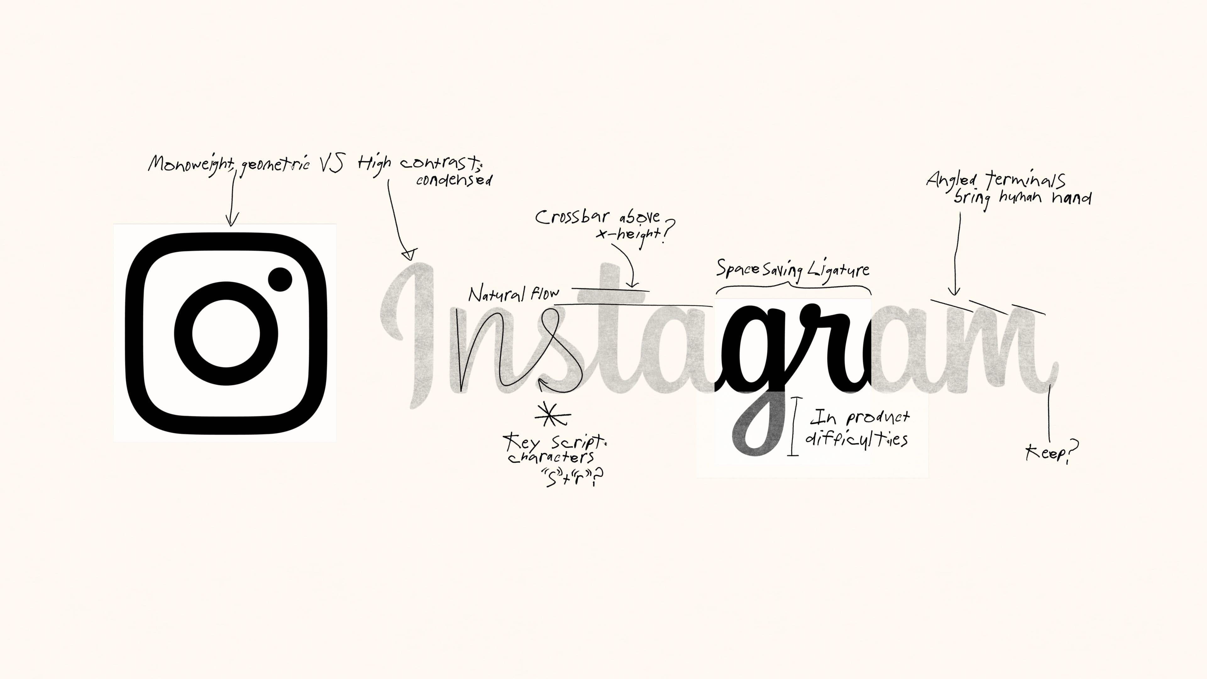
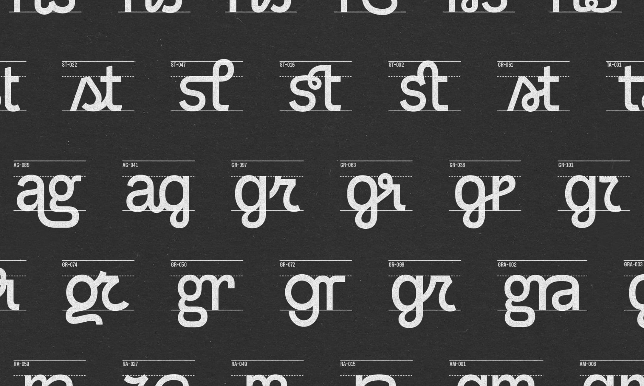
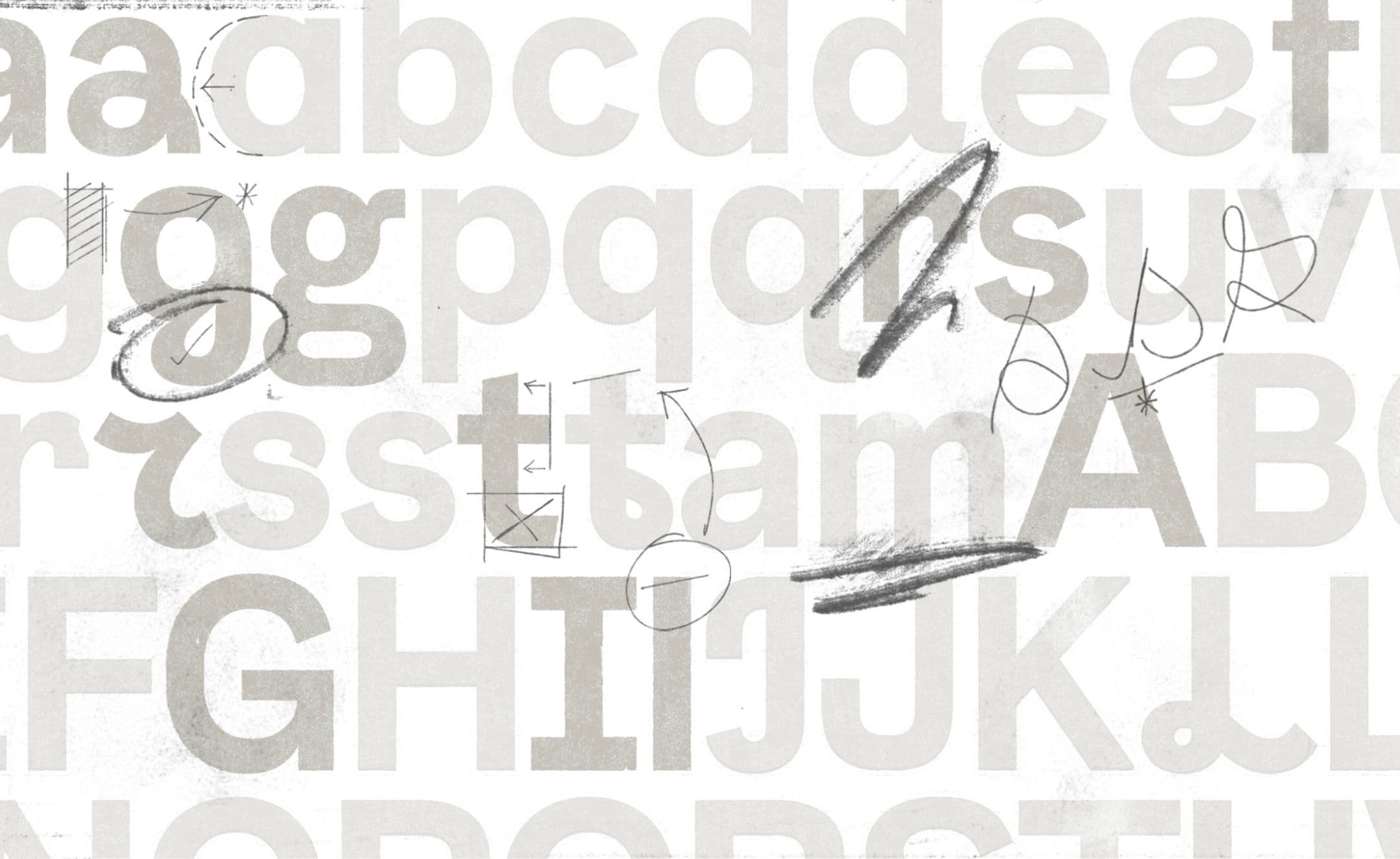
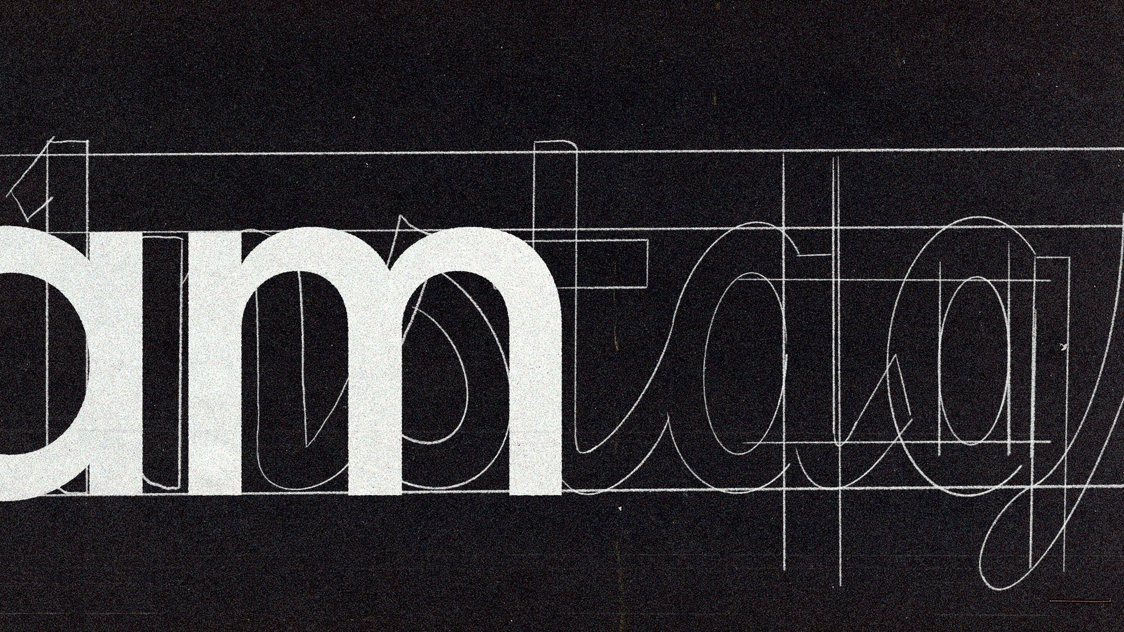
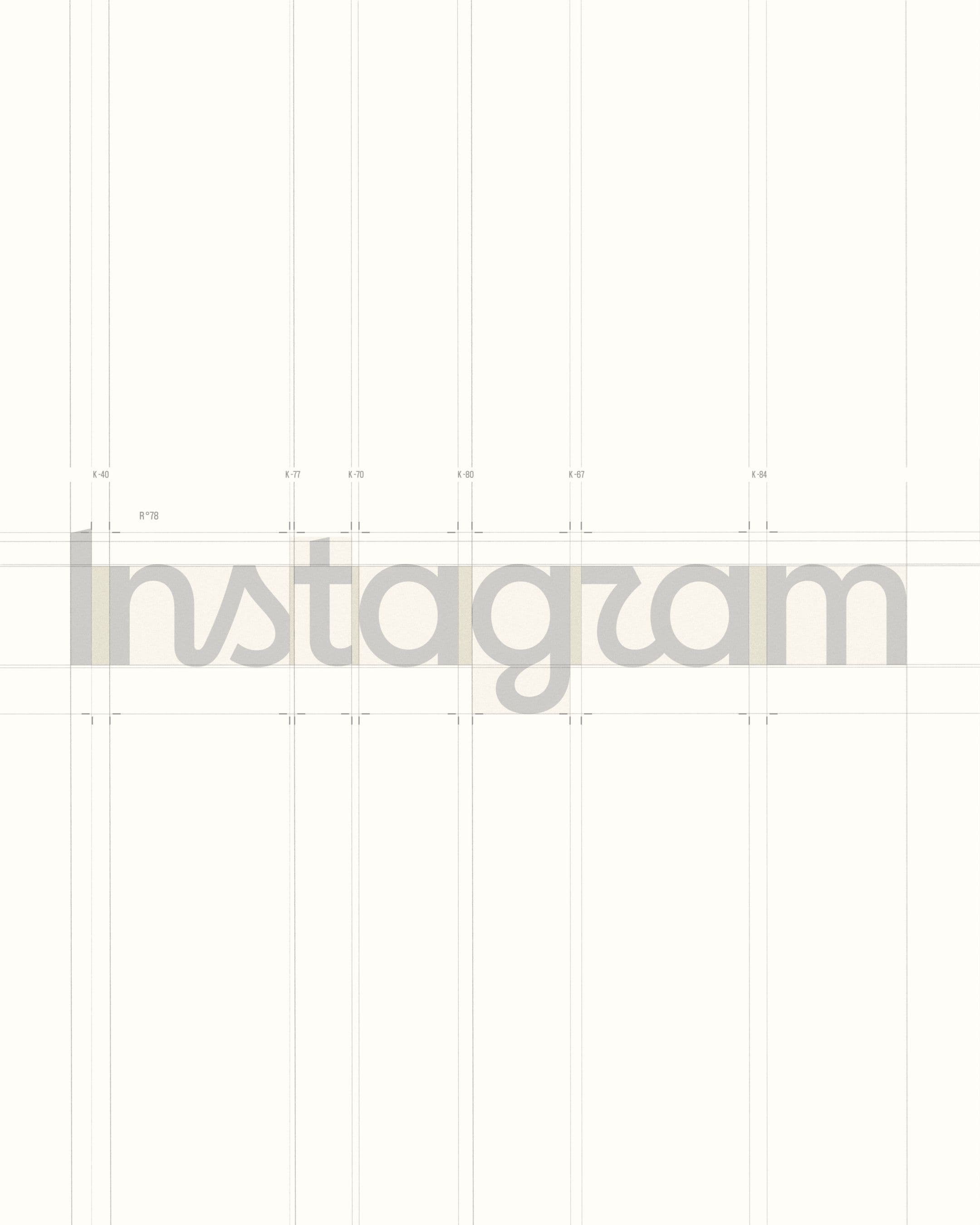
Working alongside the Instagram team, we explored hundreds of variations. We studied handwritten forms, calligraphic gestures, and the subtle imperfections that make human expression feel authentic. Every curve and connection was scrutinized. The process became one of calibration: how much could change and still be remembered?
Here, Instagram’s recognition lends a unique advantage; an opportunity to evolve the brand with great intention, and some measured liberties. For example, the distinct, simplified ‘r’ in the ‘gr’ ligature was refined to recall the original script and build a new iconic feeling for the brand.
The future of Instagram’s identity could not be designed purely through optimization. It had to feel authored.
Solution
A balance of old and new
The final challenge was ensuring the mark felt like it had always belonged.
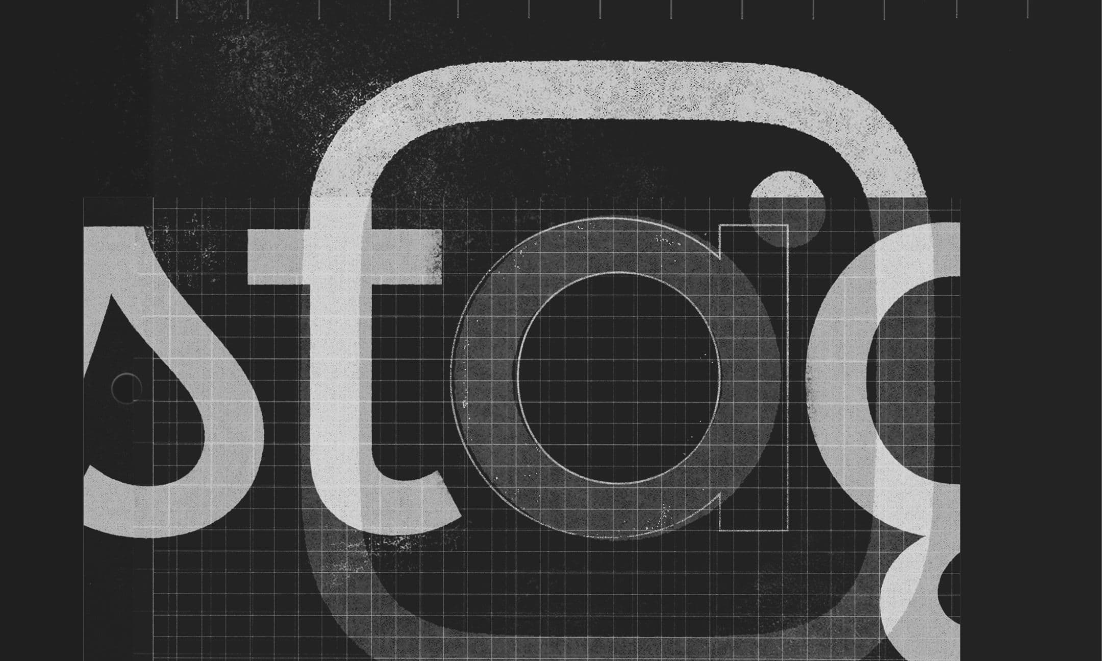
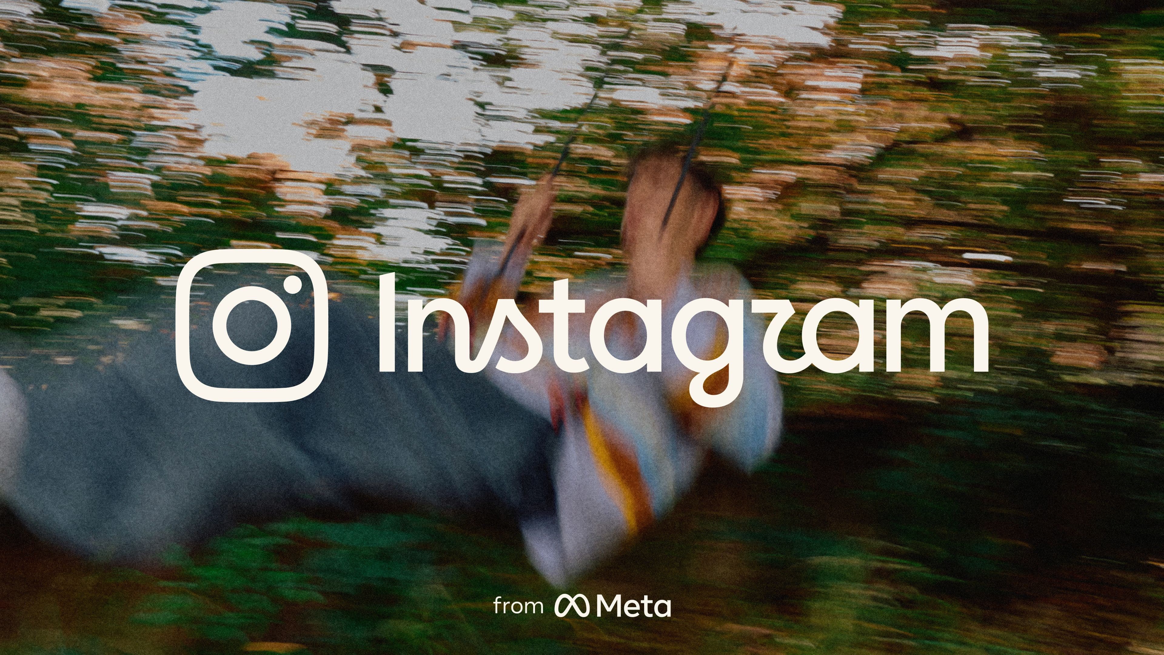
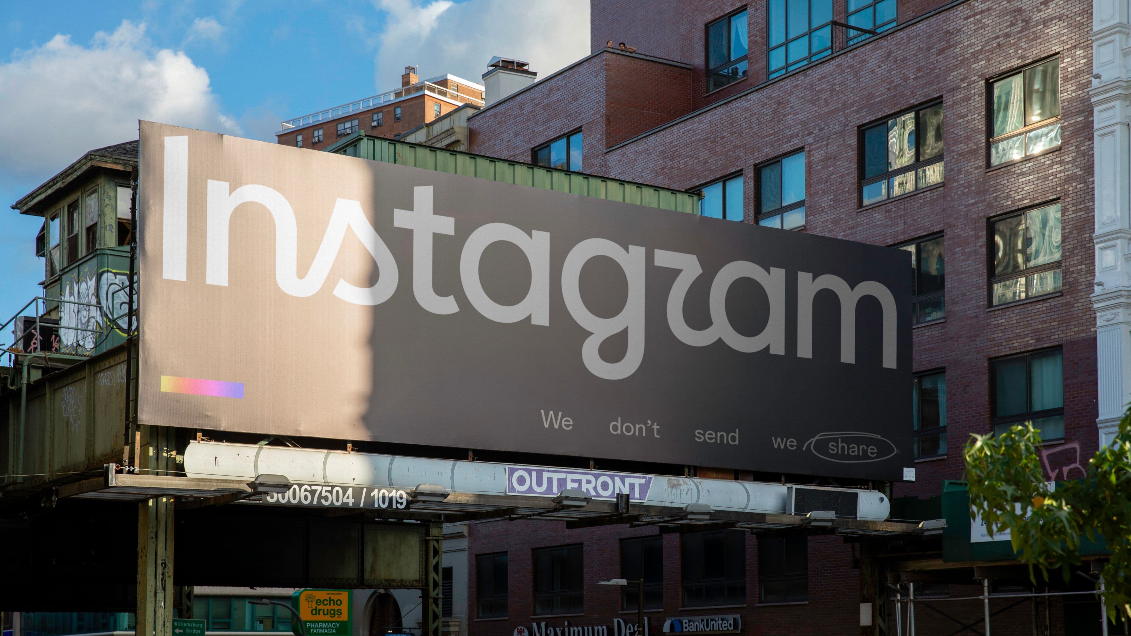
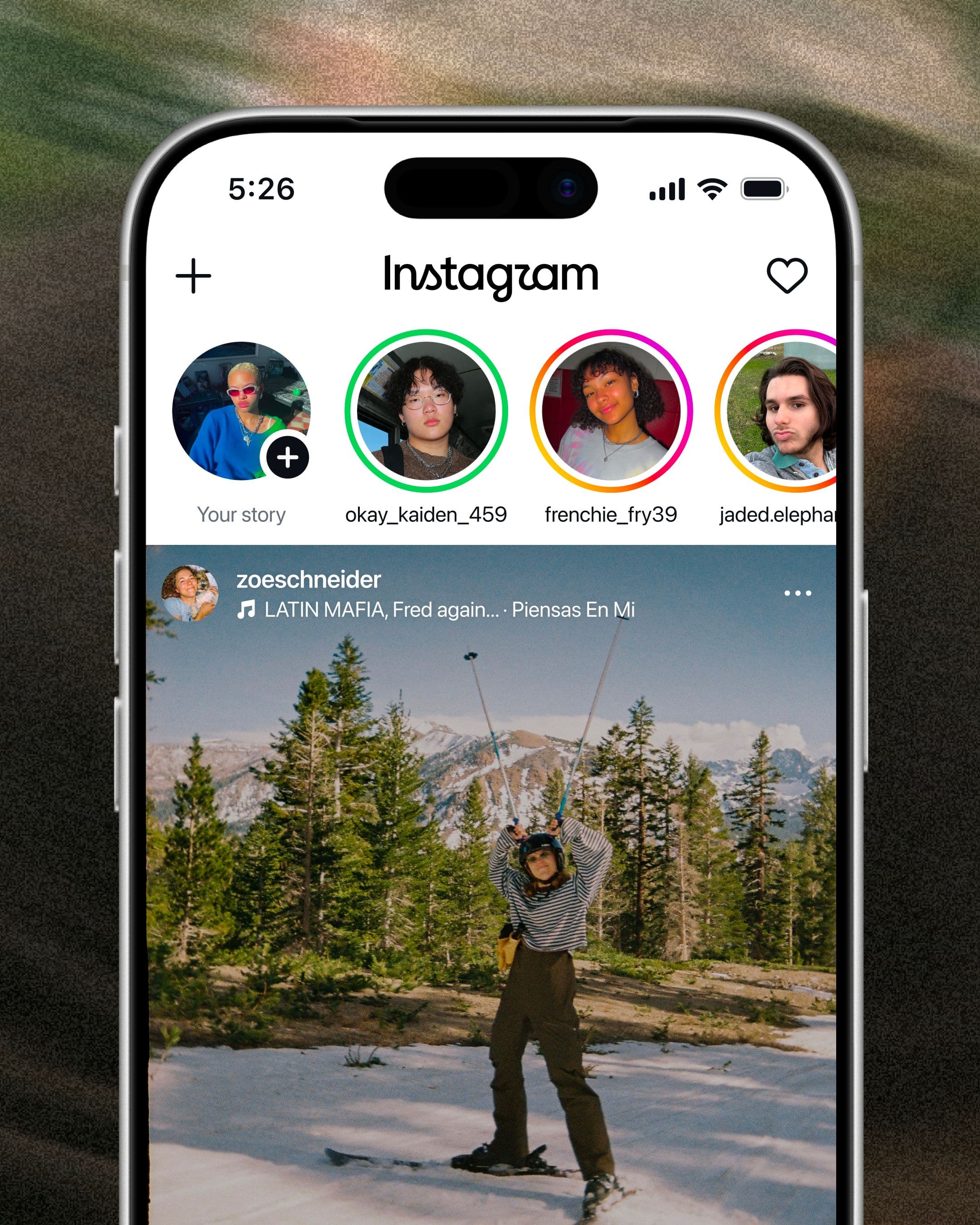
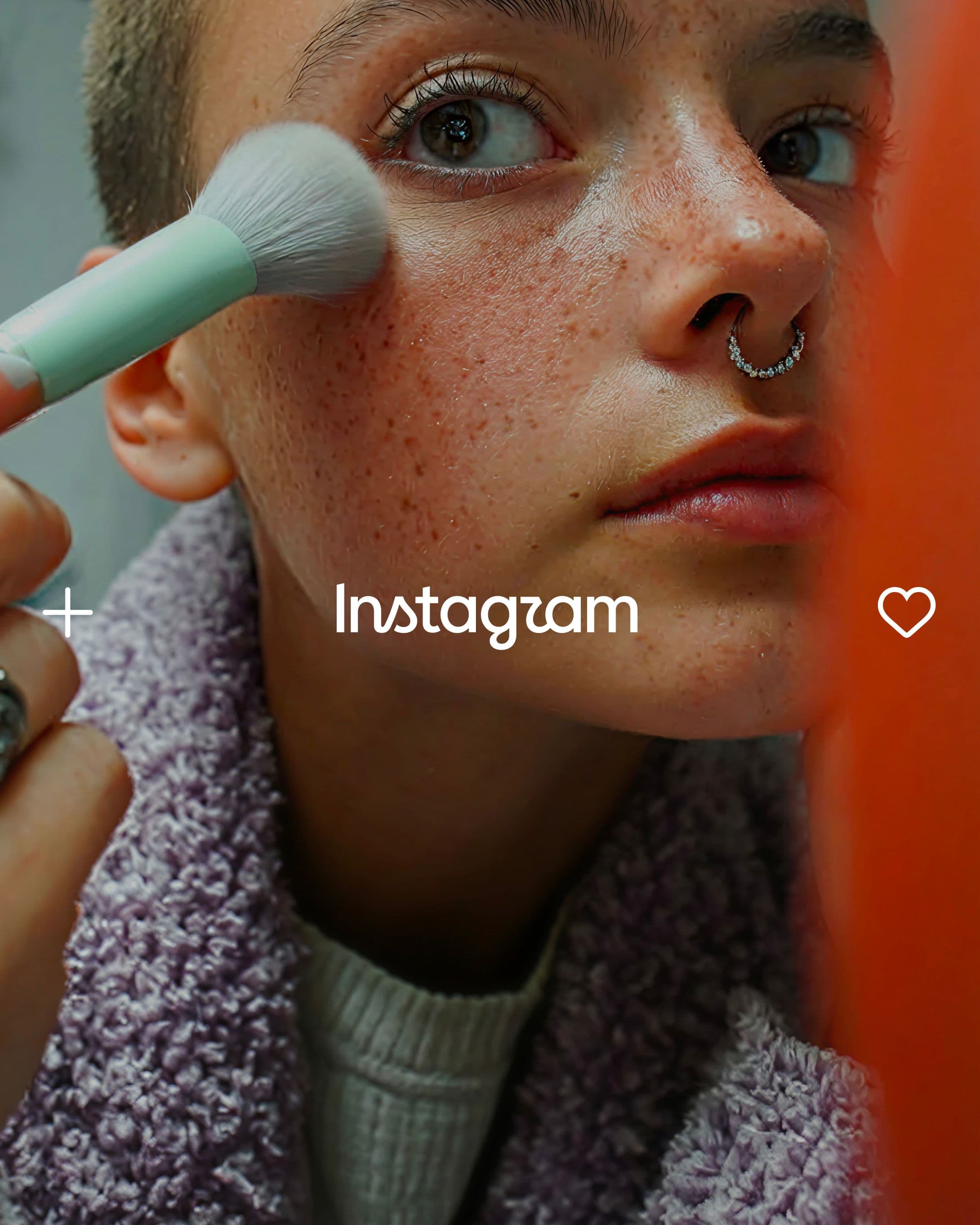
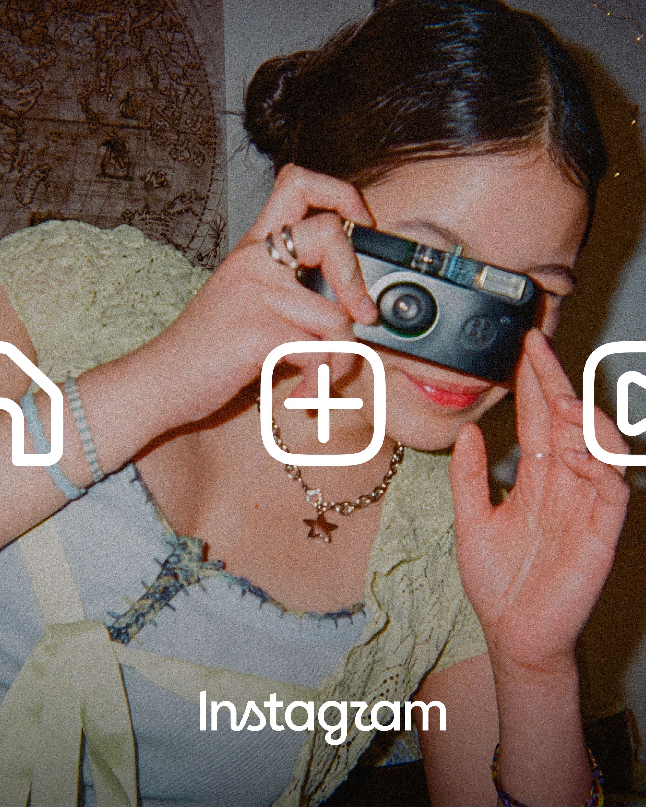
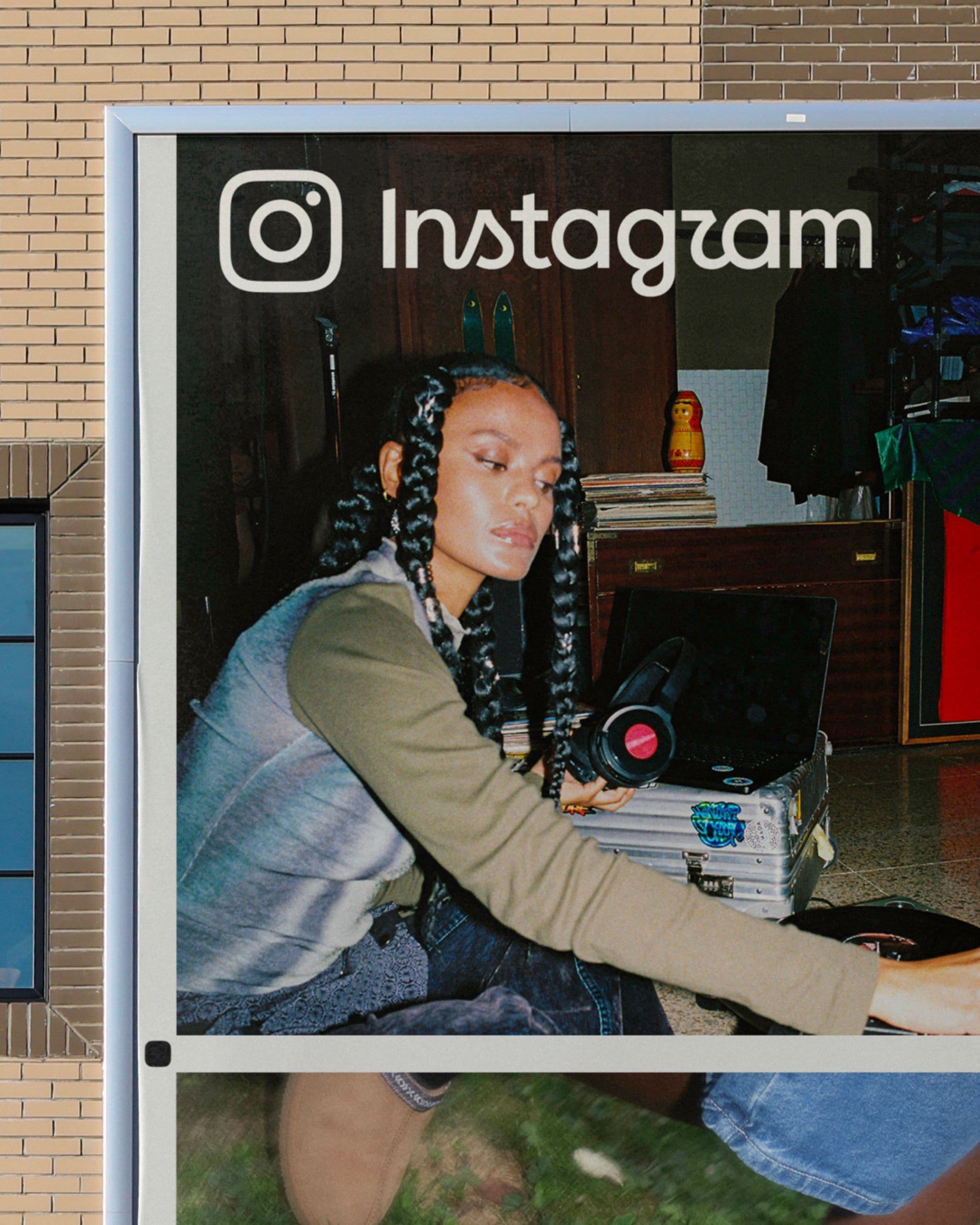
The redesigned wordmark was built to work across the entirety of Instagram’s ecosystem—from product experiences and global marketing campaigns, creator programs to new apps from Instagram. It also established a closer relationship with the Instagram glyph, allowing both marks to operate as part of the same visual language.
Designed to celebrate the creativity of the community, the new wordmark builds upon its legacy. It preserves the familiarity and recognition that billions of people associate with Instagram, while reintroducing the humanity, personality, and expression that had always existed at its core.
It's a new mark with old memories. One that upholds Instagram's heritage of creativity: setting up the brand to continue growing along with its community for years to come.
The craft was a given – but this project also took a lot of heart, grit and thoughtfulness which the Koto team delivered in spades. We appreciated your attention to details, experimentation, patient collaboration... and also, it was a lot of fun.
Cynthia Pratomo
Director of Brand Design, Meta