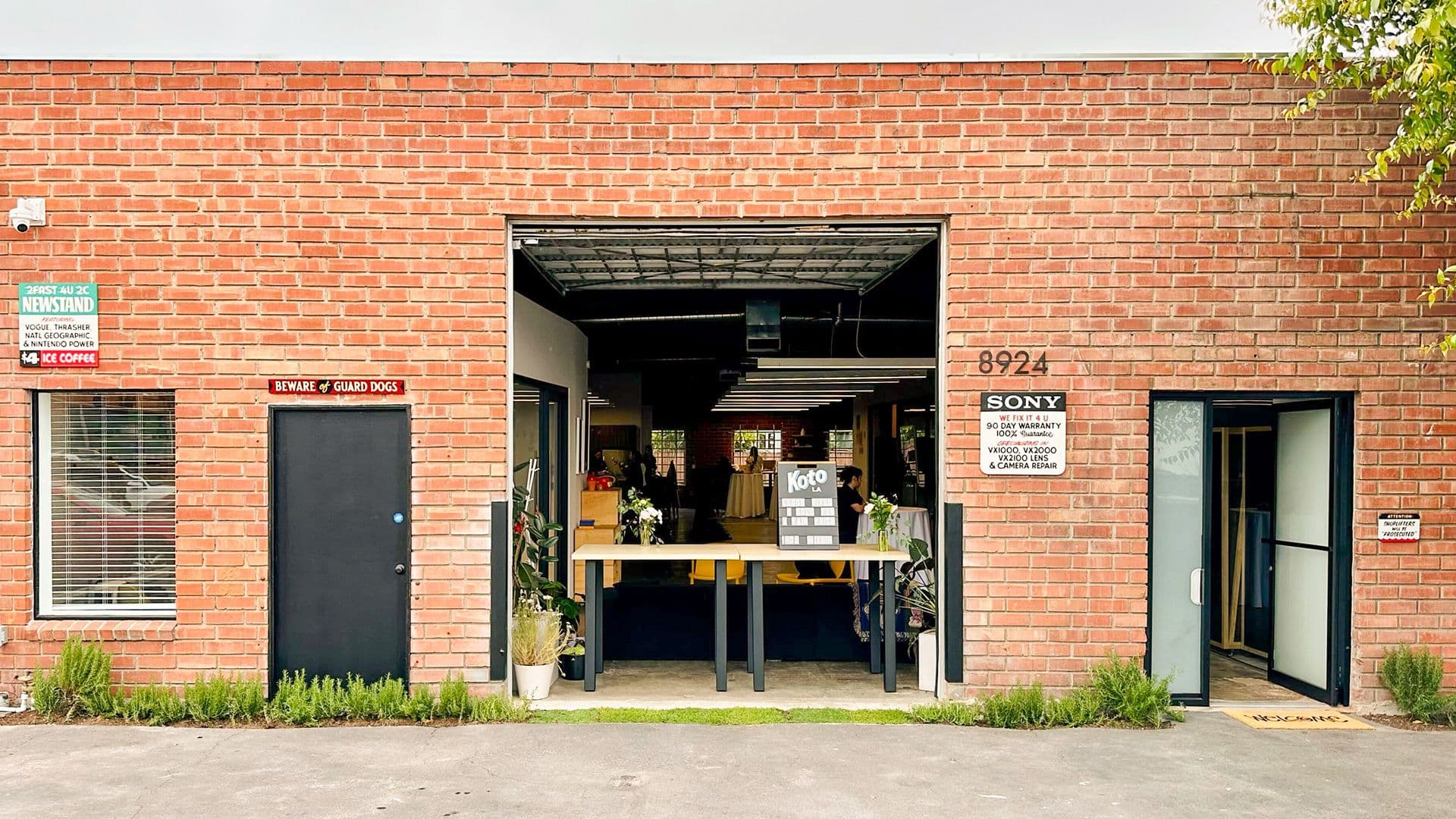


After acquiring Classy, the leading nonprofit fundraising platform, GoFundMe faced a pivotal moment: its product expanded deeper into nonprofit giving, yet its brand still reflected its early peer-to-peer roots. Drawing on existing equity, we were tasked with evolving the identity into a modern, product-informed brand that signals progress and GoFundMe’s leadership in this next chapter of fundraising.
Strategy
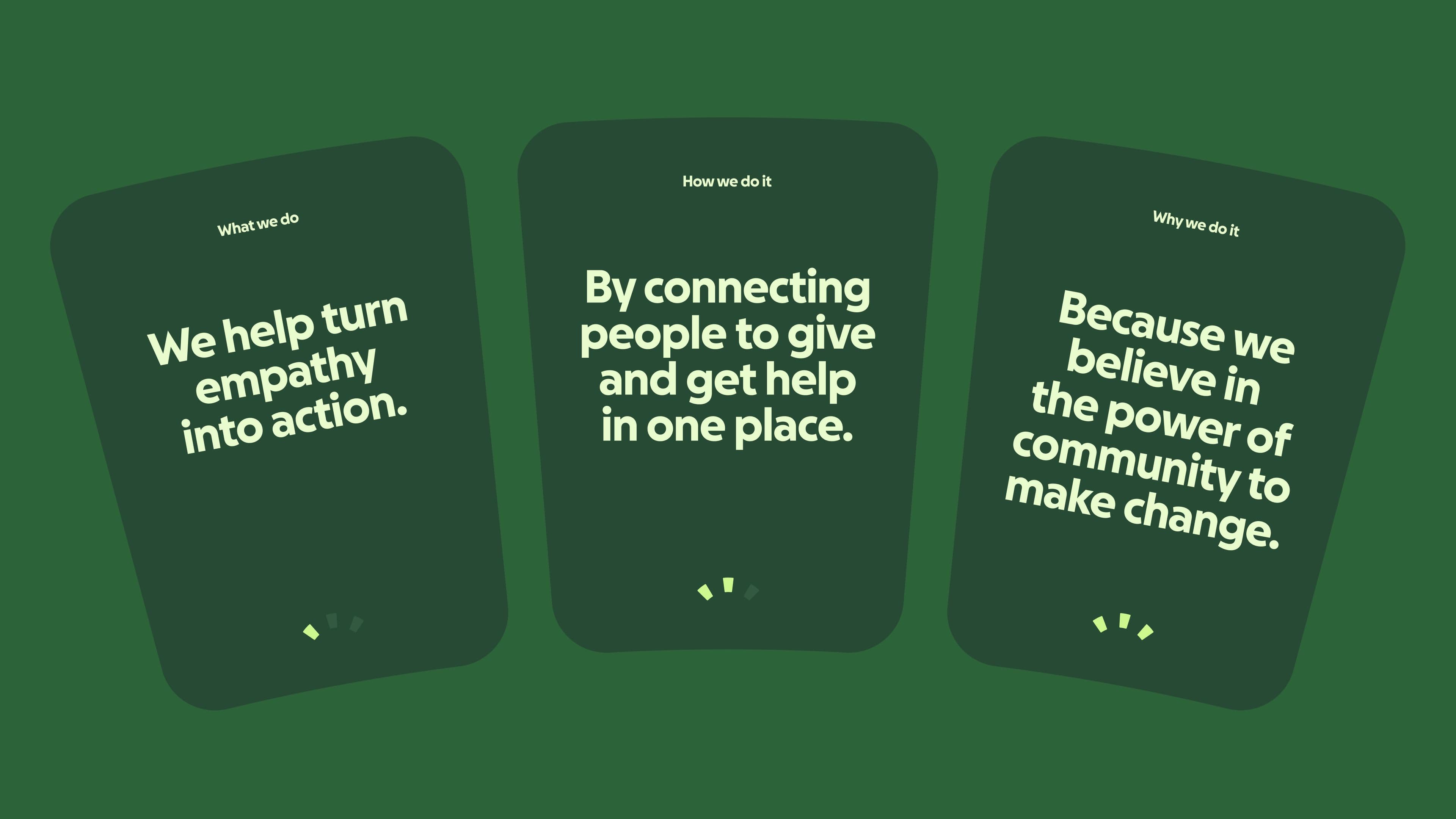
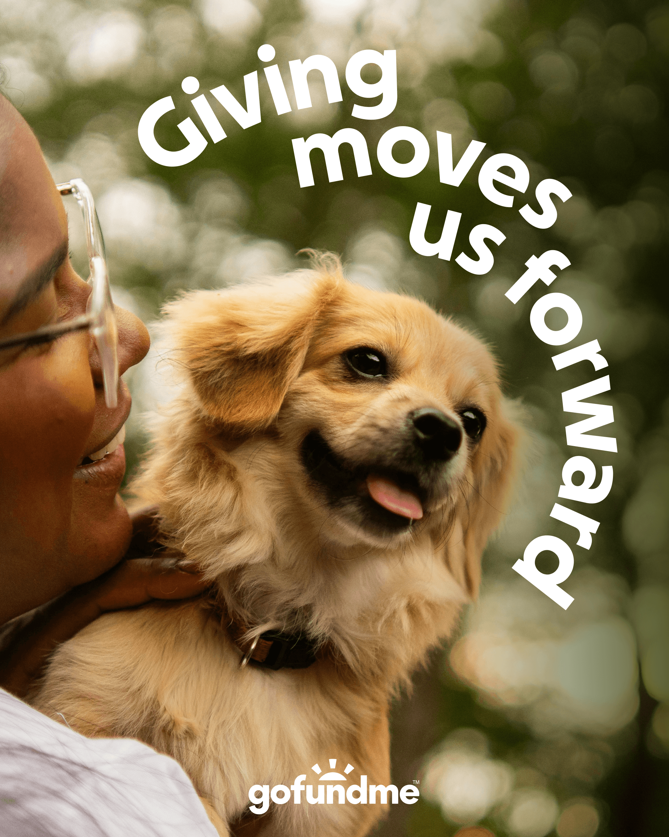
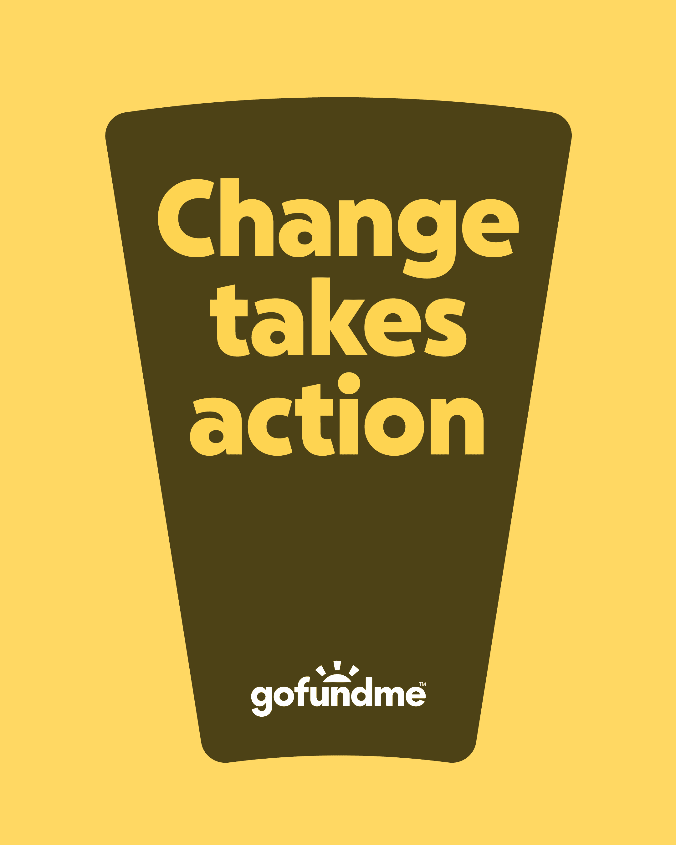
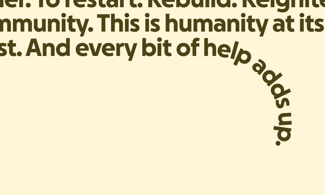
GoFundMe is the global leader in online fundraising, where anyone can give and get help in one place. By uniting individuals and nonprofits in one place, GoFundMe is helping move humankind forward with unprecedented impact and scale. Our brand idea, ‘Help Adds Up,’ captures the feeling of life-changing progress powered by community.
Identity
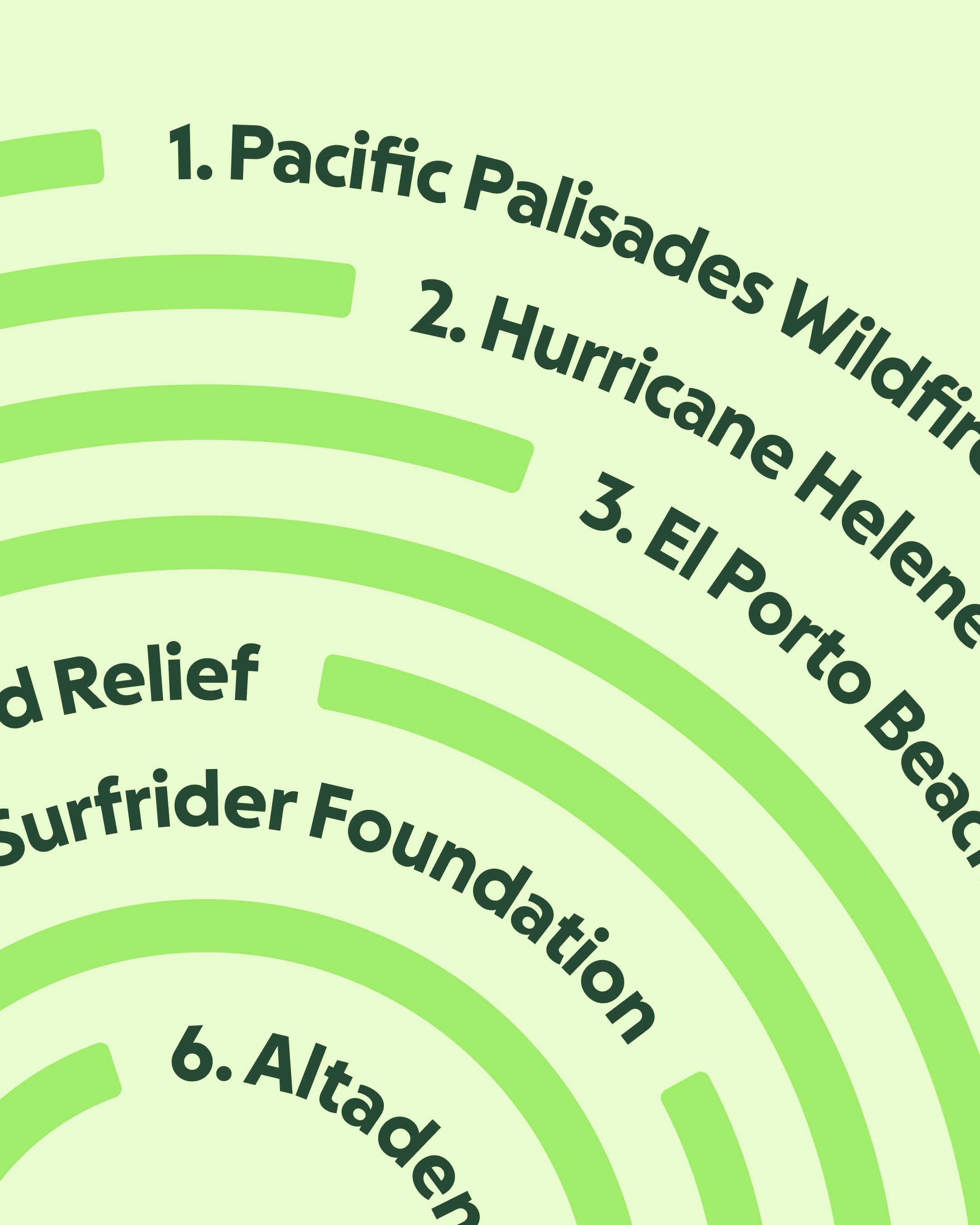
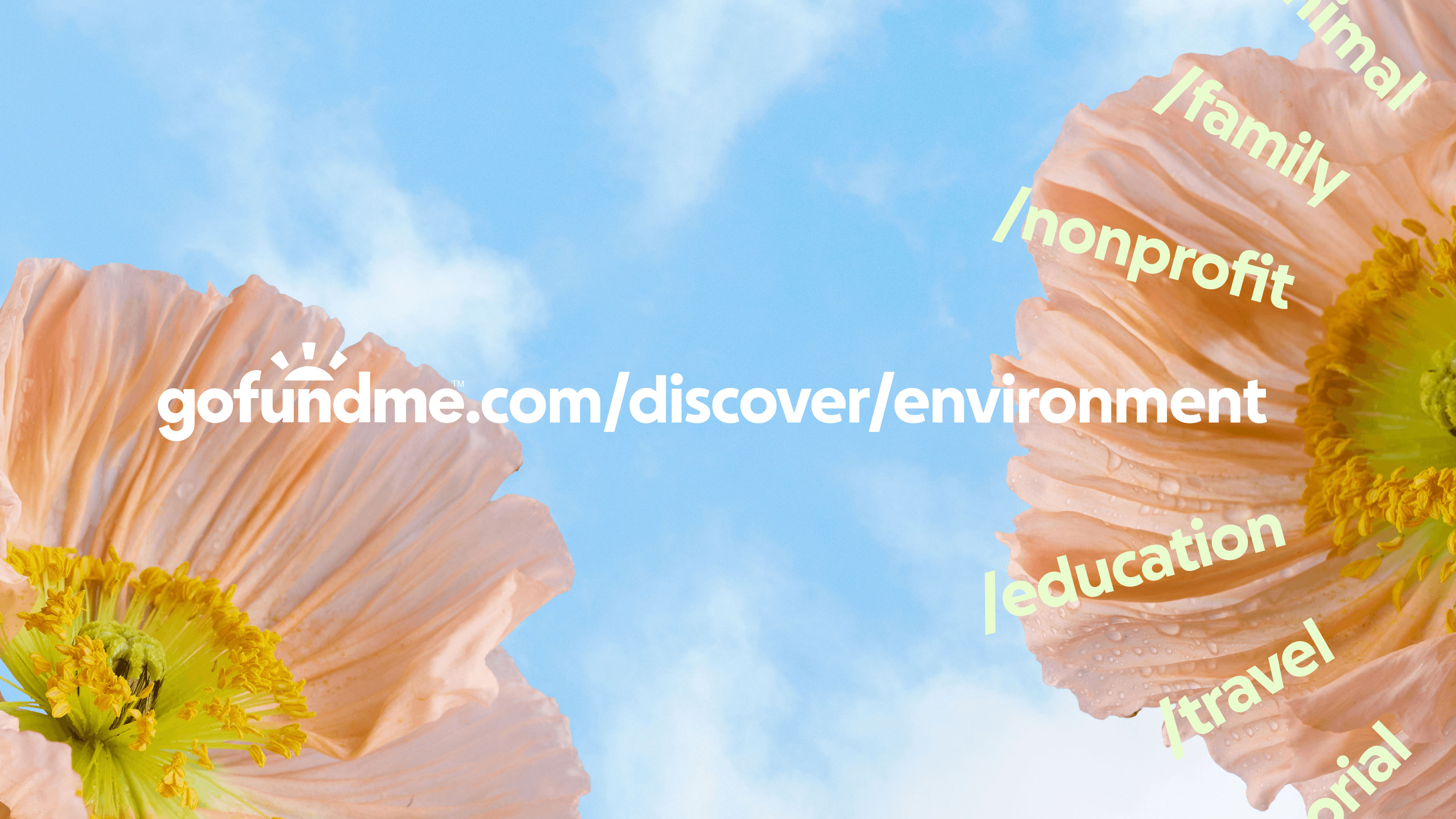
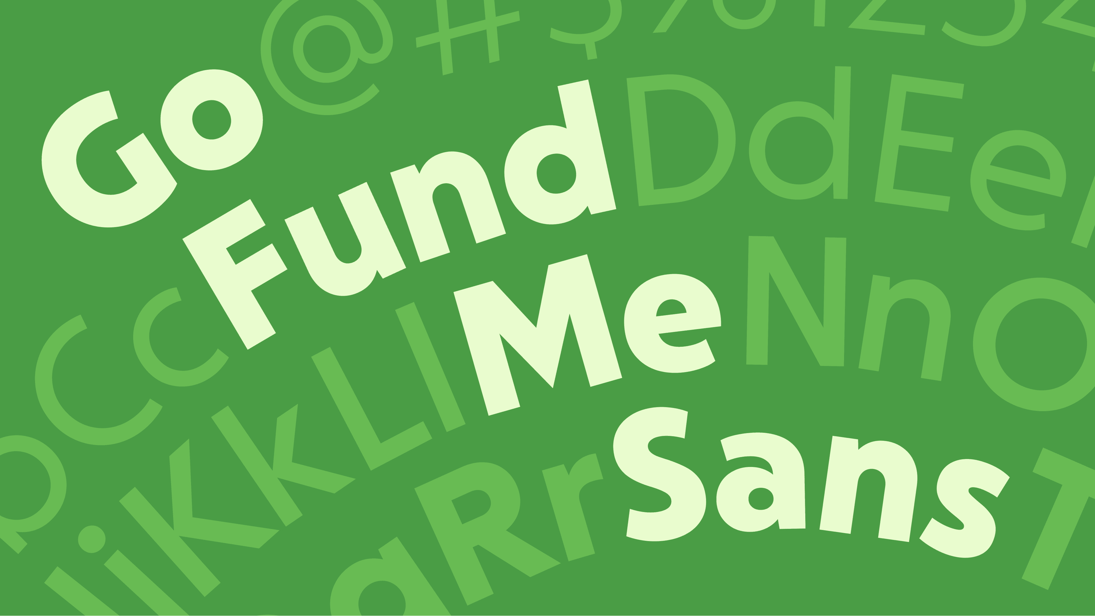
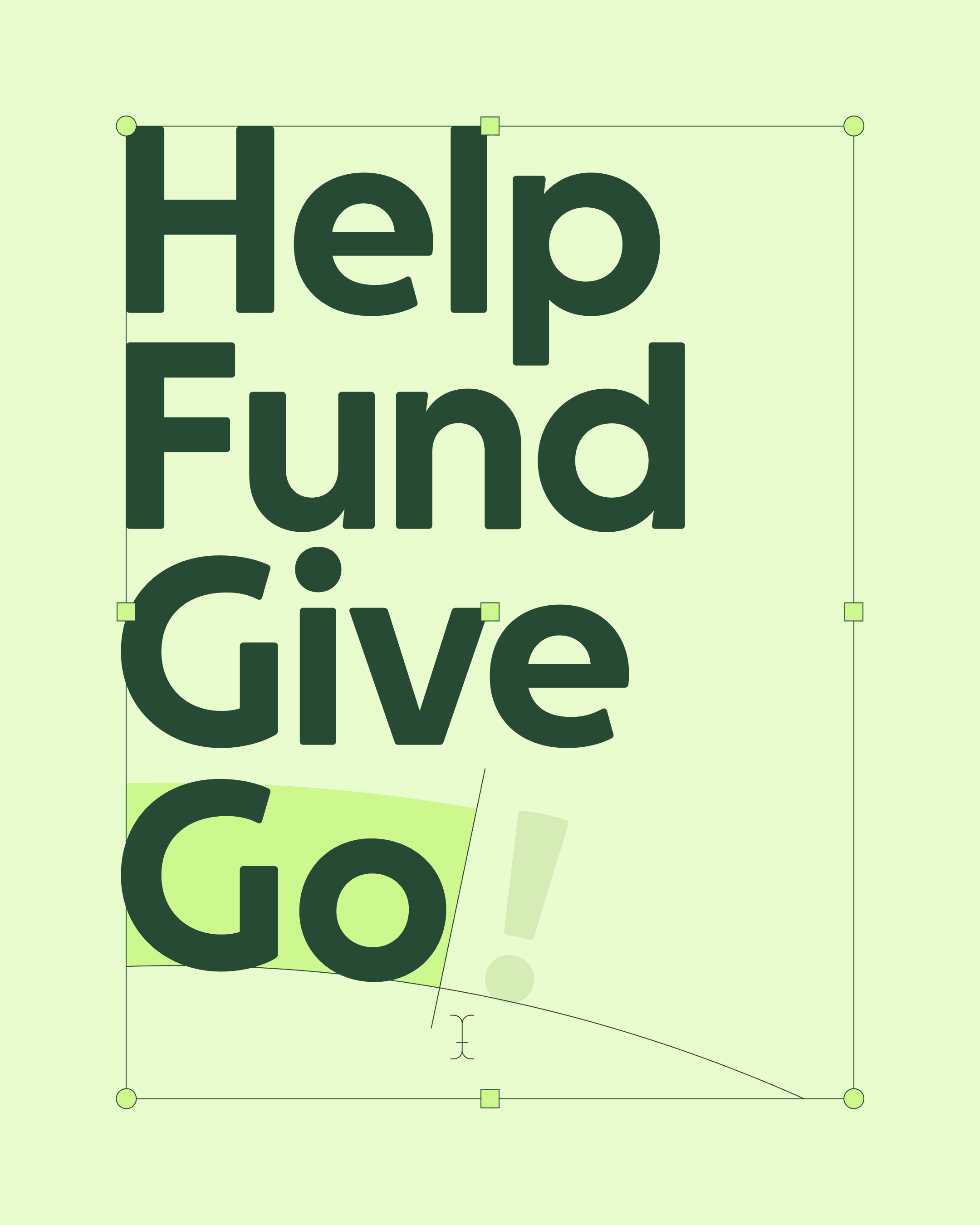
The identity transforms GoFundMe’s most recognizable asset—the goal bar—into a dynamic progress circle. This circle radiates into an arc, or ray, that sits at the heart of the logo and acts as a unifying device across the system, creating a sense of narrative momentum and shared progress. It scales seamlessly to introduce GoFundMe Pro, visually connecting GoFundMe’s offerings under a single story. Radial typography and fingerprint-like patterns extend the idea, making the brand feel human and collective.
Interactive
Application
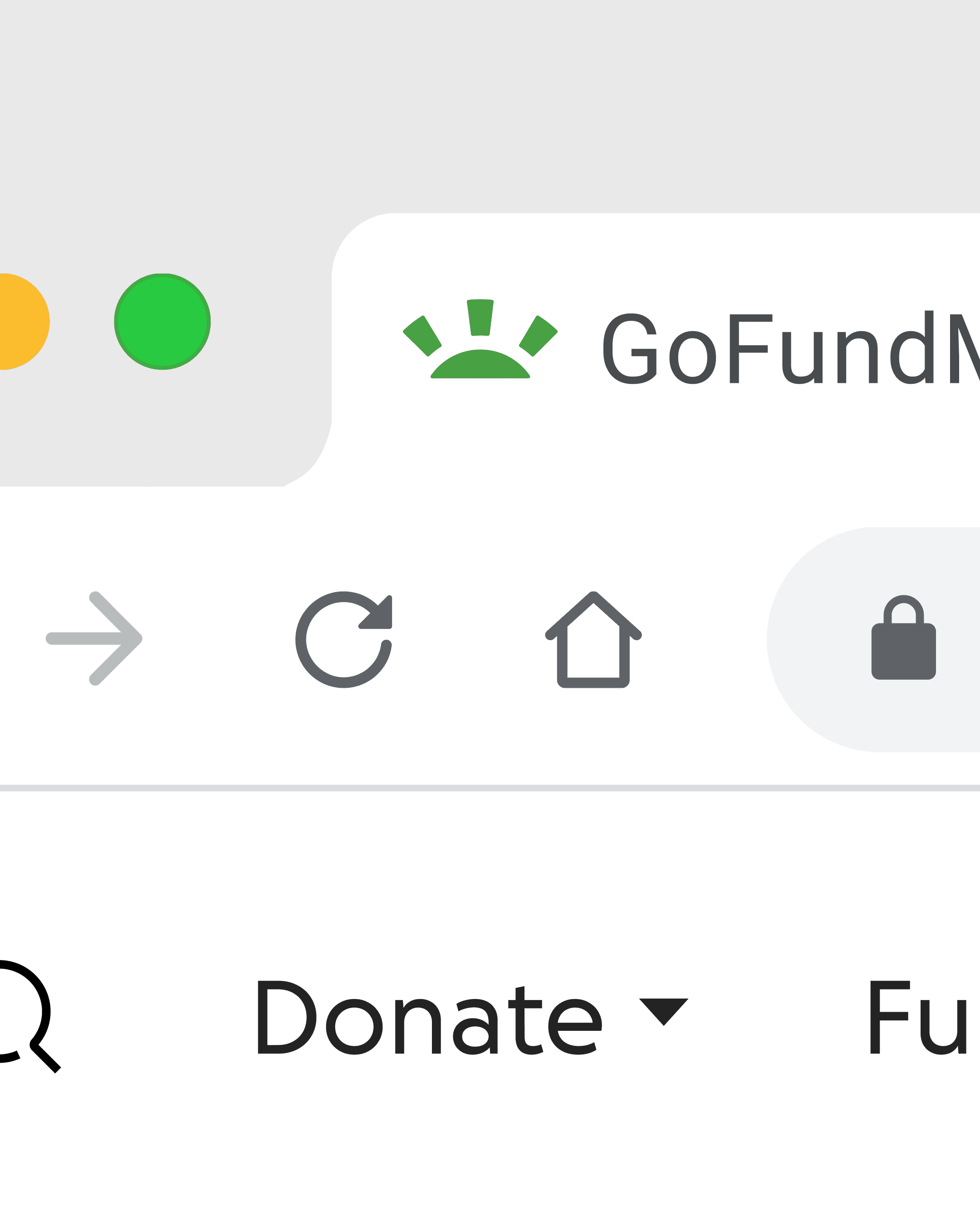
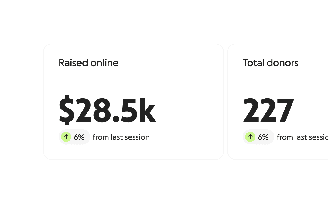
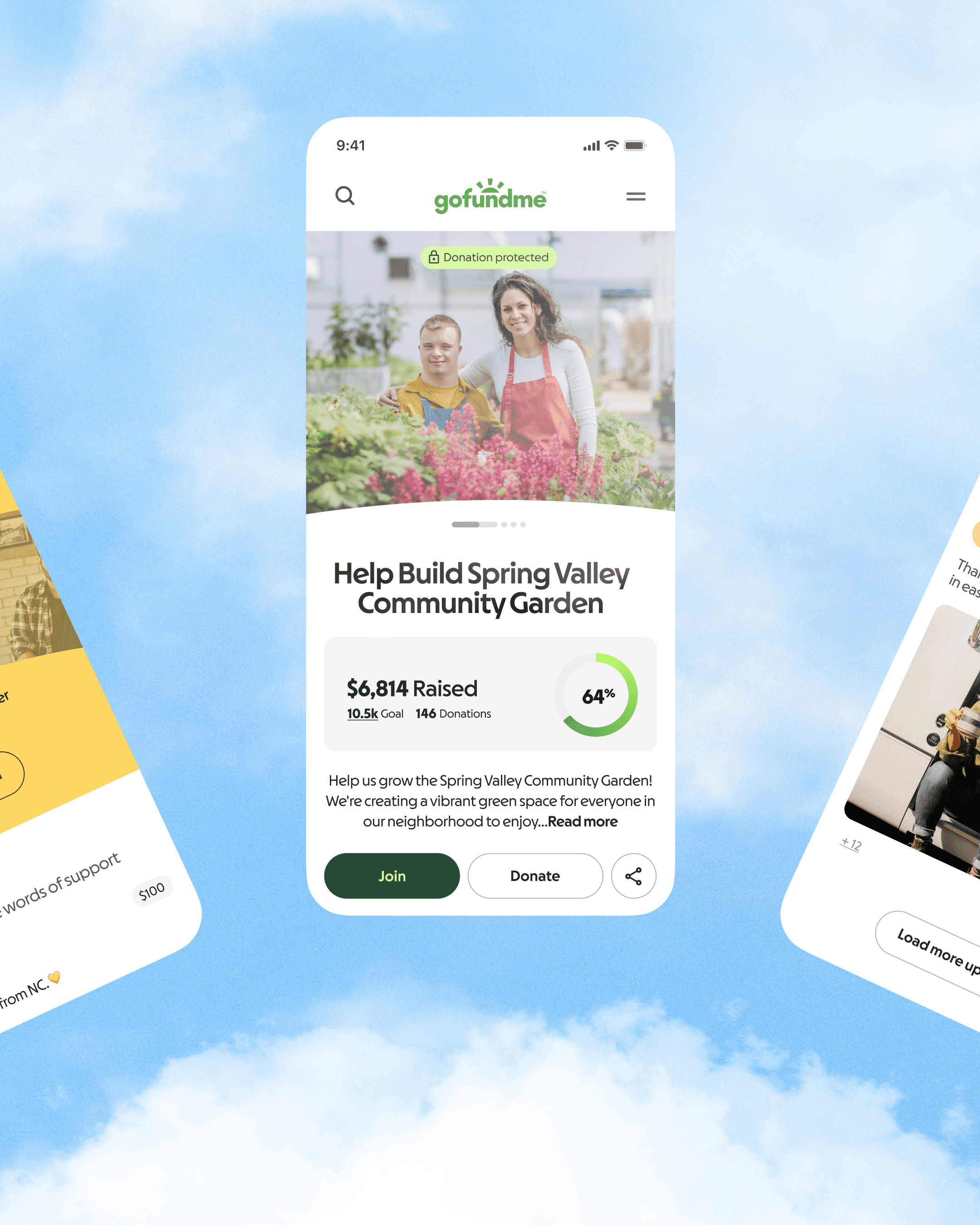
The new system shapes in-product touchpoints, such as goal tracking, donation flows, and campaign pages, to create small, visible moments of progress that bring ‘Help Adds Up’ to life. This product-first approach delivers a cohesive, empowering experience for fundraisers, donors, and GoFundMe Pro clients alike. As the identity extends beyond the product, it retains the same sense of clarity and momentum, helping every interaction feel like part of a single, ongoing story.
Outcome
The evolved brand reaffirms GoFundMe as the leader in modern fundraising—equipping people and organizations with the tools and confidence to mobilize communities and achieve their goals. It bridges trust with the warmth and humanity of peer-to-peer giving, expanding naturally to include GoFundMe Pro. By shifting from a purely sympathetic tone to a guiding one, the brand empowers action at every level and demonstrates that when individuals come together, every bit of help adds up to real, positive change.